Elevation: The Third Dimension
Elevation is the key to representing terrain.
The Earth's surface is uneven, and attempts to represent that unevenness on a flat surface, whether a sheet of paper or your computer monitor, are going to be limited either in effectiveness or in efficiency.
All representations of the third dimension, elevation, require that we have elevation measurements (the Z, in addition to the X and Y of location) for the whole surface. Where does this information come from? As surveyors were "triangulating" (a surveying term) across swaths of the US as early as the 1830s they were collecting those elevations. However, those surveyors were only recording their data for a collection of well-placed points, not for the entire surface. Furthermore, they only collected their information for the natural surface, including mountains, valleys and the surfaces of water features, and for a very few very large man-made objects such as the tops of dams. More recently, airplane-based remote sensing technology, such as LIDAR, has enabled more detailed elevation data collection. Some USGS maps will represent water depths in large lakes, rivers and coastal areas, but that information has been added much more recently and by a different agency, the National Geodetic Survey (formerly the US Coast and Geodetic Survey).
Representing Elevation
Even though attempts to represent the Earth's unevenness on a flat surface are going to be limited, like our attempts to represent location effectively and efficiently, one system stands out as the best.
Contour lines are the best and most commonly used method for representing elevation. We will start this discussion by reviewing how contours represent elevation. Contour lines, like the lines of latitude and longitude, require some study to understand and to use them effectively. Once we have reviewed contour lines, we will continue by looking at four attempts to make less technical, more user-friendly representations. The use of contour lines is actually the starting point for these other representations.
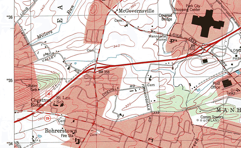
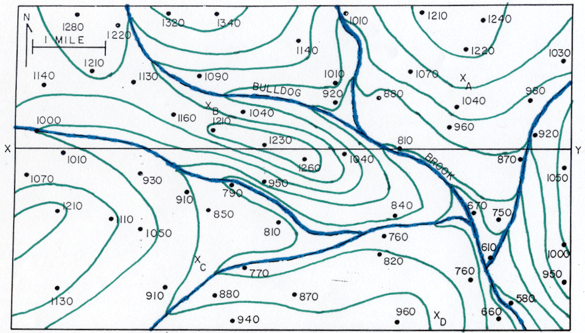
Consider this sample area of a USGS map as an example. When you understand the contour lines and how they are constructed, you can "read" this landscape. Where are the higher elevations? Where are the steeper slopes? Which hillsides face south vs. north? Where is erosion likely occuring, and where might flooding be expected? These are the types of questions that become much easier to assess when contours are used together with other map clues.
Contour Lines
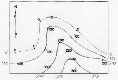
Contour lines are defined as lines connecting points of equal elevation. They are represented on USGS topographic maps as brown lines labeled every so often (also in brown) with the elevations they represent. The fact that contour lines are lines of equal elevation means that if you were walking on the Earth's surface tracing the path of a single contour line you would never go uphill or downhill. You could, in many landscapes, end up back at your starting point in your walk, circling a hilltop. Of course in many cases, such as the 0 feet elevation contour (representing mean sea level) you might have to walk for thousands of miles, following the perimeter of the North American and South American continents, before coming back to your starting point. At the other extreme, your contour walk might take you in a circle at, say 400 feet in elevation, near the top of a 408 foot tall hill. That is exactly what the map below is showing us on the hill just west of McGovernsville near the top center of this excerpt.
The procedure for taking a map of points of elevation and turning it into a contour map will be examined below. There we will also begin to consider how to "read" the landscape described by contour lines. To start, however, we will examine the main representations and terms used by the USGS in their map legend sheets.
Contour Line Elevations
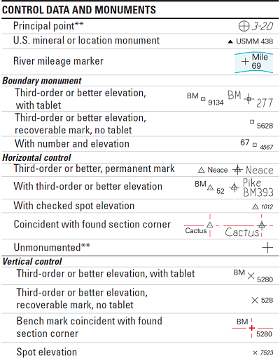
Elevations are labeled in two ways on USGS quadrangles. There are "spot elevations:" points at which the elevation was surveyed and at which the surveyed elevation is recorded on the map. Sometimes the location of the elevation is marked with one of the variety of symbols developed to show the degree of confidence by the USGS in those values. More common are spot elevations that occur at road intersections. These were easier locations for the USGS surveyors to set up equipment with good visibility from other survey points, as well as easier locations to match their measurements to aerial photographs and maps from other sources.
The second type of elevation label is the contour line label. Contours are drawn at regular elevation intervals, such as at 400 feet, 420 feet, 440 feet, etc. However, not every line is labeled. Once you have practiced reading the contour it becomes easier to know how to determine the elevation of any particular line.
Contour Interval
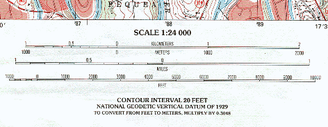
The constant difference in elevation between neighboring contour lines is called the contour interval. Again, it is the elevation difference (never say "distance") between neighboring contour lines, as long as those contours are not at the same elevation. One contour interval value is defined for every USGS map, though it is not the same for all maps. It is always a question (decided by USGS cartographers) of what works best for the particular map, considering the terrain, and whether most lines will be readable (not too crowded together) without being too sparse (on a relatively flat surface). On some maps you will see a contour interval of only 5 feet, while on others (in the Grand Canyon, for example) it could be 80 feet or greater. The contour interval, and the resulting contour elevation values, will always be rounded numbers: multiples of 10 or 5, but not multiples of 3 or 8.
The contour interval is stated on every USGS map immediately below the graphic scales.
Special Contour Lines
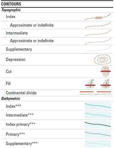
Every fifth contour line is an index contour. While most of the contour lines drawn are termed "intermediate contours" in the legend above, the index contours are "emphasized," or drawn with a thicker line so that they appear darker. The elevation value of an index contour is an even more rounded number, a multiple of 50 or 100, for example. On the vast majority of USGS quadrangles the index contour is every fifth contour, which again helps in knowing the elevations of unlabeled contours.
Also shown in the contour legend is the symbol for a "supplementary contour," a contour that breaks the pattern of the contour interval. They are used in very flat landscape areas to represent more subtle elevation changes. For example, a map with a contour interval of 5 feet might include a supplementary contour labeled 2 feet.
Finally, "depression contours" surround relatively small depressions in the Earth's surface. They are drawn with the hachure marks pointing in toward the bottom of the depression. Depression hachures are necessary because without them, the concentric contours might be interpreted as a hilltop.
Paper Contour Drawing
Introduction
This is the topic that has to be altered the most when this course is offered on-line. In the classroom version of this course, I can give you blank maps, show you the procedure, and then walk around the room while you try it. At the same time, though, contour maps (and the information they are built from) are so readily available that there is relatively little use for hand-drawn contouring. There is even software that allows the process to be accomplished by a computer, although it does not replicate the more subjective aspects of the process very well.
Carrying out the process by hand has the benefit of helping you to see that contour drawing is certainly grounded in math and an understanding of the physical environment. It faces limitations though because we do not know the elevation of every square foot of the Earth's surface (LIDAR technology, a newer type of aerial imaging system, is approaching that capability, though). That is where the subjectivity comes in.
The Steps
Step 1
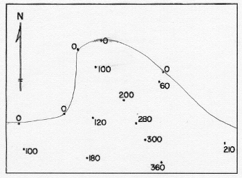
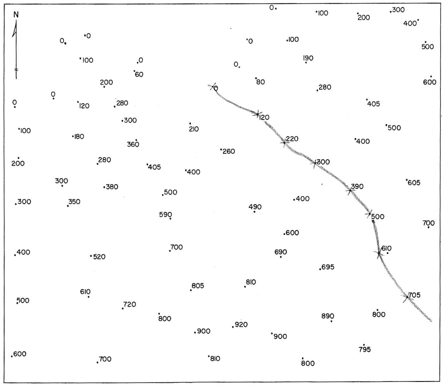
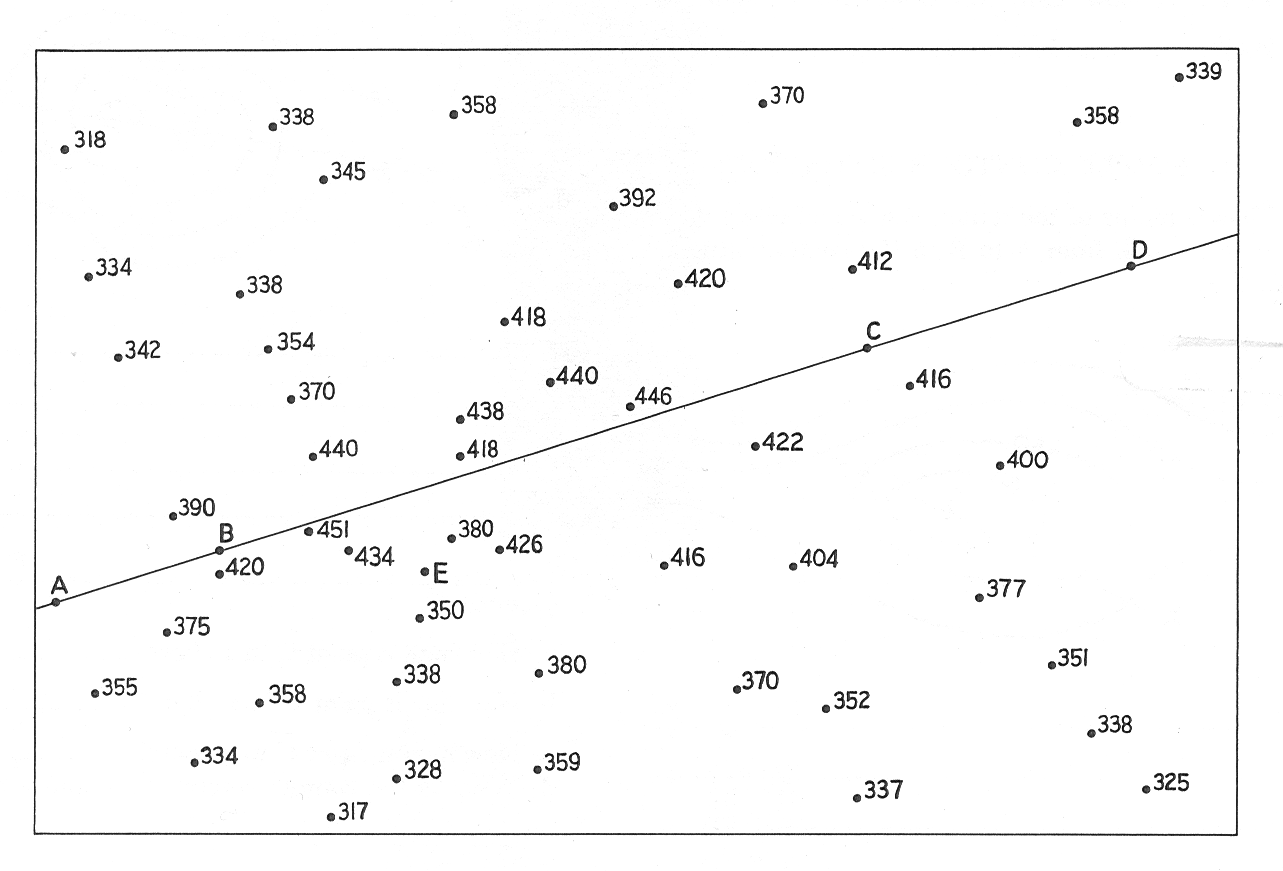
Start with a "blank" map of spot elevations. This is the map that the surveyors would produce for contour drawing. This example consists of many locations represented by dots, labeled with the elevation at each dot:
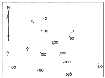
The cartographer first looks at the elevation range and decides what contour interval to use. Since we want the contour elevations to be round numbers, there will be certain choices that are more logical than others; there is no one right answer, though, because it may depend in part on the map's intended audience or intended use. This is the first of several subjective decisions. A good practice then is to list the contours to be drawn.
In this example, there is a set of dots representing sea level (0 feet elevation); that will be the first contour drawn. After that, to keep things simple, I will draw contours at 100 feet, 200 feet and 300 feet. The contour interval, therefore, is 100 feet.
Step 2
The next step in the procedure is to draw the coastline. You are not usually going to have a coastline, especially when drawing the contours for a small area. The same principle remains, though, that you have to select a lowest elevation value, so that adding the contour interval continues to yield nice round numbers.
The 0 feet elevation contour has obvious locations, except in the right-hand area of the map. The best rule is "keep it simple."
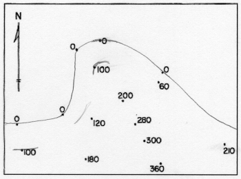
Step 3
The next step in the procedure is to approximate the first contour's path. Consider that contours, representing a line of equal elevation, separate lower elevations on one side from higher elevations on the other side (that may be tricky to see in very rugged or in very flat landscapes). There may also be some spot elevation that are exactly equal to the elevation of a particular contour being drawn. The line should go through such points, but should avoid all of the rest of the points.
Step 4
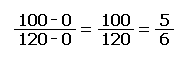
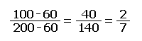
The approximate paths can then be adjusted to their best positions by a process called interpolation. Interpolation is the next subjective step, because it is based on the assumption that the Earth's surface is very predictable (which it is not). If you start with spot elevations of 350 feet and 450 feet, and are trying to draw the contour line for 400 feet, interpolation says that because 400 is exactly halfway between 350 and 450, the line should be positioned exactly halfway between those two points. By the same logic, because 400 is one third of the way between 380 and 440, the contour line representing an elevation of 400 feet should be positioned one third of the way between the dots for those spot elevations, and closer to the 380 than the 440.
A calculation (below) made in the example is to position the 100-feet contour line between the spot elevations at 0 feet and 120 feet. Here is the mathematical equation used to make this calculation. The answer is the proportion on the paper between the two points. The same format is followed for many pairs of spot elevations on opposite sides of the next stretch of contour line. Even though the process is tedious at first, eventually you get very good at estimating accurately.
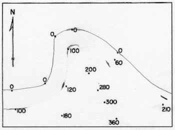
Step 5
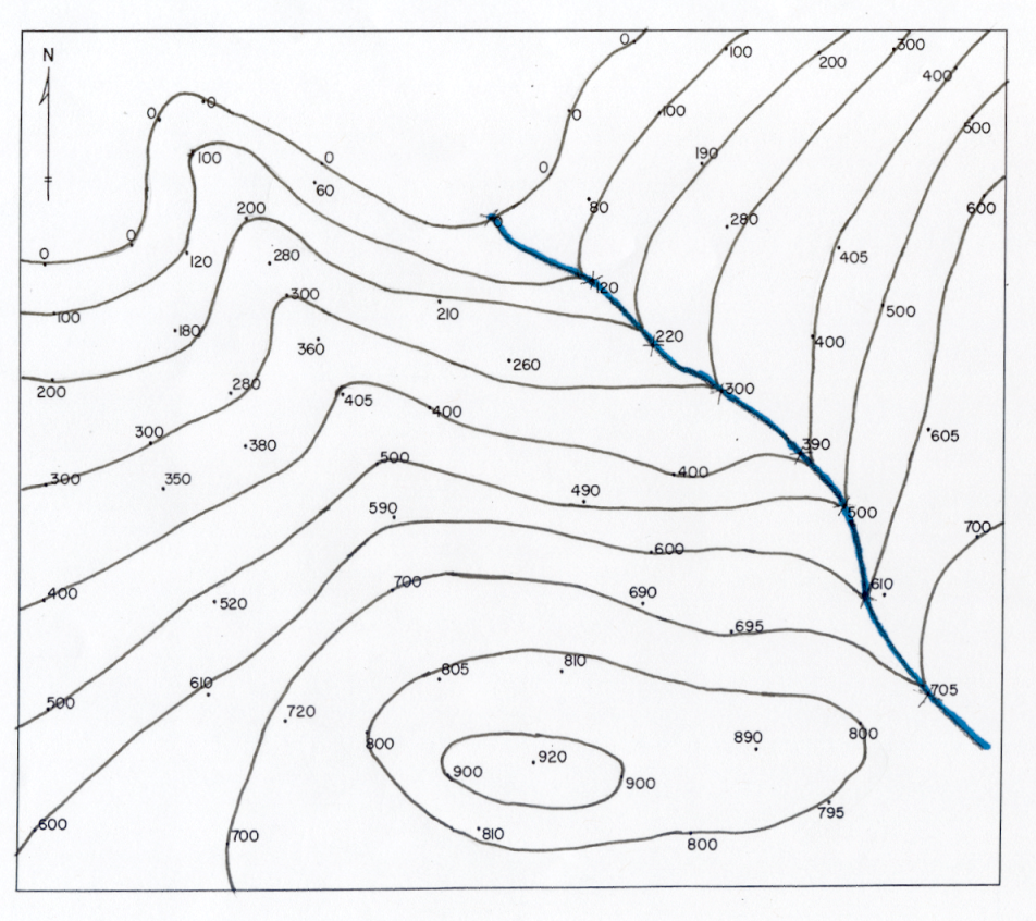
The final image linked below shows the map with all of the lines positioned using interpolation. Note that cartographers always use smoothly curving lines to connect the points representing each elevation. It is certainly more representative of nature to show them that way than to simply "connect the dots" with straight segments. It is, though, another of the subjective aspects of this process because they do not know exactly where each twist and turn really is.
This is the important thing to keep in mind from observing the process by which contours are drawn: Contours on USGS topographic quadrangles are not absolutely accurate; they are drawn subjectively or by following an algorithm from a set of scattered spot elevations.
There are two main ways that this subjectivity appears on USGS maps:
First, as the cartographer finds spot elevations equal to a contour's value and then calculates interpolated points to guide that contour, she connects those points with smoothly curving lines.
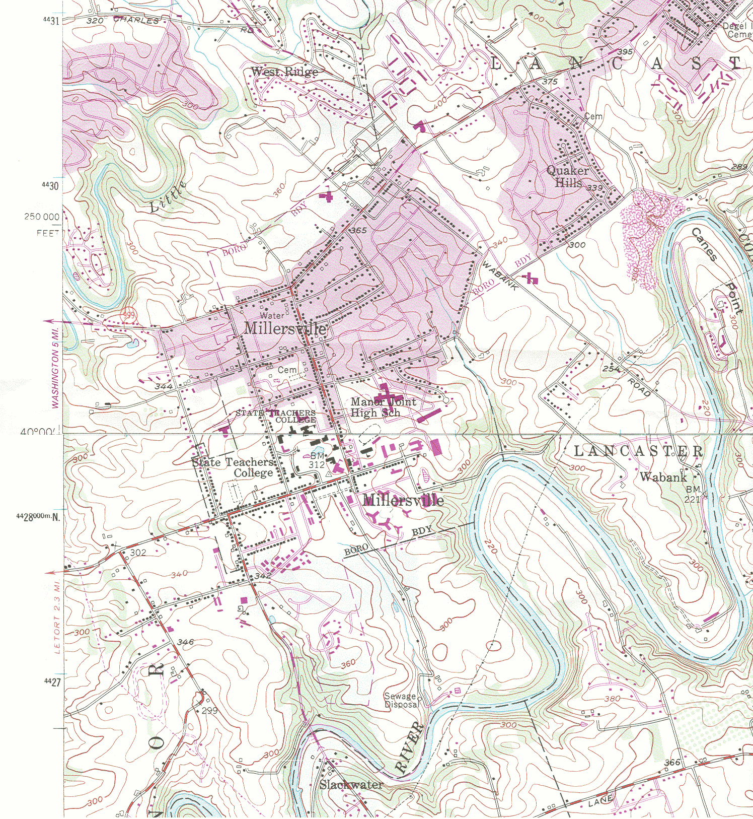
Second, when the contour lines get near the edge of the map sheet, where there are few if any spot elevations to help in calculating the line's exact path, the convention is to continue the line's current direction. Keep in mind that neighboring topographic quadrangles were likely drawn by different cartographers, so their subjective decisions are not likely to produce identical results. This is very clear if you try to line up two USGS quadrangles along a common edge, as in the Millersville example, linked below.
Rules Affecting Contour Lines
There are several rules that cartographers drawing contour lines must follow. They are rules in the sense that contours must be drawn this way in order to reflect the landscape accurately.
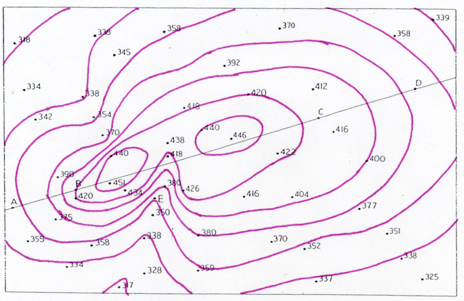
Examine this map fragment, which you have seen before, while you are thinking about the rules below. The rules marked with a * can be found on that fragment.
The Rules
- * A contour either runs to the map's edge or circles back to itself. The main implication is that a contour line cannot simply stop at any place inside the map.
- Contours never cross each other. In other words a north-south contour at 420 feet cannot cross an east-west contour at 440 feet. It is not physically possible for a surface to be arranged like that, unless you live in an M.C. Escher drawing (if you don't know Escher, look him up in your favorite search engine).
- Contours that touch form cliffs. If adjacent contours at different elevations come together, then you are seeing a line along which the elevations are stacked up one on top of another.
- * Similarly, contours that are very close together (nearly touching but not quite) form a very steep hill side.
- * Contours form a "V" when crossing a stream or river. Streams erode the land they pass through. The erosion process generally results in a V-shaped valley. A contour accurately represents those valley sides if it approaches the stream from each side like the two sides of a pointed V. Furthermore, if you consider that V to be the pointed head of an arrow, the arrow is pointing upstream.
The Blank Maps
It is not a requirement in this course that you produce hand-drawn contour maps, mainly because I have no way to easily collect them from you. However, as I have been saying, practicing the procedure is a great way to "get" the issues you have been reading about and to see the subjective element of any USGS topographic map.
Here are three links to blank contour maps, with points but no lines. Further below you will see similar links to the finished versions of these.
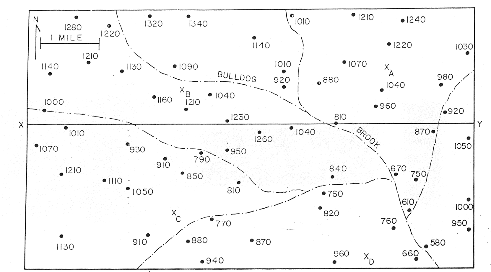
You will recognize the northwest corner of Map A as the map I used as a demonstration of contour-drawing procedure. Maps B and C have straight lines running through them which you are to ignore for now. You will see them used in the next Topic. The line on Map B has points labeled A, B, C and D on it. The one on Map C is labeled X and Y at its opposite ends.
The Finished Maps
Here are three links to the finished contour maps. Note that these are "finished" to the level that I would expect students in this course to work. They are not finished with spot elevations and labels on every contour within the map, as the USGS would no doubt insist if I worked for them.
Elevation Layers in ArcGIS
Elevation Layer Options
You have spent at least a little time examining the digital USGS quadrangles, noticing how they present elevation using both contour lines and spot elevations. We will examine what that can tell you about the land area being represented on the quadrangle later in this course. Right now, we are going to think about how those spot elevations and contour lines were put there on the USGS quadrangles and how you could add similar information to maps that you produce with ArcGIS.
Contours can be added to a map as a layer of line features. The layer can be symbolized with conventional color and line thickness characteristics, which can add a professional appearance to a topographic map. In fact, the PASDA website for downloadable Pennsylvania GIS data has just such a layer for Lancaster County, PA, provided by the Lancaster County government’s GIS team.
However, having such a layer available does not mean that every map made for any part of the county can have its elevations represented. The following questions must be asked:
- At what resolution, or level of detail, were the lines digitized and stored? Any GIS layer will have a range of scales it is suited for. If the map is zoomed in closer than that range, the lines will appear coarse and choppy, with lots of straight line segments strung together. If the map is zoomed out beyond that range, the extra detail becomes blurred. With our example above, the Lancaster County GIS Department has greatest interest in making maps of the entire county, and secondary interest in maps of local areas such as townships or Lancaster City. Maps of areas like the Millersville University campus may not be requested very often. So their data detail may not be suitable for university users making maps of the campus.
- What was the source of the data? Were they the direct result of field survey work, were they derived from aerial photographs, or were they traced off another source such as USGS quadrangles? Different sources can have different degrees of trustworthiness, or different access to the latest technologies. Obtaining documentation of the sources should be part of any project’s data collection phase.
- GIS layers always have potential date limitations. Any layer, including the contours, represents the point in time at which they were recorded. If there have been large construction projects involving major earth moving, such as highway reconstruction, new shopping developments or similar projects, especially on hilly areas of the local landscape, the land elevations may well have been altered, making that area of the map out of date.
Point Layers for Spot Elevations
You have seen that a map of contour lines actually starts out as a map of point locations with known elevations. Those locations are the result of either field surveying with horizontally pointed laser technology, or of some form of aerial or satellite-based technology using vertically aimed sensors. The accumulation of those points results in that point layer from which contours can be derived.
The USGS now uses the digital aerial sensors for collecting high-quality elevation readings for "bare earth" elevation readings. That means that they don’t want the sensors being fooled by the tops of trees and structures; they are supposed to be recording ground elevations. The sensors are active during the times of year when trees have dropped their leaves so the ground is visible. The also set their sensors to record the elevations at evenly spaced locations; the frequency or spacing varies based on the maps in which they will be used, but the points can be as close as 1 meter apart on the ground. The resulting point layers comprise a product generally called a "digital elevation model" (or DEM) of the landscape.
In the era of paper USGS quadrangles, one of the types of map information always visible was point locations of some of the point locations at which field surveyors had set up their survey equipment and calculated the elevations (legend below). Some of those points are even represented by small brass monuments embedded in pavement. Some of those points were included on the USGS quadrangles, given a variety of point symbols to represent their level of importance within that larger triangulation network. The USGS no longer includes spot elevations such as these on the digital generation of quadrangles. Neither do they include a DEM layer with their digital topographic quadrangles.
However, it is still possible to add such a layer to maps you produce. The DEM data is available from the federal GIS data download sites. The USGS monumented locations of benchmarks and other surveyor sites are still legally protected, so maps of their locations likely exist in most local planning and mapping agencies, possibly available from some GIS data sites. For example, the PASDA site referred to earlier in the course has a layer hosted by the Lancaster County, PA GIS Department titled “Lancaster County – Geodetic Monuments” (PASDA).
It is also worth noting that ArcGIS software has the ability to take a layer of spot elevations and create a layer of contour lines. The procedure for doing this will be described later in this course in the descriptions of various types of thematic maps. In that context the steps are more easily laid out, but it is leading only to displaying a representation of contour lines. It will not take us to a point of using contours and elevations to analyze a landscape. ArcGIS has such capabilities, though they are beyond the scope of this course. That certainly illustrates the importance of continuing with GIS coursework if your career will involve creating or using contour maps.