Classified Means Ordinal
Ordinal Context
As introduced in the previous unit on Thematic Maps, the three ordinal-level thematic maps explained below are shown in the organizational table in that unit with the word "Classified" as part of their names. The classified graduated symbols map, classified flow map and classified choropleth map are so named because they require that, if the map theme is based on quantitative data, then the classification procedure (also previously demonstrated) must be considered part of the map's construction. There are data situations where that is not the case, so we will start with those.
Original Ordinal Data
The most common scenario in which you will encounter data that come to you already in ordinal form, is if the source of the data or a previous holder of the data performed the classification procedure. In that scenario, you do not see the original data values; all you see are the class names. Even if the class names or some other documentation for the data shows you the upper and lower limits of each class, you do not know each observation's original quantitative data value. You are stuck with those classification results, and you do not even know whether they performed the procedure well. The best you can do is to make the clearest map possible using the data you have.
The second scenario is that the data came to you in ordinal categories because that was how it was collected in the first place. Consider a survey in which you are not asked to enter a number value in response to a question, but to identify which ordinal category you identify with. For non-spatial example, “Do you make a) $0 to $19,999 per year, b) $20,000 to $49,999 per year, c) $50,000 to $149,999, or d) $150,000 or more?” In that scenario no one ever had quantitative data. Another example that might be part of a spatial data set of the storm tracks of hurricanes (or equivalent cyclones or typhoons) would be an attribute table field recording the maximum storm categories. The possible values are "Tropical Depression," "Tropical Storm," "1," "2," "3," "4" and "5." The values are primarily based on wind speed and duration.
Ordinal Data from Quantitative Data
Most classified thematic maps are maps based on a quantitative data variable that has been run through the classification procedure. Classification, in this context, means that the original quantitative level of measurement variable has been replaced by a new ordinal level variable for mapping purposes.
I should note that ArcGIS does have a built-in ability to graph the data values and does give you a default "natural breaks" classification, but neither meets the guidelines I have set. The Jenks natural breaks classification algorithm used in ArcGIS struggles with irregularly spaced outliers in the data variable, frequently creating classes toward the middle of the distribution that have too many observations. This would be easier to see and work around if it displayed the observations as I have required, with a number line graph where the data values are plotted as dots. Theirs is sort of a histogram with very small evenly spaced classes. The narrow vertical bars of varying heights is a poor way to represent the data values compared to Excel's XY scatter graph.
In ArcGIS we have two ways to create classified thematic maps. The first is to interact with the data variable outside of ArcGIS, say in Excel, where we run it through the graphing and natural breaks classification process. The final step within Excel would be to add a new data variable (column) that contains just the class values such as "Class 1," "Class 2," etc. You would have to keep a record of your classification decisions so that you can customize the legend with data value ranges instead of the class names.
The second, easier procedure is to work out the classification in Excel, as previously taught, to decide on the class limits. Then, use ArcGIS's built-in abilities to take the quantitative variable and create the appropriate thematic map: choropleth, which ArcGIS calls "graduated colors," or graduated symbols. In both cases ArcMap's dialog includes a listing of the default number of classes and the class limits of each class. Those parameters are not likely to match your own research, so be sure to replace the class limits determined by ArcGIS with yours. It may be tempting to trust ArcGIS to get it right, but we have to keep in mind that ArcGIS's algorithms are based on very general assumptions covering a wide variety of scenarios, while yours are based on close familiarity with your dataset.
The Finished Maps
A future session will take you through the process of taking your ArcMap "Data View" map into the "Layout View" dialog and adding the map legend and other elements to the map.
It is worth noting here, however, that classified maps have a unique distinguishing feature. The legends of classified thematic maps will show all the different symbols used on each map, whether they are colors, shapes or lines. Next to each symbol in the legend for such a map will be the data range represented by that symbol color or size. The key thing to notice is that they are indeed ranges of number values, such as "1 - 500" and not single values such as "500."
Choropleth Maps
Choropleth Maps
In a choropleth map areas are colored according to their data value. Usually the data are data are divided into classes with one color representing all the geographic features in each data class. The color scheme is selected so that the lightest color (or shade of gray, or pattern of lines or dots) represents the lowest data values and the darkest or brightest color represents the highest data value. Between those extremes the cartographer makes the colors, shades or patterns increase in intensity gradually. The trickiest requirement of a choropleth map, one that is often violated in published maps, is that the data should represent a ratio or density, not a simple count. For example, to show US population distribution, do not map the variable that contains each state's population, but map the variable in which you have calculated each state's population density.
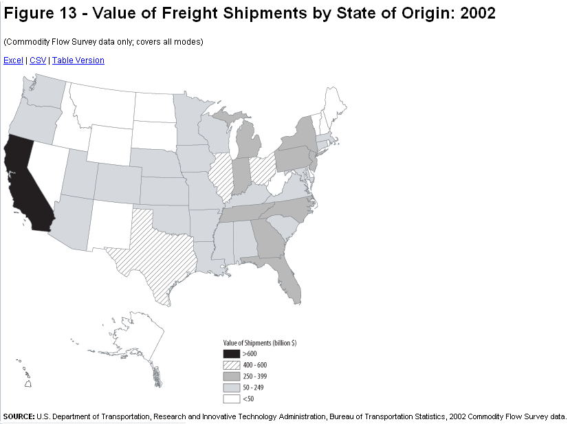
The two maps below are, respectively, bad and good examples of choropleth maps of the same data. The first map is bad because of a poor choice in its color scheme, and also because of strange alignments of Alaska and Hawaii (US Dept. of Transportation). I strongly suspect that its cartographer has chosen its data ranges for each color poorly, as well. When data classes on a map have strictly equal data ranges, I am immediately suspicious that the cartographer who created the map did not start by graphing the data and looking for natural breaks in the data to serve as color change values. At least this one does not make that error.
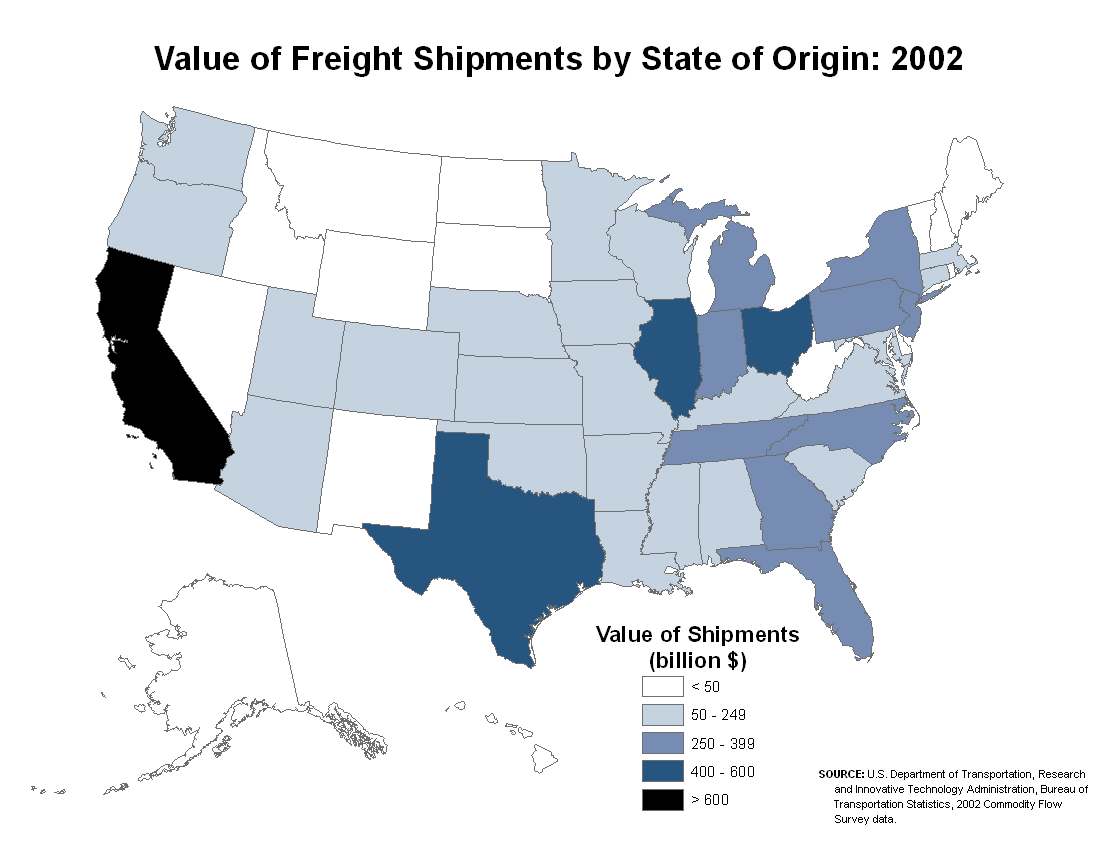
My re-creation of the map corrects the color flaws and the depiction of Alaska and Hawaii. However, I did not have their original data in order to look for the best data ranges. This is an example of the scenario laid out above of receiving ordinal data already classified.
Classification
The first step in creating any choropleth map is to examine and analyze the data variable to be mapped. The purpose is to decide on the best number of classes and the best class breaks. As explained previously, the best graphical way to do this is to graph the data using a number line graph, either manually (e.g., on graph paper) or in Excel.
Graphing in Excel is practical because one of the shapefile's component files can be opened in Excel. However, in order to maintain the larger shapefile's integrity, this is only practical if you work with a copy of the file in question. In your file browser program, locate the group of files that make up the shapefile you want to work with. Make a copy of the file whose filename extension is DBF (that is, *.dbf, where "*" is the name of the larger shapefile collection). Save it with a new name but do not change the ".dbf" filename extension.
The only way now to open the DBF file in Excel is to open Excel first, and then drag the new DBF file into Excel. Next, use Excel's Save As command to make a new XLSX copy of the file.
Finally, once you have chosen a variable, follow the instructions in the previous topic to create the number line graph. Then, use Excel's tools for drawing lines and other shapes to add vertical lines to the graph to show the positions of the class breaks. Write down those class break positions by finding a rounded number that falls within each gap where you placed a break line.
Choropleth Color Choices
The choropleth map is the thematic map type that is most commonly encountered, and with good reason. Color is a very effective way to display differences, as we also saw for topographic symbolization. Where appropriate, as also shown in the topographic symbology discussion, it is effective to use color schemes that incorporate color associations. For example, a choropleth map displaying money-related data can be shown in shades of green because that is a standard color in American currency. Green also works for agricultural productivity maps for crops, while shades of red might be more appropriate for agricultural meat production data.
Choropleth map color schemes are based on the concept of the "color ramp." The color ramp takes a range of colors from a light shade at one end to a dark or bright shade at the other end. The lightest shade should be associated with the lowest data values while the darkest or brightest shade should represent the highest data values. The specific colors chosen will depend on the number of classes in your classification. This is where the rule of 4-6 classes for choropleth maps becomes important: with too many classes, the colors in adjacent classes become too difficult to distinguish. In the point of the map design process in ArcMap where you choose your color ramp (step 7 below) you will have many options to choose from.
There are exceptions and special considerations for these "color rules." You will notice, when you activate the Color Ramp drop-down list in ArcMap, that many of the choices are not 'light to dark for a single color.' Keep in mind that ArcMap uses the same dialog/list to provide color schemes for topographic mapping, so many of the options are not color "ramps" at all, but randomly sequenced colors; avoid those if you are constructing a choropleth map. Other patterns frequently found on the Color Ramp display are ramps that blend from one color into another, such as shades of yellow to shades of red. These really are inappropriate for basic choropleth maps because they imply that the data are not only changing value but they are also changing in meaning. A simple example would be a color ramp that blends from reds for lower values to greens for higher values; the context for this might be financial data that ranges from negative values representing money owed to positive values representing money earned or profits. Again, be very selective and cautious when using such color ramps.
Try it:
Use those class breaks again, as follows, to create the choropleth map. Note again that ArcGIS calls this a Graduated Colors map.
- Select the GIS layer representing the area data theme that will be the basis of the thematic map; this data theme includes the data variable to be represented using the choropleth map symbols.
- Right-click on that layer and select "Properties" at the bottom of the menu list that appears.
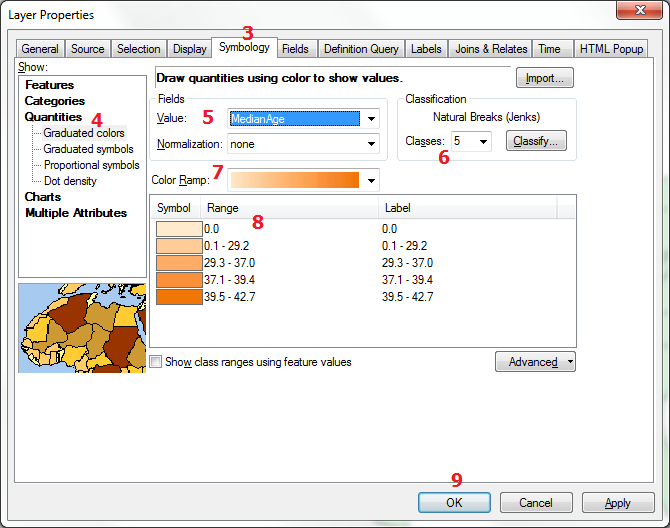
- In the "Layer Properties" window that opens, click on the "Symbology" tab.
- In the left side of that dialog select "Quantities," and then "Graduated Colors." The right side changes to reflect your new options.
- First, under "Fields" and to the right of the word "Value" select the variable your map will be based on.
- Next, further to the right find the box in which you can type or select the number of Classes to appear in your map.
- Next, select a color scheme from the "Color Ramp" list. Be sure to select a "light to dark" color scheme. The lower part of the window changes to show the colors and their default corresponding values.
- Edit the numbers in the "Range" column in that part of the window. You are just editing the digits at the end of each line. Avoid editing the last line except to round it up a little. When you have edited the end number on any one line, the beginning number on the next line should automatically adjust. If needed, edit the numbers in the "Label" column to add commas, dollar signs, etc. for display.
- When you are finished editing the Values, click on the OK button to see your choropleth map. Your color and classification choices appear in the Table of Contents.
Graduated Symbols Maps
Classification and Symbology for Graduated Symbols
The Symbology
Graduated symbols are usually circles, but can be many other shapes. The basic concept is that the symbols increase in size as the data increase in value. Ideally the symbols are representative of the features or the data variable being represented on the map, but that is not always easy to achieve. The circle is considered the most generic symbol and has the added benefit of being the most compact symbol. If two circles are located close to each other or overlap each other on the map, it is easier to tell them apart, based on their shapes, than if they were squares or other shapes.
Graduated circles are unique in that they can represent either point features such as cities or area features such as the states. ArcMap will make the graduated symbols dialog avaiable for either of those types of layer. The advantage of circles for point locations is that they imitate the smaller dots that would be a common topographic symbol for them, with the center of the circles representing the actual place location. With area features it is more desirable that each circle be clearly identifiable with its area feature, even staying inside the area it represents. However, the latter is often not possible. The way the ArcMap software positions the graduated symbol for area features is to calculate the point, known as the centroid, at the center of the shape of the area.
One challenge of graduated symbols is that differences in size are more difficult to perceive than differences in color. Because we are asking map viewers to notice differences in size and compare the size differences between two symbols near or far from each other on the map (including the legend), we should not create as many different classes as we would for a choropleth map (see below).
Other shapes are possible and easily found in the Symbology dialog in ArcMap; hexagons, squares and triangles are other easily resizable symbols. ArcMap has also been increasing the availability of pictorial symbols, all of which are also able to be resized. The challenge with these other shapes is that size differences in them can be more difficult to distinguish, so they have to be exaggerated a bit more than simpler symbols.
Data Requirements
Probably the most subtle, but important, aspect of deciding when to use the graduated symbols representation is making sure you have the correct data, especially when you are working with the quantitative data field in ArcMap and not with previously classified data. The data for determining symbol sizes on graduated symbols maps should be a count data variable, and not a density or ratio or similar variable.
Occasionally you will find a graduated symbols map in which the symbol sizes are directly proportional to the data values: for a map of the 50 states there can be up to 50 minutely different circle sizes, each one proportional to the number it represents. These maps are called Proportional Symbols maps and will be treated in a coming session where we deal with thematic maps for quantitative-level data.
Classification for Graduated Symbols
The discussion about classification in this context is largely the same as it was for choropleth maps, and even more similar to the discussion below about flow maps. As with the choropleth map, the data are most often divided into classes, with one symbol size representing all of the features in that class. The concept of creating classes that reflect natural clusters and gaps in the data field is just as relevant in the classification of symbol sizes.
In fact, deciding on the classes for a graduated symbols map can be more challenging, given that map readers have a harder time distinguishing size differences than they do distinguishing color differences. That is the reason why fewer classes, three to five, are recommended for classified graduated symbols maps, where four to six classes were considered optimal for a choropleth map. With fewer classes, the question of how to treat outliers becomes more critical. The objective should still be to not let the number of features in one class dominate the other classes.
Try It:
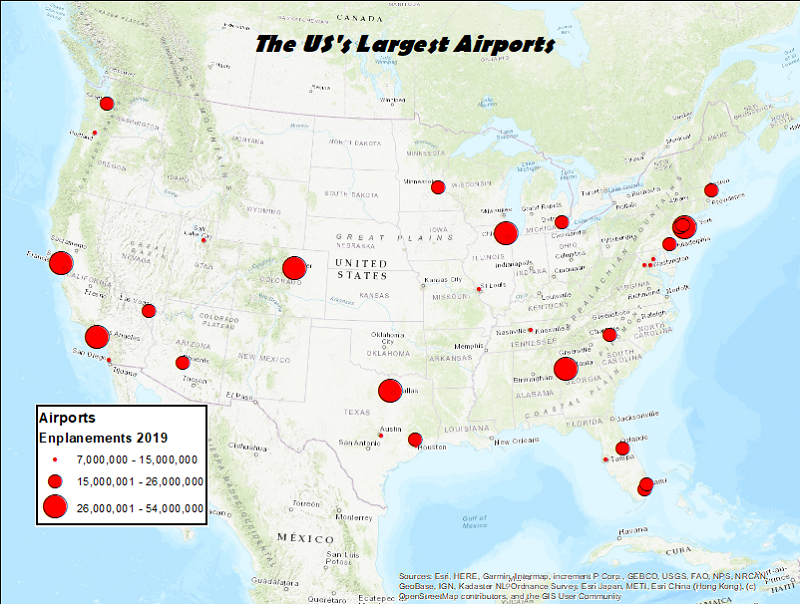
The theme for this example will be airports. These are point locations at the scale of a US map. The plan is to represent them as graduated circles with the circle sizes representing the number of passengers. The official term for passengers in the airline inducstry is "emplanements."
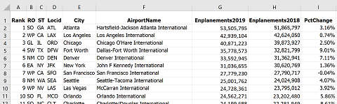
- The first step is to retrieve the data. My usual strategy is to run a browser search on "shapefile" plus the data layer I am looking for. I usually have very good luck with this strategy. Unfortunately, this search was not so straightforward and left me at some dead ends. I finally reached an FAA (Federal Aviation Administration) website (a subsite of their main page) that had a layer of every airport in the country and another part of their site had a spreadsheet file of the emplanement data (below).
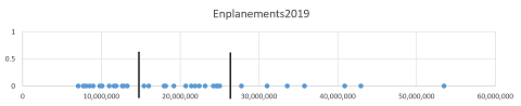
- The first step is to prepare the data. A map of all the airports in their lists would have been unusable because there are thousands of them. Fortunately, the data table was arranged in order of size, so it was easy to choose the largest airports. I copied that subset of three dozen airports to a new worksheet and took it through the classification process. Because all the airports on this shortened list were large, I knew there was not as much variation as if it was a more random sample. For that reason, I went with three classes.
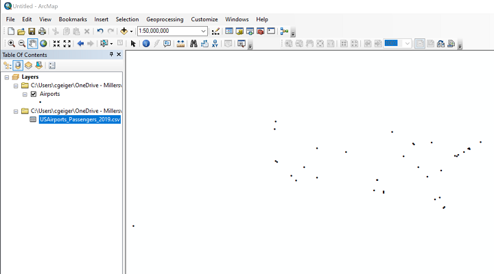
- Here is the map of that set of locations. Obviously, the map does not include all the airports on the FAA list. There are several ways to eliminate features from a shapefile, either temporarily for one map or permanently for that dataset (you can always make a copy of the original for other uses). Those processes are beyond the scope of this course, but what we have below is the ArcMap window showing the 36 airport locations.This map includes Honolulu, Hawaii, which I later decided to remove from the map just for readability. Again, there are procedures for adjusting the map or adding an inset map of Hawaii, but that adds a lot of complication here.
- The other element visible in the ArcMap Table of Contents above is the data table. That means another step needed here is to Join the data table to the airport layer's attribute table. Once that task is done, the emplanement data are available for symbolizing the map.
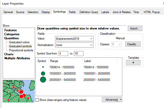
- The next step is to set up the symbology. In the symbology dialog box shown below I first identified the Graduated symbols map type, selected the Emplanements value field, modified the number of classes to 3, and then retyped the upper values in each data range.
- After the above shot was taken, I added commas to the Label side of the range list to make the map legend more readable. The final task was to change the appearance of the graduated circles. It is possible to control the appearance and sizes individually by clicking on each symbol. The other option is to click on the Template button to the right of the symbols list. The dialog that opens would not include the size adjustment but does let you control the color and edge lines of the circles. Finally, again after the image above was taken, I kept the smallest symbol size at 4 but increased the largest from 18 up to 36.
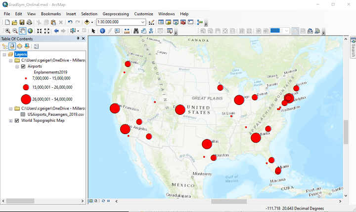
- The next map shows all those decisions in place. In creating this map I took the additional step of adding a topographic basemap, a much easier way to add the spatial context needed than trying to assemble all those layers and symbologies.
- Finally, before setting up the Layout view of the map (below), I had to set up the page to display the map in "landscape" orientation. Use the File menu's Page and Print Setup dialog to accomplish that. The last step was to switch to Layout view, adjust the edges of the map to fit the page, and add the legend.
Flow Maps
Flow Maps Depict Line Features
Flow maps represent quantities of things that flow, or travel, either from an origin to a destination or along particular paths. An example of the former is a map of petroleum trade between countries, with each pair of trading partners represented by a line whose thickness corresponds to the amount of petroleum; the line just links the two trading countries, and does not follow the actual shipping route. An example of the latter type of flow map is a traffic flow map, with each stretch of road varying in thickness according to the average number of vehicles per day that travel on it. On this type of flow map the road is in its proper place on the map.
Strictly speaking, then, the data variable that a flow map is based on, like that of the graduated symbols map above, must be a "count" type of variable. Furthermore, because of the nature of the representation, the data variable should represent something that can be counted (not measured or calculated), at least conceptually. So, we can map the number of trucks per day along each stretch of highway in Pennsylvania but not the percentage of traffic that are trucks. It is a subtle distinction, but important for proper use of flow maps.
As with its cousin, the graduated symbols map, we are focused here on maps displaying ordinal-level data, meaning the data must be classified before mapping, with the map showing only a few different line thicknesses. This is in contrast to the proportional version of the flow map, in which each line's thickness is based directly on its data value.
Classification and Symbology for Flow Maps
The comments above about classification for classified graduated symbols maps are virtually identical when talking about classified flow maps. The ideal range to aim for is three to five classes. More than that and line thicknesses are just too subtle to differentiate easily, especially if there are other lines present in the map's background layers, such as boundaries, transportation routes or even the graticule.
Flow map symbology choices are much more limited than for other thematic maps. They are basically just lines of different thicknesses. There are some style variations that can be added, such as edge lines and colors. If you choose to enhance the line thicknesses by adding colors, then make sure they are in an appropriate corresponding “graduated colors” sequence.
Try It:
Here are the steps to create an ordinal-level flow map in ArcMap:
- In the first image below, I have downloaded the layers needed for the map. All the layers needed for this example are available on the PASDA website (see the end of Unit 4), particularly the "PaTraffic…" layer (the year portion of the filename will change each time they issue a new layer). To retrieve it from PASDA, I searched "by Data Provider" on the PASDA homepage and selected "Pennsylvania Department of Transportation" as the provider. "Pennsylvania traffic counts" is the title for the shapefile/layer. So, the layer consists of the right type of geographic feature and has the right type of data for the flow map.
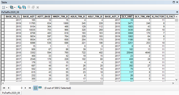
- The "Pennsylvania traffic counts" attribute table contains the spatial data for the state-owned roads of Pennsylvania and the most recent traffic data for each road. The traffic data occupy a half dozen data fields, including values calculated for daily, weekly and annual traffic volumes and differentiation between total vehicles and trucks.
- The field that I will base the flow map on is "DLY_VMT" which stands for Daily Vehicle Miles Traveled. To determine that, examine the "Metadata" for the layer within the PASDA site. Keep in mind that every road is a combination of many road segments (from one intersection with a crossroad to the next intersection). Not every road segment will have frequent traffic counts, and some may have low counts (or high counts, for that matter) just because of the timing of the count.
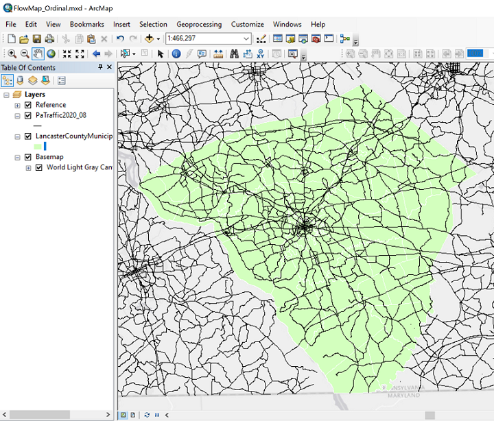
- Because of the thematic map type and the amount of detail that would be easiest to see on a map with the number of features that the Pennsylvania Department of Transportation (PennDoT) is responsible for, I will choose to look at just one county: Lancaster County, of course. The challenge with this layer is that PennDoT is responsible for many thousands of miles of roads throughout the state. There are ways to trim the data down to our county of interest in ArcGIS, but we will not worry about that here. To make that decision more visually clear I also downloaded a Lancaster County municipalities layer and symbolized it to function as a highlighting background (light green municipalities with white boundaries), and laid the entire map against a light gray ArcGIS basemap.
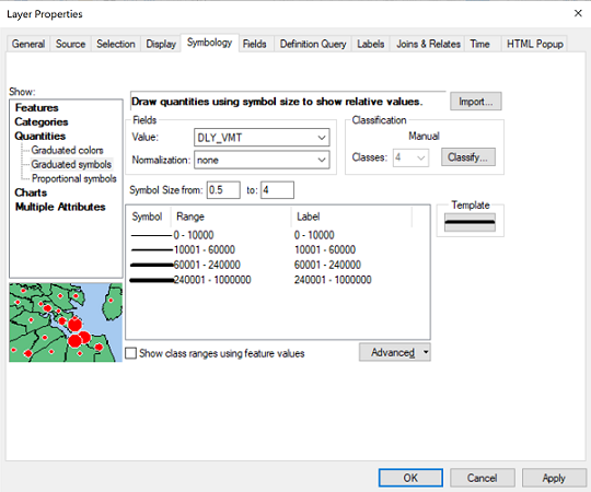
- In the Symbology dialog, the first decision is identifying the thematic map type. ArcMap does not have a type specifically called "flow map" but the comparable categorization is that it is a type of graduated symbol for line features, so ArcMap places it in the "Quantities" symbol category. After selecting the "Graduated symbols" thematic map, the first thing to specify is the data field, or "Value" field that the symbology will be based on. The second thing to specify is the number of classes. Based on the classifications of roads that PennDoT has to monitor, from smaller two-lane roads in rural areas to major highways in more urbanized areas, as well as the limitations of the flow map, I am choosing four classes. The next part of the process is to adjust the class limits to create a more useful set of numbers. It is not easy to run the classification procedure for tens of thousands of map features, so my decision in this case was to use the numbers calculated by ArcMap but round them to less-confusing numbers of significant digits.
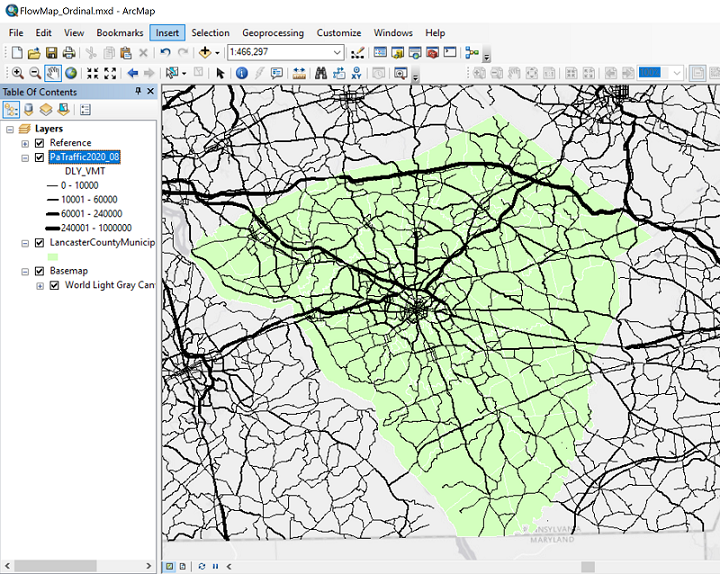
- Here is the finished map (not the Layout view this time) showing the four classes that are reasonably easy to distinguish: