General Principles
Main Points about Thematic Maps
Recognizing the difference between topographic mapping and thematic mapping is critical. Topographic maps (like the USGS quadrangles we have used in this course) can be complex and detailed, but thematic maps should be simple and clear. The complexity of a topographic map invites the map user to spend time studying it and looking for details. Since many different kinds of information are crammed in together, the cartographer has to pay attention to things like whether some features are covered by other features, and whether labels can be read easily. Thematic maps, on the other hand, are like magazine ads: if they don't communicate their "message" (the spatial pattern of the data) within a few seconds, the reader will probably not buy into it. Simpler is better. And if anything is visually wrong or distracting, that error will be noticed more than the data pattern.
Because thematic maps have to communicate their message quickly, having too many details creates problems. That is why the principle of mapping only one or at most a few variables is usually followed. Text is also used sparingly so that the symbols do most of the communicating.
Detailed location information is not necessary, but easy clues to the identity of the map area are. The cartographer has to consider whether the map's intended audience will recognize the map area. Latitude and longitude, map scales and north arrows are not usually desirable because they add complexity to thematic maps and detract from the immediate message. If the area will not be easily recognized by its intended audience, other ArcMap solutions are available and will be descibed just below.
Choice of Thematic Map Type
Over the last few units we have reviewed all the types of thematic maps. When choosing among them, it is important to always return to the chart showing the types of geographic features and the data levels of measurement, so I reproduce that here. Those are the two aspects of your thematic mapping project that you should always specify first. The need for a map may stem from having a data set to display, or it may stem from a research goal best expressed in map form. If the map is data driven, you identify the map features by looking at the data table rows and you identify the data level of measurement by looking at the column heading and the types of data values showing up as you look down the column. If the map is research driven, it takes a bit more analysis and creativity. What is the best level of geographic detail to represent the scope of your research? That will define your map features, which will in turn define what GIS layer is needed. Once that is determined you will need to identify an attribute table field that fits that layer and provides an appropriate level of measurement. Finally, you must identify a data source that would be provide the appropriate content for that data field or go out and collect the data yourself.
| Geographic Feature Types | |||
|---|---|---|---|
| Levels of Measurement |
Points | Lines | Areas |
| Nominal, or Qualitative |
Descriptive Point Symbols | Descriptive Line Symbols | Descriptive Area Patterns |
| Ordinal, or Ranked |
Classified Graduated Symbols Map | Classified Flow Map | Classified Choropleth Map Classified Graduated Symbols Map |
| Interval/Ratio, or Quantitative |
Discrete Phenomena Proportional Graduated Symbols Map Heat Map Continuous Phenomena Isolines Map |
Proportional Flow Map | Absolute Counts Dot Map Cartogram Proportional Graduated Symbols Ratios or Densities Classless Choropleth Map Isolines Map |
So, choosing the most appropriate type of thematic map type is the most important decision in the mapping process, and that choice requires maximum familiarity with your data.
Map Elements
The elements of a map are the parts that make up the whole. They must work together to communicate the "message" you are trying to convey with the map. They complement each other and should all help to focus the reader's attention on the most important content within the map. It is important to note here that it is not necessary to include all the elements below; include them only if they contribute to that main message. Here is a list of the most common elements; most of them are described further down this page.
- The map.
- The map title and subtitle (if needed).
- The legend.
- A North Arrow.
- A map scale.
- Any additional explanatory text.
- Source information.
- Your, or your organization's, identity or logo.
The general principle underlying all positioning and sizing decisions for your thematic map is that the size and position of the map element should reflect its general importance relative to your map's purpose. The map itself should be the most important thing, so make it as large as possible (allowing for the other map elements that will be needed). The title communicates the purpose in words, so that should also be relatively large and high up on the page, usually above the map but that depends on the shape of your map area. Other elements can fit lower on the page wherever there is room to keep them appropriately sized.
Working with the Map Elements in ArcMap
Remember the distinction made earlier in the semester between map compilation and map composition. The previous chapters presenting the types of thematic maps were focused on the map compilation stage of the process. All your work in ArcMap there was in the Data View. The cartographer's perspective shown in this unit will require switching to the Layout View. Remember also that the availability of some commands on the various ArcMap menus changes in Layout view. There will be some exceptions, but the most important map composition decisions will require the use of the Insert menu, in particular the Legend and Title and possibly North Arrow and scale-related commands on that menu.
Planning your layout ahead of time, even sketching it with pencil and paper, helps but many decisions cannot be made until you are viewing it live in ArcMap. Using the example of the need for geographical context above, here are some options that are worth experimenting with:
- For example, if a map of Lancaster County is needed for a publication with a Pennsylvania-wide audience, then an inset or marginal map with Lancaster County highlighted within Pennsylvania will help. Inset maps are possible to create in ArcMap, but require more advanced knowledge of the software than we are covering in this course. If you want to look it up and figure it out yourself, it involves creating a second "data frame" (your existing data frame is identified in your Table of Contents as "Layers") and then adding both data frames to your map Layout.
- Far easier to execute in ArcMap would be to add a basemap. These were described in the early part of the course in the context of topographic mapping. The important distinction here is that the basemap must be a real "background" for the map, allowing the map to stand out. The topographic basemaps built into ArcMap will not work for this purpose. There are two alternatives; one is the "Light Gray Canvas" and the other is the "Dark Gray Canvas." The vast majority of the time you should find the light gray version to be preferable. The dark gray version adds a great deal of drama to the map; however, the risk is that it could easily distract from your map's main theme. One problem with both these alternatives is that they actually add two layers to your map. The main layer, drawn as you would expect behind all your thematic layers, depicts the continents and oceans in shades of gray with very lightly represented boundaries. The second layer, which you might find distracting, is added at the top of your Table of Contents and is titled "Reference." This adds many names; depending on your map scale they might be the names of countries and major cities or they might be medium and smaller towns. Again, depending on your map purpose and audience, this could be beneficial or it could be distracting. You have the option of either turning it off (unchecking its box) or removing it altogether.
Map Design Elements
Symbolization
As we have seen in the last few units, the determination of the appropriate type of thematic map is the most important cartographic decision when you have statistical data to present, and determines generally what types of symbols will be used. Each thematic map type does have some flexibility in its design. It may be the color choices in a choropleth map, the smallest and largest circle sizes in a graduated symbols map, the dot size and value in a dot density map, or the isoline interval for an isolines map. The motivation for each decision should be to keep the intended information as clear and obvious as possible.
The Legend
Thematic maps generally require a legend to convey the meanings of the symbols (the type that is least likely to require one is the isoline map). One of the sure signs of an amateur cartographer is when the heading of the legend is "Legend" (map readers will know what it is and what it is for). Again, design simplicity and clarity are important.
The legend is the best place to communicate the more detailed characteristics of the map data. The most important of those characteristics, after the data values themselves, is the units of measure. Since the map title or caption should identify the variable displayed on the map, it is not necessary to repeat that in the legend, but any clarification or explanation would be well suited to being either in or adjacent to the legend.

Legend Position and Shape
The legend is less important than the title but more important than elements like the scale and north arrow. Therefore, its position should be higher on the page than those other map elements, but it should also be positioned closer to the map if possible. The reason for the latter idea is that, if the map reader has to judge colors or circle sizes (as in the map above), the comparison will be easier if its counterpart in the legend is as close as possible. That was a significant enough concern on the map above that I made the map portion of the page narrower to accommodate the legend to the right of the map. There it is closer to the majority of the sizable graduated circles.
Computer programs often limit you to having only as much flexibility as the programmers can allow, and ArcGIS is no exception. In ArcMap the shape of your legend will always be a rectangle. You do have the option (see below) of adding a rectangle around the legend or leaving it with none, as in the map above. In that proportional graduated symbols map not having a legend allowed the East Stroudsburg label to intrude into that space a little even though the legend still appears cohesive and complete.The other program limitation imposed by the software in the above example was that it would not produce a circle size in the legend appropriate for evaluating Lancaster County's circle on the map.
The legend is the most complicated map element to design in ArcMap, so it will be treated separately below.
Text
The map title, and perhaps a subtitle, of a thematic map are important. If they are brief and clear (this is not usually a place for clever creativity), they enhance the informational message. If the map area depicted is clear and obvious for the intended audience there is no need to restate the name of the area in the title. What will be less clear is the specific variable shown on the map and possibly its units of measure. The variable name is perfect for the title content and the units of measure work well for the subtitle. Another important detail is usually going to be the date representing when the data were collected. Its relative importance determines whether it needs to go in the title or subtitle, or even somewhere lower on the map page.
Creating a title for your Layout can be done in one of two ways, both from the Layout view's Insert menu. The obvious option is to choose the Title command from that menu. That choice comes with some challenges, though. The Title command opens a dialog that prompts you for your map's title. That title is more like a project title. It will be used in the map's title but if you want to change it you have to go to the File menu and the "Map Document Properties..." dialog. The "Text" command on the Insert menu is a bit more straightforward. However, it is not always easy to see what you are adding. Once you select that Text command a very small label appears on your map consisting of just the word "text." Not only is the word short, but the default font is very small and the default color is black. If it happens to be created in a dark area of your map it can be hard to find.
Double-clicking on either the title or any added text after it is inserted opens the Text Properties dialog. It shows a few characteristics of the item but does not let you change the font or size right away. You have to click on the "Change Symbol" button there and go to a second dialog box with the more common Word-style interface.
Thematic maps used in textbooks, magazines and journal articles do not require a title if there is a caption. The caption includes the title and a brief interpretation of the map, so it encompasses the subtitle, too. The caption in that scenario allows the cartographer to keep text within the map to a minimum.
Other text might be needed on the map, but its size and position on the map page should reflect its importance to the map's purpose. The title should be the largest text positioned highest on the page, and the subtitle should be a little smaller and a little lower. Other information, filling in relevant context information, should be smaller and lower in proportion to those elements.
Because the thematic map is showing some form of calculated or researched data, like any research publication it is important to document the source or sources of the data right on the map. This is generally done in small print near the lower margins of the map or in the caption if one is attached to the map. The one exception the fact that the map represents its data as of a certain date (generally just the year) which might be part of the title or subtitle or perhaps in the legend (see below). If there is a caption, the date could be repeated there.
Scale and North Arrow
Both these elements were considered to be very important on topographic maps, but that value is not so vital on thematic maps. The question again is how central to the map's purpose and audience these map elements might be. If the map is intended for elementary school students who are still learning North, East, South and West, and you are trying to show a pattern that favors one of those directions, then a North Arrow, or even a full compass rose, can be considered necessary. If you are displaying city locations with graduated symbols and it is relevant to consider how far apart the cities are from each other, then a map scale, along with a note instructing users to measure from the center of one circle to the center of the other, and not edge to edge, could be necessary to clear understanding. In most other cases these map elements are not integral to the map's purpose. In fact they might be considered as clutter, interfering with the map's interpretation.
If either one of these elements are considered to be necessary, then the best design decision is to keep their appearance simple and appropriately-sized. Do not draw attention to the North Arrow at the expense of the legend or even the map itself. ArcMap does include many North Arrow designs and many of them are very much over the top with ornateness. The same goes for map scale representations. Again, the best design philosophy is "keep it simple."
To access these elements, you must, again, be in Layout View. On the same Insert tab (or ribbon, as Microsoft calls it) is one icon to click on to insert a "Scale bar" on the map and another icon to insert a North Arrow. The initial dialogs for both items allow you to choose a general style for that map element. Again, please remember to keep it simple, even though ArcMap gives you some fairly complex and intricate options. You can always experiment with alternatives by Double-clicking on that element after it has been inserted into your map.
Legend Design in ArcMap
The Legend Design Process
The challenge with using any kind of graphics software is learning its terminology and its tools. ArcMap is no exception to that challenge. In trying to design a dialog to help the cartographer design a map legend, there are many controls with very subtle purposes. In what follows here, I will point out the elements of that procedure that are most useful, and which ones you should spend some time experimenting with.
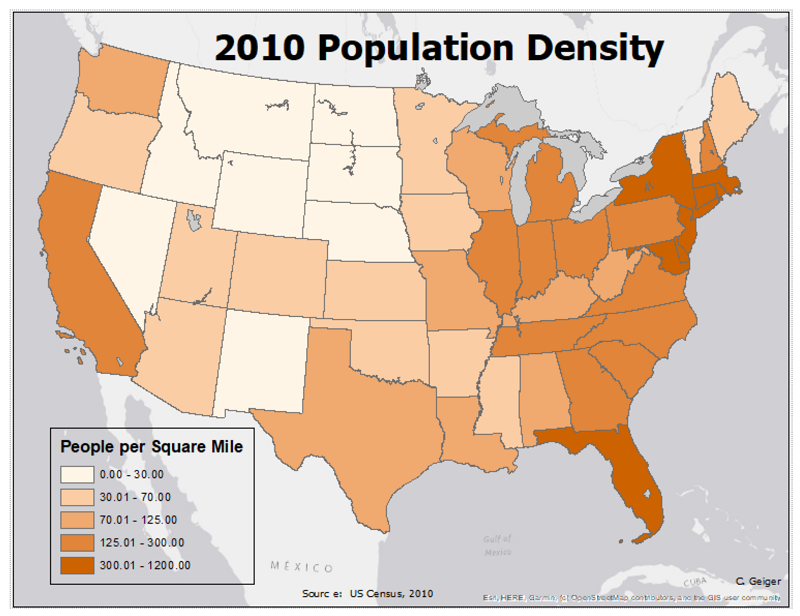
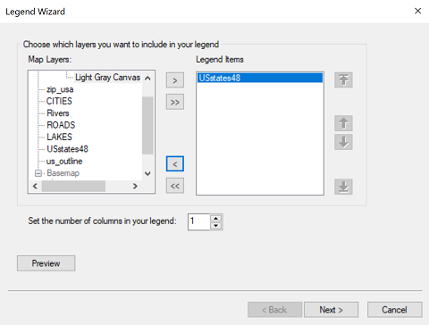
We noted above that you find the command to insert a Legend on the Insert menu when viewing the Layout window. Selecting that command starts what Windows users refer to as a "Wizard," a sequentially connected series of dialog boxes. I will demonstrate the use of the ArcMap Legend Wizard and, since that does not quite get the job done, a follow-up dialog box. The example we will follow creates a choropleth map legend for a map of population densities of the US states.
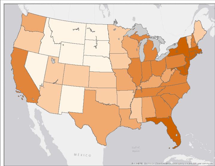
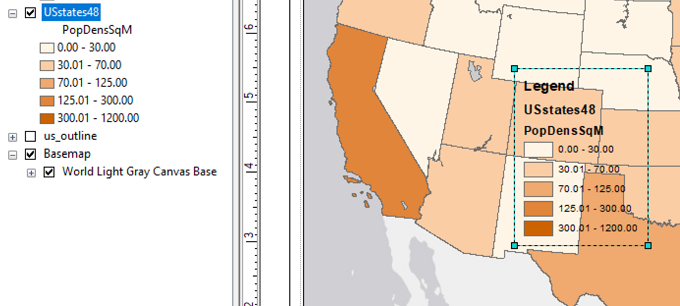
To begin, here is the map Layout for which the legend is being designed.
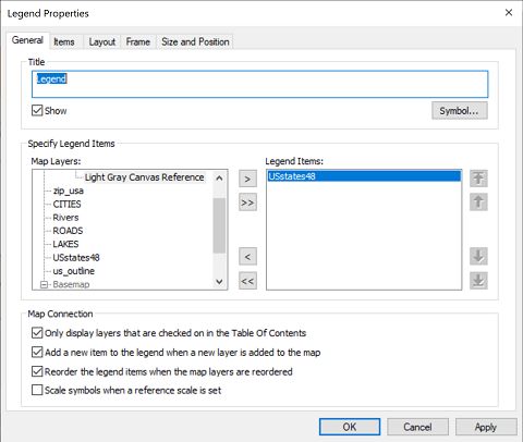
In the first dialog box of the Legend Wizard you are just deciding which layers should appear in the legend. For example, creating this map I had added a basemap and a layer of US lakes in order to clarify and simplify how the US states were being represented. The legend, by default tries to create items for every visible layer in your map, so my action here was to remove the basemap and lakes layers from the legend design using the "<" icon (highlighted) in the space between the two lists.
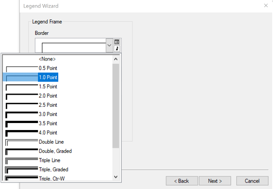
The next dialog in the Wizard is for setting up a box, or frame, around the legend. You can add a border, a background fill color and even a "Drop Shadow" effect. I opted for just the border, specifying its line thickness. I normally avoid legend borders because I consider the additional lines to be more clutter on a thematic map, but in this case due to the presence of the basemap, I expected it to make the legend a little easier to see.
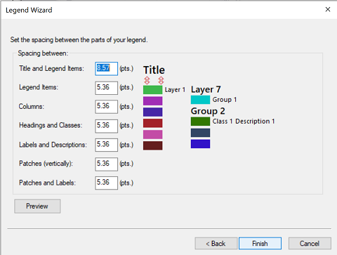
You can use the next dialog in the Legend Wizard to control the separation between the rectangular color swatches in the legend. I have rarely found this necessary to alter.
That finishes the Wizard. When you click the OK button to close the Wizard it takes a few seconds to compose the legend and then places the constructed legend in the middle of your map. When you move your mouse over the legend you can either move it or resize it. However, it is not yet ready for final display, as my sample below shows, because in addition to the choices you just made in the Legend Wizard ArcMap has made a few of its own...and they weren't very good choices.
For example, the legend as constructed has a main heading that says "Legend" which we decided above is the worst possible heading for a legend. The next two lines below that contain the names of the layer and the name of the attribute table field as they were when you created the layer.
To take the next step, double-click on the legend as it is. A new dialog box will open titled "Legend Properties." It has five tabs, a few of which are identical or nearly identical to the dialog boxes in the Legend Wizard. One that is different is the first tab, called the "General" tab. The most important capability in this tab is that you can change the "title" of the legend. You can either type a more meaningful title or you can delete the title or you can uncheck the box beneath it labelled "Show."
That takes care of the legend heading, but there are still the other two labels showing. There are complex ways to remove them, but the easiest way to do it is to go back to your map's Table of Contents and click on each one twice, but pause between clicks so that with the second click it gives you the option to rename the label. Instead of renaming it, though, delete it. After you delete the label and press your Enter key, not only will the label disappear from the Table of Contents (don't worry, the layer is still there), but the label will disappear from the legend, too. Again, repeat this for both the layer name and the field name. The image below shows the blank Table of Contents. You can always add the labels back into the Table of Contents when you have printed or taken a screenshot or exported your Layout.
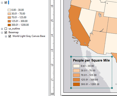
The finished map shows the full effect of all the decisions made: