Population
Representing People on Maps
Population Characteristics on Topographic Maps
Map symbols or aerial photography can give clues to population change. Older USGS topographic quadrangles included symbols representing individual houses. Those symbols were absent from densely populated urban areas, where the red tint or shading was used to identify "building omission areas." Toward the end of the print era of USGS quadrangles the color used was a light gray, and on maps that had been photo-revised areas of newer development would be shaded a light purple. Like many USGS mapping practices, the use of the building omission area evolved over time to the point where it was difficult to say what the criteria were for declaring one.
Outside of those densely populated areas, though, the map had symbols representing each house. However, remember that, as it was for roads, smaller houses were represented by a standard-sized black square that could represent a scale size larger than the actual house, but larger houses were represented by true scale representations of their shape and size.
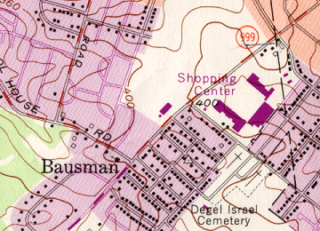
One application of understanding how symbols were used to represent houses is to use them to estimate the local population of smaller areas. Multiplying the number of houses by an average household size for the area could give a reasonable estimate of the local population. Of course, there are many variables that can affect the actual occupancy of those houses, but an estimate that was not far off could be made. A similar procedure can work in areas without such detailed mapping if aerial photography is available; the main limitation of aerial photography occurs if the area has abundant trees that obscure some of the houses.
For example, the map below shows a small neighborhood named Bausman, located between Millersville and Lancaster. A count of the houses within that neighborhood yields 143. Average household size across the country can vary quite a lot, for cultural, economic and other reasons. In this case the neighborhood consists of smaller houses rather tightly spaced, so large numbers should not be expected. If we do some research and find, for example, that the average household size in suburban Lancaster County is 2.8 persons, then that would result in a neighborhood population of 400.4, which should be rounded off to 400.
A Population's Essential Statistical Characteristics
People can also be represented on thematic maps, in many ways. Since thematic maps can be based on several different types of map features using data at multiple levels of measurement, identifying the specific population characteristic to display becomes essential. The population characteristics to be examined below include a wide range of measures.
The most simple measure is, of course, the count of the population. Of course, the US Census is the obvious source for authentic population count data. The key decision to make is what level of geographic detail is needed: states, counties, municipalities, census tracts, census block groups or census blocks. Recall also that because the population statistic is a count type of quantitative variable, choropleth maps are not suitable. Graduated symbol maps or dot density maps are the preferred ways to present count data for area features. On the other hand, if the population count is turned into any kind of ratio, including population density, choropleth maps can be very effective at displaying spatial patterns.
The other measures to be presented below include:
- Ways to show cultural chavacteristics of the population (see the next Topic below).
- Ways to read or depict population growth and change over time.
- Ways to show the population's relative age characteristics.
- Ways to show the population's level of economic success or struggle.
- Ways to show the population's political preferences.
Population Growth and Change
Population Change
Population growth is a combination of two processes: natural increase and migration. For the most part in world history, populations have increased over time, so a few of the terms reflect that trend. One example is the fact that we commonly encounter the term "population growth" in this context. Another example is the term "natural increase," which represents changes due to the natural events of birth and death. Migration, on the other hand, represents people moving into an area or people moving away to a different area. Either natural increase or migration can cause the local population to increase or decrease over time, as will be illustrated here. After a brief look at the evidence available on topographic maps, look for a longer discussion of thematic mapping of population characteristics.
USGS quadrangles can be used to illustrate population change if maps are examined at multiple points in history. Quadrangles at 1:24,000 scale date back to about the 1940s to 50s, so it is reasonable to assume that any area that stayed rural or suburban for much of that time should have multiple stages of growth available. Again, the same thing goes for a sequence of aerial photographs of such an area. In fact, the use of air photos dates back further than USGS's 1:24,000 scale mapping program.
The most relevant clues to examine are the roads and houses on each quadrangle or photograph. Since the late 1940s, a great deal of the growth happened in the suburban areas around major cities, and happened when large numbers of people moved out of the cities into the new suburbs. We cannot really demonstrate the loss of population from the cities with maps and aerial photographs, since abandoned homes and businesses look the same as occupied homes and businesses on these maps. However, we can easily see the suburban growth. The development process previously discussed left a huge imprint on the landscape, given that every new housing development added miles of roads. The land cover changed little from farm fields (the most common prior use of the land) to yards, but the houses themselves were the ever-present reminder of the sprawl that was occuring.
USGS Quadrangles to download and examine:
| Lancaster, PA |
|---|
| (7.5 x 7.5 minutes) |
| Lancaster quadrangles (some photo-revised) were published in 1956, 1969, 1976, 1989, 1995 and 1997. Download each one and view the transformation that took place in the land surrounding the city. |
Natural Increase
The next set of population change factors require thematic maps to display. Again, a lot depends on the spatial level of detail needed for any particular map. Where the US Census is the primary source of population related data, curiously, their data on natural increase factors is rather limited. Births and deaths are medical events as much as they are population change events, and the Census is more dependent on its annual and decennial surveys for its data than on communication with the medical community. The data used in this discussion come from the Naional Center for Health Statistics, which is part of the US Centers for Disease Control and Prevention, which is, in turn, part of the US Department of Health and Human Services.
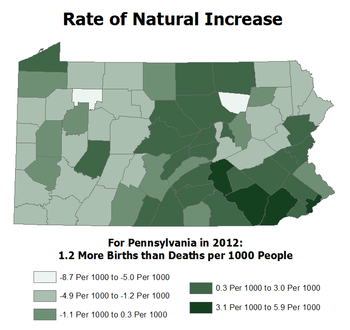
Natural increase, the first factor, is the change in population due to the two natural events: births and deaths. Even though it is termed natural increase, it can be a positive or negative value. It is reported as the net increase or decrease in population for every thousand people in the population. Thus, if 300 more people in an area are born than die, and the area's population is 150,000, then that ratio of 300/150,000 reduces to 3/1,500, which is equivalent to 2/1000: 2 more people for every 1000. Another way of calculating it is to divide 300 by 150,000 to get the decimal value .002. Multiply that value by 1000 to get the ratio per thousand (just like you would multiply .50 by 100 to form the percentage 50% because "percent" means per hundred). By the way, the equivalent symbol for expressing the number 2 "per thousand" or "per mille" is 2‰.
The first map illustrates these patterns for Pennsylvania counties. Keep in mind that the age factors we examined in the last topic are relevant here because a positive natural increase requires a younger median age and a lower percentage of elderly in the population. Urban areas tend to reflect those characteristics better than rural areas.
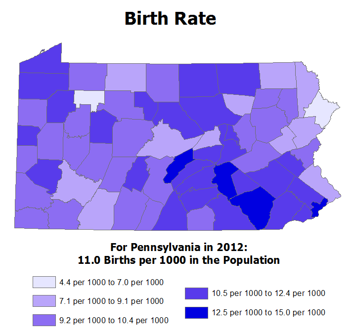
Birth Rates: We can also map the birth and death factors in the natural increase computation separately. The birth rate of an area is the number of births per thousand in the population. Note that, unlike the natural increase, these values will only be positive. Like natural increase, though, higher birth rates will depend on having a sufficiently young population. Another factor that tends to result in a higher birth rate is cultural: the presence of religious and other cultural groups that disapprove of birth control, such as the Roman Catholic church, will tend to be reflected in higher birth rates.
The map of Pennsylvania birth rates again illustrates these considerations. The southeastern portion of the state features younger median ages and lower percentages of elderly. Other parts of the state have a long history, dating back into the late 1800s, of Catholic heritage, especially from Irish, Polish and Italian families. A newer wave of Catholic church immigration is now occuring in the southeastern part of the state (overlapping the younger ages), with increasing Hispanic populations.
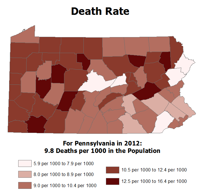
span class="bold">Death Rates: Just as we can isolate the birth rate portion of the population's natural increase, it is also easy to document and map death rates. Again, higher death rates will primarily reflect older populations with higher percentages of elderly. It could be imagined that death rate data could be used to demonstrate particular disease mortalities or impacts of crime, to be really conclusive that would have to be done at a much smaller level of detail, such as municipalities or census tracts, and probably with data for a series of consecutive years.
Again, Pennsylvania's county death rates can be used to illustrate those generalizations. The areas with lower death rates generally have younger populations, while most of western and southern PA have older populations. The latter areas are also our primary coal mining regions, which could also be seen as a contributing factor, both occupationally for the men who worked in the mines, and in terms of local air pollution.
Population Migration and Overall Growth
Migration Rates: The population of a place or area also changes when people move into it (immigrate) or out of it (emigrate) it. Note that immigration and emigration in this context do not necessarily mean that people are traveling to or from a foreign country. Someone could be moving in from the neighboring county and still be counted as an immigrant to your county, or they could be moving out to California and still be counted as contributing to a decrease in the county's population.
Finding data to map in order to illustrate this concept is very difficult. You basically have to work backwards from population change data (see below) and eliminate the population change due to natural increase in order to isolate the population change due to migration. Even then, you don't really know how much immigration vs. emigration took place, just the final effect of those changes.
Growth Rates: As described at the outset of this Unit, population growth (or decline) results from the interplay between natural increase and migration. In spite of the fact that migration data are harder to find, and that natural increase measurements are given in numbers of people per thousand, the overall population growth rates are given as numbers of people per hundred, and are stated as percentages.
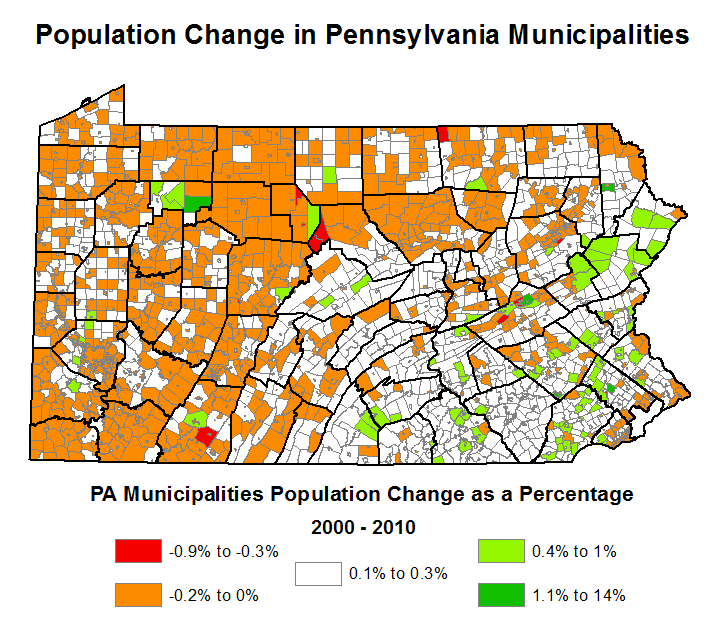
Because both natural increase and migration can result in positive or negative numbers, representing growth or decline in population, the overall total can also be positive or negative. The map below shows that overall population change for Pennsylvania's municipalities. Positive values are represented with white or green choropleth shading, while negative values are in orange and red. Again, at this level of detail, it is easy to see that variability within counties is sometimes greater than variability between counties. Unfortunately, the colors of very small municipalities (which means many boroughs) is impossible to see at the scale of the map. The only real solution to that problem would be to symbolize the municipalities without borders, but then we would not be able to tell where one municipality ends and the next begins.
Other Population Factors
Population Density
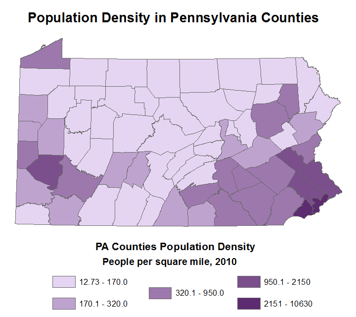
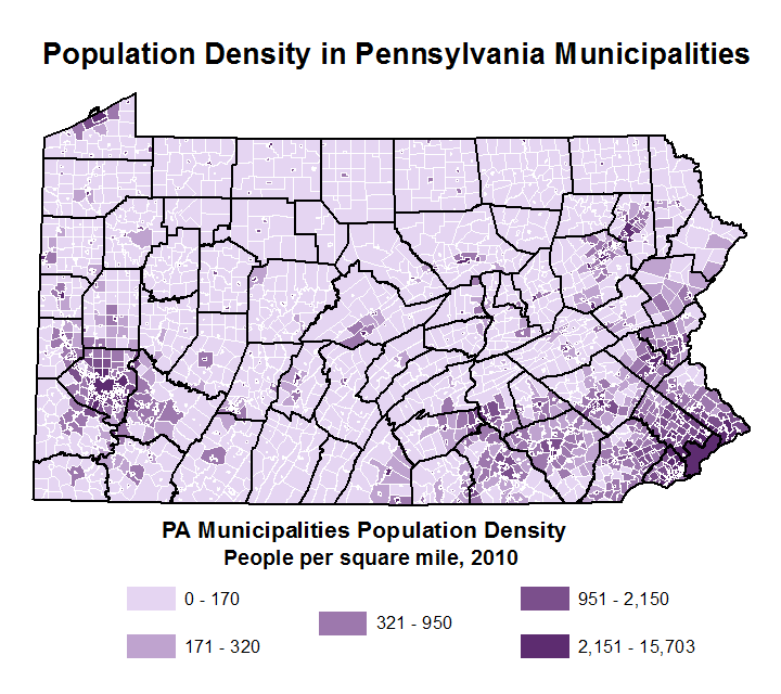
Population density is very commonly used to portray population distribution characteristics. It is normally calculated in the US as people per square mile, accomplished by dividing the population of an area by the number of square miles covered by that area. The numbers range dramatically between rural areas, where they can be fractions of 1, and urban areas, where they can easily exceed 10,000. That issue is highlighted in the maps of Pennsylvania's population density below. As demonstrated earlier in the course, it creates challenges in the classification process when trying to decide on class limits for a choropleth map. At that time, the decision was made to eliminate Washington, DC from a population density map of the US states because it was such an outlier and would be barely visible on a national map.
One of the interesting patterns to demonstrate with population density is the effect of increasing detail. The two maps below show population density for Pennsylvania counties and municipalities, respectively. In the counties map, you can identify the higher density counties as the ones enclosing Pennsylvania's larger cities. Since all counties other than Philadelphia include extensive rural areas, there is a big gap between Philadephia's (or Philadelphia County's) population density and the next closest one. On the other hand, on the second map showing the population densities of Pennsylvania's municipalities, it is easy to distinguish the cities and boroughs from the rural townships. Note, some suburban townships have higher densities than many boroughs (which are generally smaller), but there are also many smaller cities with population densities approaching that of Philadelphia.
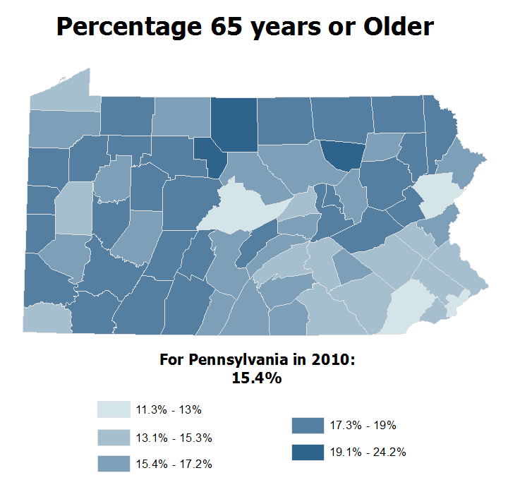
Population Age
Mapping the age characteristics of a population can help to explain several qualities of local areas. Age measures include median age and percentages of the population in particular age brackets, sometimes separated into males and females. The median age of a place or area is the age at which half of its population is older and the other half is younger. The age bracket percentages can be used to identify whether particular age groups are in larger or smaller proportions than in some other place or area. Age data can portray many characteristics, often in comparison to other similarly sized places or areas or to some larger area such as the state average or US average. They tell us which place or area is younger or older, which means telling us which age groups tend to be largest in the area's population.
Younger populations can indicate:
- The presence of a college or university.
- Other attractions for a younger workforce.
- A higher birth rate, for example, due to the presence of religious or cultural groups that favor large families or that disapprove of birth control.
- A higher death rate among the older residents or due to a lack of healthcare.
- Emigration of older residents, for example, to the suburbs or due to lack of healthcare.
Cities tend to be younger than suburban or rural areas for several of these reasons (though usually not due to the lack of healthcare).
Older populations can obviously result when the opposite conditions (compared to the above list) exist. They can also indicate
- The presence of one or more retirement homes or communities.
- That the community is more mature with fewer children at home.
- That it is a very wealthy suburb affordable for only late-career white-collar employees or executives or those with family wealth.
As with population density, a more-detailed map of smaller areas such as municipalities or census tracts will show trends better than larger areas such as counties or states.
Rather than simply infer the presence of a large number of people in a particular range of ages, it is also possible to map that specific group. The US Census readily provides population numbers broken into smaller age ranges, primarily at five-year intervals. The map below shows the distribution of elderly residents of an Pennsylvania counties. In most instances it will be consistent with the map of median ages.
Political Preferences
Viewing a population's political preferences spatially can illustrate several other characteristics of that population. Typically, party preferences would be candidate- or issue-based. If we take it as a stereotype that Republicans tend to live in rural areas and wealthier suburbs, while Democrats tend to live in cities, union-friendly industrial towns and working class suburbs, then a combination of political maps, population density maps, and maps of incomes can help us to see which combinations tend to occur, and where.
In the case of Pennsylvania (below), several illustrations of such interrelationships are visible. It should be noted, first of all, that the map shows three levels of Democrat or Republican predominance. In the lowest level for each party, the map is showing that the leading party includes less than half of that county's voters. That may sound contradictory at first, but it means that a third party has enough registered voters to keep both traditional parties from having 50%.
One interesting pattern that emerges from the information provided on the map is that even though there are more counties in which Republicans are the leading party, there are more Democrats statewide. This demonstrates the impact of the higher population densities of the cities, especially Philadelphia.
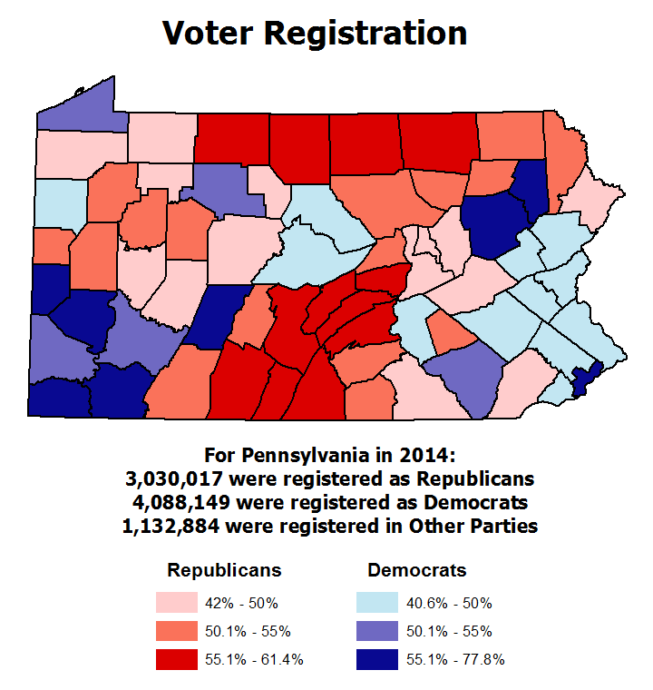
Philadelphia is clearly a Democratic Party stronghold in the southeastern area of the state. Suburban Philadelphia counties, on the other hand, include both wealthier and working class communities. Over the last several elections, whether state or federal, they have tended to vacillate between a plurality of Democrats or Republicans depending on the most salient issues in that election.
Southwestern Pennsyvania features another major urban area, but it is one which is largely contained within one county, Allegheny County. Allegheny County includes both the city of Pittsburgh and its suburbs, and the cities plus other urban municipalities add up to nearly two thirds of the county's population, so like Philadelphia it shows up as strongly Democratic. In addition to Allegheny County, the rest of that corner of Pennsylvania also registers as Democratic, mostly strongly so, in spite of the fact that much of it is rural and less wealthy. The reason has to do with the traditional occupations in the area being dominated by typically union-represented jobs.
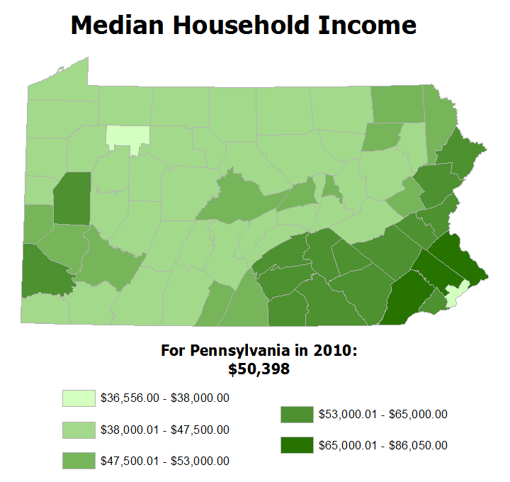
Income Characteristics
We noted a relationship between political leanings and affluence, but the latter has other consequences as well. For example, home ownership, automobile usage and energy consumption are all related to the income level of an area's population. The first map below shows median household income, the income of the middle household in each county, if all household incomes in that county were placed in rank order. Obviously, the higher median incomes represent higher incomes county-wide. The advantage of the median as a general measure for this purpose is that it is not affected by outlier incomes. Comparing them to Pennsylvania's statewide median household income, $50,398 in 2010, and the United States' median household income, $51,914 in 2010, is another useful approach to interpreting the map. Again, urban areas and working class suburbs show up with lower values, as do largely rural areas. Counties with even a few wealthier suburbs will readily rise above those lower medians.
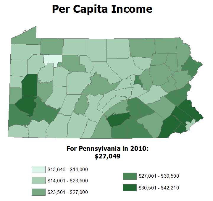
On the other hand, per capita income is calculated by adding up the income of every money earner in a county and dividing the sum by the total population of that county. Because it includes children and others who are not employed at wage-earning jobs, the value for each county will be lower. Relatively speaking, though, per capita income will show similar patterns to the median household income. One way it can differ, however, is that it will decrease in areas which have larger numbers of children or unemployed in the population.
The map below, of per capita income for Pennsylvania counties, illustrates those patterns. The one county in the lowest class, Forest County in the northwestern part of the state, is very rural and has a very small population. The wealthier counties in the southeastern corner of the state represent Philadelphia's wealthier suburbs; in central Pennsylvania, Cumberland County hosts some of Harrisburg's wealthier suburbs; and in the western part of Pennsylvania, the counties that show up in the highest class represent Pittsburgh's wealthiest suburbs.
Culture
Cultural Origins
Culture encompasses many forms of expression and activity on the landscape, and there a variety of potential map clues and map use strategies to determine the existence of particular culture groups. Culture relates to the background and lifestyle of the population; it can be expressed in their religious institutions, their schools, and in their names for places and things. Many cultures produce unique buildings for very specific purposes, or show a preference for certain types of jobs. Identifying the culture group who created certain elements of the landscape as represented by map features is sometimes possible. Background knowledge or a little research often helps to explain the map evidence.
We will focus on one major piece of evidence: the names given to map features. How do the different types of features that are visible on USGS topographic maps get their names to begin with? The words used in feature names come from two sources. Some come from the formal names of particular people or families, or from other towns and cities that already exist. The other type of name source is the descriptive word: some are nouns that identify an object that has local significance; and others are colors and other adjectives that describe the thing or area. See the table below (Gersmehl, p. 97) for a list of everyday words that are frequently part of place names translated into several languages).
There are several ways to organize a discussion like this. One, which will be used below, is to create topics based on the different cultures that are well represented in the maps you are likely to produce or read. Another is to start with different categories of features, such as natural features, place names and roads in order to illustrate cultural preferences. A third approach would be to organize the discussion historically, emphasizing which names are oldest and which reflect newer trends. Though we will primarily address the European and Native cultures, you will see the feature types and historical dimensions explained also.
European Culture in America
The connections between European cultures and America are well known. English culture is the most dominant of these, having had the most power and wealth in the formative colonial years and being the predominant cultural background for the early leaders of the US after independence. With the latter fact in mind, it is generally difficult to distinguish English from American unless you know the specific history of a particular name you are investigating. There are place names that reflect an interest in preserving American (US) culture only; for example, American culture names include Washington, Lincoln and even Columbus. Except for these obvious cases, we will not try to distinguish between English and American culture.
Even areas of what grew to be our current version of the US that were originally Spanish or French eventually became more culturally English or American/English. German culture became prominent in the "Pennsylvania Dutch" region of southeastern Pennsylvania. The idea behind the table below is that you probably have enough background in at least one foreign language to judge whether a place name is English, Spanish, French or German.
| English | French | German | Spanish | |
| Directions | ||||
| east | est | osten | este | |
| north | nord | norden | norte | |
| south | sud | siiden | sur | |
| west | ollest | westen | oeste | |
| Colors | ||||
| white | blanc | weiss | blanco | |
| black | noir | schwarz | negro | |
| red | rouge | rot | rojo | |
| green | vert | griin | verde | |
| Features | ||||
| land | terre | boden | tierra | |
| sea, lake | mer, lac | meer | mara, lago | |
| island | ile | insel | isla | |
| water | eau | wasser | agua | |
| snow | neige | schnee | nieve | |
| fire | feu | feller | fuego | |
| High/low | ||||
| places | high | alta | hoch | alto |
| mountain | mont, montagne | berg | montana, sierra | |
| plateau | plateau | hoch bene | mesa | |
| plain | plaine | ebene | llano | |
| valley | vallee | tal, thal | valle | |
| cave | caveme | hohle | cueva | |
| river, creek | riviere | fluss, bach | rio, arroyo | |
| mouth, bay | boche, baie | miindung, bucht | boca, bahia | |
| Plants/ | ||||
| animals | forest | foret | wald | bosque |
| oak, pine | chene, pin | eiche, kiefer | roble, pino | |
| desert | desert | wiiste | desierto | |
| meadow | prairie | wiese | pradera, cienega | |
| bear | ours | bar | oso | |
| horse, cow | cheval, vache | pferd, kuh | caballo, vaca | |
| Minerals | ||||
| iron | fer | eisen | ferro | |
| gold | or | gold | oro | |
| silver | argent | silber | plata | |
| stone, rock | pierre | stein | piedra, pena | |
| Buildings | ||||
| castle | chateau | schloss | castillo | |
| church | aglise | kirche | iglesia | |
| house | maison | halls | casa | |
| road | route, rue | strasse | camino, calle | |
| town, city | ville | doff, stadt | pueblo, cilldad | |
| Miscellanies | ||||
| beautiful | beau, belle | schon | bello | |
| dead | mort | tot | muerto |
Having the authority to name places and things in the landscape required wealth and position or influence in local, regional or state/colonial government. Names reflect the historical sequence of such authority. Along our southern shores and boundaries, including Florida and the stretch from Texas to California, Spanish names represent the first wave of settlement. The exception there is Louisiana, with its strong French heritage. Later waves of immigration brought in people of many other nationalities; only in some areas, such as the Germans and Scotch-Irish in more rural areas of Pennsylvania, did they gain enough prominence to make the decisions about names. In the areas of the US previously settled by Native Americans, Spanish and French, some of those early names were preserved, but almost all places and landscape features named later have Anglo-American names.
There have been other European cultures immigrating to America in large numbers, but most of that was in the later 1800s to early 1900s. By that time, the Spanish and French areas had already been transferred to Anglo-American dominance and the places absorbing the newer Europeans had either already existed as Anglo-American towns or were being built by Americans in that dominant culture group. In American history, no other foreign culture has produced dominant enough land owners or developers to have much of an impact, even though many cultures have been present.
Road Names: The naming of roads presents an interesting perspective on these European and early American practices. Roads are of two general types, and their names generally come from two different sources. Many roads are connecting roads; most often a connecting road was named after the nearby town or city it connects to (obviously route numbers do not count here). The second type of road is the one that is within a planned development, which could range in size from neighborhoods to entire towns. They presented a different challenge: how to name a batch of streets all being built (and mapped) at once. William Penn himself came up with a couple of schemes. Philadelphia's use of numbered streets and streets with tree names has been repeated in many towns and cities. As another example, the practice in colonial times of naming streets after British royalty (including the generic King Street and Queen Street) has continued with memorialized names of other famous historical figures from Columbus and Washington to more modern local heroes.
In historical terms a town's founder or a neighborhood's developer would often be the one to name the roads. In those scenarios the residents of the area seldom make those choices; developers often do not live in the places they develop and are more likely to make name choices that reflect their own culture than the culture of any anticipated group of residents. Where the road names include everyday words (such as tree names or the words in the table above), the culture of the developer who made those choices is generally obvious. Where the road names memorialize famous or local individuals, the culture of those memorialized is sometimes a clue to the dominant local culture, but it is important to make this connection cautiously. For example, there are many towns in America with French cultural roots that have French road names. But there are others that have never had any significant French population that have a road named after Lafayette just because he was a Revolutionary War hero; by memorializing him they are expressing an American history connection, not a French one. The map recommended below is of a city in California. Considering that it is California, what ethnic group would you expect to see? Are they present in landscape names such as streets? Look for other cultures, both expected (such as English/American) and unexpected (such as the Jewish cemeteries at the southern end of the map.
| Stockton West, CA |
|---|
| (7.5 x 7.5 minutes) |
| Look for street names, and other names in and around Stockton. |
Place Names: The names of places, such as towns, cities and even suburbs, are also generally more expressive of the culture of the founders and developers than of the residents. Again, the founders/developers generally had naming rights, and their cultures were most likely to be reflected in the chosen names. However, some associations are tricky. Sometimes the developer will name the community using a pre-existing place name for the area, and leave their own culture out of it. Or, many towns are named after the founder, such as Harrisburg or Millersville. The ending of the name can even be a clue to the local culture or the founder's culture. An ending like "-burg" may well reflect a German cultural connection, or "-ville" may reflect French culture. Be careful not to take this reasoning too far, though, as we will see below.
USGS Quad to reexamine:
Donaldsonville, LA
(7.5 x 7.5 minutes)
What culture shows up most prominently, and why? Why is the "Donaldson-" part of Donaldsonville not of that culture?
Native Cultures
Native American culture is reflected in many feature names, despite the fact that the Native Americans no longer populate many of the places where their names are still used. The emphasis in trying to establish this connection is to think about when the Native Americans were present in an area with the prominence for their names to be respected. It is not as easy to generalize about Native American words, or to create lists like the one for European-based cultures above, because there were many Native American nations with different languages. Their original place names or landscape feature names are preserved often enough that it is still important to be able to recognize them. The easiest way to identify them is that they do not have European language letter sequences or pronunciations. The biggest challenge to recognizing them is that many, such as Mississippi or Massachusetts have become so familiar that we may not think of their spelling as unusual. The USGS quadrangle identified here has some great examples of similar names.
| Bridgewater, MA |
|---|
| (7.5 x 7.5 minutes) |
| Look for the names of natural features. Which are Native American as presented, and which are probably English versions of Native American names? |
One category of geographical names that is common on topographic maps is the names of significant natural features. Rivers and streams, lakes, hills and mountains and even valleys, are examples of landscape elements almost always given names. What is interesting here is that, despite the Anglo-American authority mentioned earlier, those natural feature names often reflect some Native American name previously given to the place. It is the Native American names for natural features that were most likely to persist because their communities or other political or cultural elements were generally not preserved by the European colonists. Another twist on Native American names is when later settlers translated an original Native American name into English and gave that feature the translated name. Names like Beaver Swamp and Turkey Hill probably have such an origin.
Other Cultural Connections
There are some situations where feature names cannot be easily interpreted. For example, the suburbs have been built over the last 75 years or so and, compared to the cities they surround, the suburbs reflect a very modern and technology-oriented "popular culture." Landscapes that reflect popular brands and mass consumption are common. It has often been stated by travelers that it is difficult to distinguish the suburbs of one city from the suburbs of other cities; even the names given to streets and neighborhoods tend to sound familiar.
Another example is place name fads. An interesting example of this is the place-name ending "-ville" (as in Millersville). There was a period in the late 1800s or early 1900s when changing an English or German town name ending to "-ville," which is the French word for towm, became fashionable, especially if there already were other places with the same former name. Thus, Millersville was once Millersburg and later Millerstown (named after John Miller, the town's founder), but its leaders made the decision to make Millersville the official name in the 1850s.
In another example of fad names, the map features named represent places or people the founder intended to memorialize. It is the current culture at that point in history which is being preserved. You can find dozens of Washingtons and Columbuses (or Columbias) around the country, for example, representing eras of patriotic fervor.
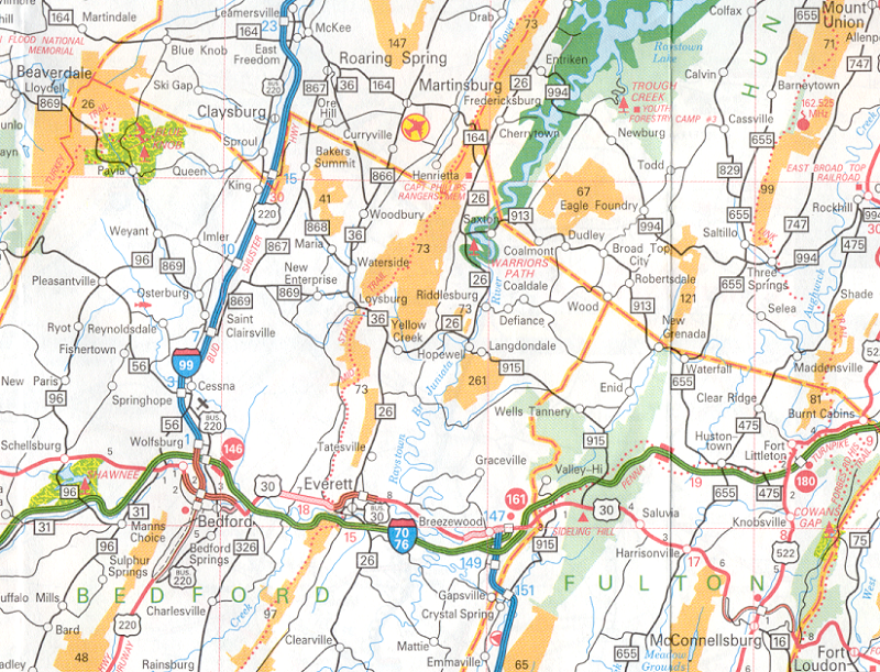
Finally, there are place names that reflect other human traits, such as work or even fun. The map below, of an area in western Pennsylvania, shows an area of mining and industrial towns. Look carefully at the place names and see the variety that is possible. Many are conventional names, like those described above, but some are unique:
- European names: King, Queen, New Paris and Osterburg
- Native American names: Shawnee, Beaverdale and Roaring Spring
- Places named after people: Emmaville, Enid, Todd and Calvin
- Industrial names: Coaldale, Coalmont, Ore Hill and Eagle Foundry
- Fun names such as: Burnt Cabins, Defiance and Drab.
Culture on Thematic Maps
Cultural Data
Culture is a wide-ranging concept with many potential interpretations. As mentioned above, culture is generally the shared expression of a group whose external visibility takes on many representations. Everything from how to develop land (remember the French long-lot survey system) to what instruments best convey their music are strong cultural elements. For every one of those types of cultural expression there are likely to be observers who collect records of those expressions, including photographs, counts, measurements and text-based observations. All of these constitute cultural data, and the sources of these data are as varied as the types of data themselves.
One aspect of culture we focused on above was ethnicity or ancestry. One source of ancestry data is the US Bureau of the Census. In the Census Bureau's transition from decennial surveys to annual American Community Surveys (with the decennial Census retained as part of that system) decisions had to be made about what kinds of information to collect in which survey. Questions about the respondent's ancestry have been retained in the American Community Survey. Interestingly, this question is asked as an open-ended question. Several sample answers are included in the question, but the respondent is asked to simply fill in a blank, which means that they can word it in whatever form they like. The vast majority of the answers are the names of foreign countries from which the respondent or their ancestors presumably came. However, it must be realized that no one at the Census Bureau will ever check up on whether that person is correct about that ancestry, or what percentage of that respondent's family tree can be traced back to that origin. Like a lot of cultural data, the information is very subjective.
To search for a recent collection of results from this source, go to the Census Bureau's data access site, and search through their collection of Tables for table B04006, preferably for a 5-year Average of the latest American Community Surveys. In the list of ancestries, an intriguing one is called "Pennsylvania German." The table includes the number of people in the selected geographical features that area projected to claim that ancestry, plus what is called a "margin of error" for those counts. One of the first columns of the data file is the total population of each of the geographic areas.
It should be remembered that the American Community Survey, and indeed the decennial censuses, too, are not able to count or record results for every individual person. The decennial census is a great success when over 60% of the inhabitants of the US replies, and the ACS is a smaller percentage than that. However, the Census uses formulas and techniques honed over many years of experience to upgrade the actual counted returns proportionally to numbers that would have been received if every last person had responded.
Cultural Mapping
The final data collection decision required is for which geographical features the data will be totaled and then mapped. The Census Bureau is responsible for protecting the privacy of everyone who completes their questionnaires. That will ultimately limit the level of detail for which data are available. Census "geographies" range from totals and averages for the entire nation to those for counties, municipalities (which the Census calls "county subdivisions," census tracts, block groups and blocks. At some level in that hierarchy it will become too easy to find a situation in which only a few people identify with such a detailed category. In the case of the Ancestry data, there are sufficient numbers for the Census to release the data for counties. However, if we select the "county subdivisions" level of detail and identify Pennsylvania as the state within which we want to collect the data, we do not get a complete set of all the municipalities in the state. Instead, only six cities and one suburban Philadelphia township have sufficient numbers for the data to be viewable. Thus, county-level data are the best we can do for a complete map of Pennsylvania.
The Pennsylvania German populations of Pennsylvania counties makes for a pair of interesting maps. In the first map, a conventional choropleth map, the first thing to remember is that the data must be "normalized" to create a percentage or density variable. The easiest way to accomplish that is to divide the total number of Pennsylvania Germans by the total population of each county. Here is the map that is created.
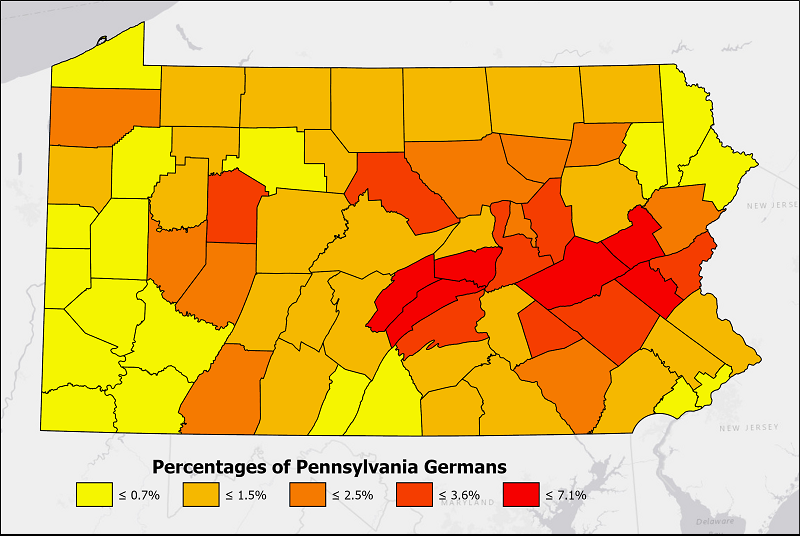
The pattern that appears shows a strong concentration of Pennsylvania Germans in the central of the state. See the discussion below the next map for an explanation.
However, if the same data are mapped as counts a very different pattern will appear. Remember that count data should not be mapped using choropleth symbology. The best options available are the dot map or the graduated symbols map (again, cartograms could be used but are a bit too obscure for most audiences). Either the dot map or graduated symbols map is equally valid, but since we want to compare the magnitudes of those counts, I chose to use the graduated symbols map. Further, for the same reason, I settled on showing the data at the quantitative level of measurement by displaying the data on a proportional symbols version of the graduated symbols map. Here is the map:
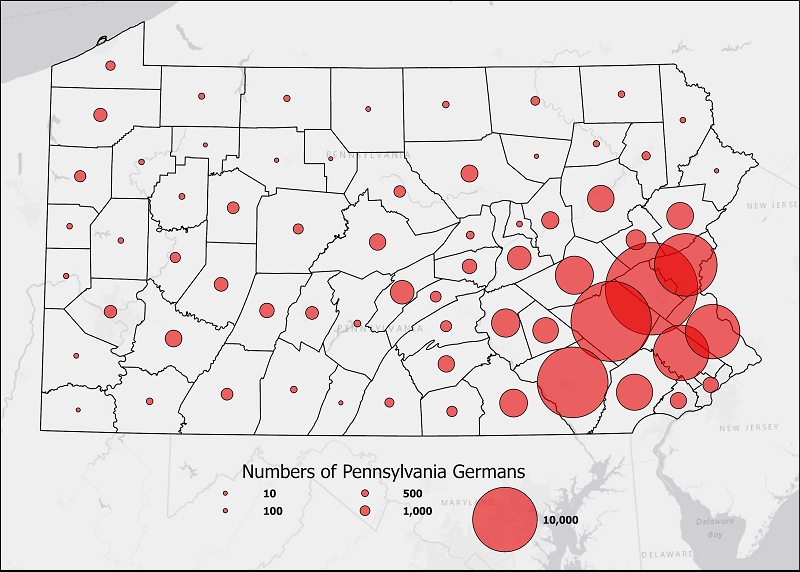
Notice how it gives such a different impression of where the Pennsylvania Germans are concentrated in Pennsylvania. The more eastern counties are where the Pennsylvania Germans first settled all the way back in the early 1700s. Significant numbers came, to the point where there are many German place names and feature names on the topographic maps of the region. The numbers were also significant enough that their descendants and German immigrants who came later had to move on into those parts of central Pennsylvania where there was less fertile soil, but also less competition for the land. Later waves of immigrants created some of the larger cities in Pennsylvania, like Reading, Allentown, Bethlehem, Lancaster and York. Those immigrants diluted the percentages the Germans had, but not the total numbers. On the other hand, those percentages in more central areas of Pennsylvania were not diluted nearly as much.