Geographical Features
Maps and Computers
In a broad sense, there are two ways we encounter maps on computers: either as map images (pictures of maps) or as the product of using computer mapping software. It is relatively easy to find map images online, and to take a screenshot of an image; you will do so for your assignments in this course. Such maps can be added as images to Word documents, PowerPoint presentations or webpage contents. In fact, one of the longterm outcomes of looking at lots of maps and learning about all of their components and characteristics is that you will become something of a map critic. Your ability to find maps will be enhanced when you know how to tell the better ones from the worse ones.
There are two main principles to understand in considering how maps are represented in computer mapping software. The first principle has to do with how to re-conceptualize the geographic features that are being put into the computer. The second principle has to do with how to design the software to make producing maps as efficient and logical as possible. At center stage in this discussion are the emerging fields of computer cartography and Geographic Information Systems (GIS). In fact, at the level of this course there is hardly any difference between the two: a great deal of computer cartography can be done using GIS software. You will make use of GIS software for your assigned work in this course.
ArcGIS is the premier GIS software product; Esri, Inc. is the company that produces ArcGIS (Esri, Inc.). Many other GIS programs are also available, some as freeware. Most follow the same logic and have similar features, which you will see as you use the software. One of the lessons you will learn from this software experience is that, even though GIS software was written for solving geographical problems, there are still some language differences between the computer programmers who wrote the software and the language of maps that we have been learning in this course. If you hope to move into the world of GIS professionals, it is never too early to begin learning to tranlate between the two languages.
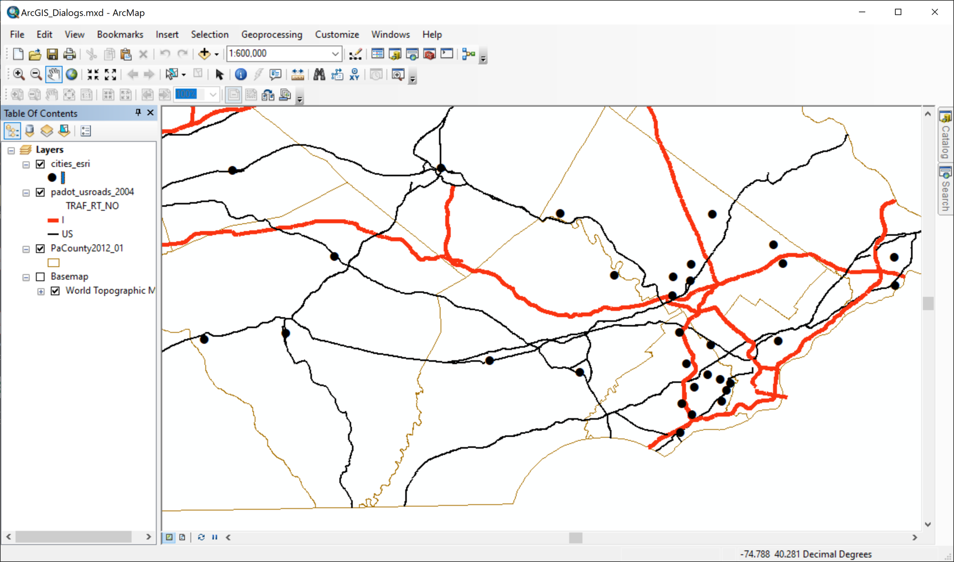
A more complete introduction to ArcGIS begins below, and you will be using it intensively during the rest of this course. The screenshot below shows the main ArcGIS window you will be using. The simplest example of the language differences mentioned above is that ArcGIS refers to the left side of the screen below the menus and toolbars, what map readers would want to call the map legend, as the "Table of Contents."
Geo-Graphics: Types of Geographic Features
Looked at graphically, there are three categories of geographic features that are represented on maps:
- Points
- Lines
- Areas
Many features are inherently one or another of these feature types, but for others it depends on the scale of the map. It would be hard to imagine any context in which you would not identify a fire hydrant or a water well as a point on a map. In the same way, roads and pipelines will generally be lines, and lakes, counties and forests will be areas.
These differences are visible in the ways these objects have been represented in the topographic maps you have been introduced to, and of which you will be making a lot more use in this course. In the map legend as well as in the body of the map, point features are represented by compact symbols whose true location is represented by the center of the symbol; schools and hospitals are usually represented this way. Small streams and roads are usually drawn with a single line and a narrow pair of parallel lines, respectively. Lakes are most likely to be shown by patches of blue and forests by patches of green.
A few items are not so obvious. Boundaries are often represented as lines on the topographic map, but the feature they represent is really an area. A state is the area under the jurisdiction of that state's government, which meets in that state's capitol; it really does not make sense to focus only on the boundary line when it is the territory that really counts. Cities are also problematic because at small scales they are best treated as points, while at large scales they really are the larger areas they feel like when you are walking around in them.
Just to complete this picture of how GIS software represents geographical features, what we have just covered represents the computer programmer's conceptualization of how to draw features on a map. This was Esri's great discovery that basically got the GIS revolution started. Points, lines and areas encompass all of the different feature types, but there actually is another way to use a computer to draw a map, which is to present it as an image such as a photograph or a scanned copy of a map. So, another distinction you may come across in GIS sources is the difference between vector representation and raster representation. More will be said about the latter in a future unit, but it is beyond the scope of this course to fully treat that topic.
Maps as Sets of Layers
Data Themes = Layers
Next we need to conceptualize the different types of information on a map. This is subtly different from the types of map features identified previously. On a map of the US, cities and mountain peaks are both point features, but you would not see them represented using the same map symbol. They represent very different types of phenomena, and urban geographers would collect very different kinds of information about cities than physical geographers would collect about mountain peaks. The combination of descriptive information and geographic coordinates for each set of features comprise a data theme. Both data themes represent point locations, but each will have a different symbol. That is the best way to identify the different data themes on a computer-generated map: each data theme has its own symbol (or, in some cases, a set of related symbols, like the data theme representing the median ages of Pennsylvania counties in the map below.
Each different data theme on a map can be stored in a separate computer file as its own map layer. In the screenshot above, for example, one layer ("US Highways") represents the major highways that run through Pennsylvania, another ("Cities") represents the places officially designated as cities, and the third ("PaCounty2013_02") represents the counties of Pennsylvania. In these examples, the first one is a layer of lines, and the last two are layers of areas (the counties are larger and cover the state contiguously while the cities are smaller and separated). Computer mapping and GIS software can combine as many or as few layers as needed to suit the purpose of a particular map-based project. In addition to being stored as separate files, each data theme, or layer, is listed as a separate item in the ArcGIS Table of Contents.
The Layers Concept
The term "layers" is widely used when describing GIS, but is not used consistently within the software. One version of the original concept of GIS was based on the concept of drawing maps of different kinds of information on transparent materials at the same scale, and then stacking the maps on top of each other like a layer cake. For example, each layer might represent a different factors that eliminated properties from consideration for a new Wal-Mart, such as one map layer of residential housing areas, another layer of swamp land, a third layer of lakes and a fourth layer of properties more than 20 minutes away from a major highway. Then, after all of the layers were added to a local map, the properties that were still clear would be the viable choices.
The popularity of the term "layers" also comes from the fact that it is a great description of how the software works (see the screenshot above). The user not only selects the data themes, but also stacks them in the order (bottom first) that they will be drawn. As the computer follows that order, parts of the lower layers will be hidden by higher layers.
That explains the reason why the data themes, or layers, are listed in the order you see on the sample map above. You have to make sure that the US highways layer is drawn on top of the cities so the locations of the highways within those cities can be seen, and then be sure that the cities layer is drawn on top of the counties so that locations of the cities within those counties is clearly visible. For that reason, area layers will normally appear toward the bottom of the Table of Contents, and points and lines layers will appear at the top. The exception to this is that an area layer can be drawn "hollow," which means that it has an outline represented by a line of a certain color and line thickness, but no color to fill in that outline, so that "lower" layers show through.
GIS Layers in Practice
Computer mapping and GIS software can combine as many or as few layers as needed to suit the purpose of a particular map-based project. Most of the programs also give the user a very wide assortment of ways to symbolize features: many different shapes and colors for point symbols, which can also vary in size; many different thicknesses and patterns (such as solid, dashed or dotted) as well as colors for line symbols; and many different colors and patterns to fill areas, including different degrees of transparency or opacity.
This conceptualization of data themes or layers can also help in explaining the distinction we have already made between topographic and thematic maps. Since topographic maps combine many different types of information, they can also be described as computer mapping projects in which many layers will be combined. Thematic maps, then, will be maps with only a few layers, at most, emphasizing the data characteristics of one layer that will dominate the map.
All of these possibilities will be demonstrated and explained in due course. At this stage, an effective application of this understanding is to open a website such as Google Maps, whose underlying map information was processed in this way, and examine the decisions they have made and the conventions (or departures from convention) they have followed.
USGS Quadrangles in Adobe Reader
Adobe Reader
Google and users of ArcGIS are not the only map publishers to take advantage of the 'layers' concept; pretty much all professional maps today are produced using that strategy.
Earlier we examined the USGS as a government agency making detailed maps available to the public for free digital download. The PDF file format in which they are stored, originally created by the Adobe software company, has become ubiquitous, enabling even a computer browser (Google Chrome, Firefox, Microsoft Internet Explorer, Microsoft Edge, Safari or Opera) to display the downloaded files, though not with full functionality. The first generation of digital USGS quadrangles were, like many other graphical PDF documents, just another image to display. That approach evolved to today’s functionality with the development that the current generation of all-digital PDF format quadrangles are much more interactive.
The more thoroughly interactive functionality is available only if you use the "Adobe Reader" app to view the quadrangle. Adobe Reader is a free program that you must download and install to use USGS quadrangles in the remainder of this course. Use your browser search engine (Google, Bing, etc.) to search "Adobe Reader download" and follow any links to the Adobe.com site. Once you install it, it will be important to remember to use it every time you view a USGS quadrangle PDF file.
Please note that if you download some older scanned USGS Historical Topographic Maps (older than about 2010), and open the map file by double-clicking on its PDF file, Adobe may prompt you to download a "Geo-PDF Toolbar." You will NOT need that toolbar, since Adobe Reader now has better capabilities built into it.
Taking Advantage of Adobe Reader's Geo-PDF Tools
Remember to use Adobe Reader to open USGS quadrangle PDF files.
To open a USGS quadrangle you can double-click, as was recommended in a previous unit, or you can right-click on the file name, choose "Open With..." from the menu that appears. Look for Adobe Reader on the list that appears; if Adobe Reader is not on that list, then it is most likely not yet installed.
The modern version of the USGS quadrangle files is an enhanced PDF file format known as "GeoPDF." There is no way to know that it is different other than what happens when it is opened in Adobe Reader, because its only identifying characteristic is that its filename ends with "PDF". Adobe Reader does not even tell you that it has detected the difference after you have opened the file.
Before we work on understanding the features of the GeoPDF interface, remember from our earlier discussion that you cannot use the mouse scroll wheel to zoom in and out on the USGS quadrangle. You can only zoom using the percentage tools above the middle of the map in Adobe Reader, which is how you have to do it in browsers and other programs that allow you to view PDF files.
The difference between a conventional PDF image and a USGS GeoPDF image does show up in two ways. First, to the left of the map are three icons (see below), the bottom one of which looks like three sheets of paper. Click on it and the left side of the Adobe Reader window will expand and show a list of layers just like you will see in ArcGIS. The names are rather obscure: Map Collar, Map Frame, Images and Barcode on the current generation of USGS GeoPDFs. Older quadrangle GeoPDFs from the early 2010s may not have the Image or Barcode layers.

The first layer in the list is the Map Collar. The name refers to all of the text outside of the map rectangle, above and below the map, except for some very tiny (initially) numbers around its edges. The Map Collar entry in the Layers list can expand if you click on the 'greater than' symbol (>) to the left of the layer name. It only shows one sublayer: Map Elements. In reality there is no difference between the Map Collar layer and the Map Elements sublayer. To the left of the greater than symbol is a small box with a representation of a human eye in it. This is the equivalent of the 'checkbox' that almost every other computer program uses. Click on it to clear the box (or double click on either layer name) and all of the map collar content disappears from view. Click it again to re-draw both the eye symbol and the map collar content.
The second original layer, Map Frame, is much more useful, referring to everything within (or attached to) the map rectangle. Expand it to see a list of sublayers, which are all the functional layers within the map. A few of those sublayers have sublayers of their own. Again, each one can be turned off and on. A few of the names of these sublayers might also be a little obscure:
- "Geographic Names" refers to map labels naming cities, towns and smaller communities around the map.
- "Structures" refers to fire stations, courthouses, schools, churches, cemeteries and a few others.
- "Transportation" includes several sublayers for all forms of transportation and a separate sublayer for the street names.
- "Hydrography" refers to water features and controls the visibility of everything that is blue within the map.
- "Terrain" controls two sublayers: contour lines, which will be a major topic later in this course, and "Shaded Relief," which is turned off by default but can be turned on to depict the relative hilliness of the landscape (again, more will be said about such mapping later in this course).
- "Boundaries," "Wetlands" and "Woodlands" are self-explanatory.
The other significant major layer in the list is the "Images" layer. This is another layer which is turned off by default. Turning it on places a layer of aerial photography under the entire map. It can be used with all the other layers, although many are harder to see or read with the air photo visible. This is a good example of where the ability to turn off some of those other sublayers comes in handy.
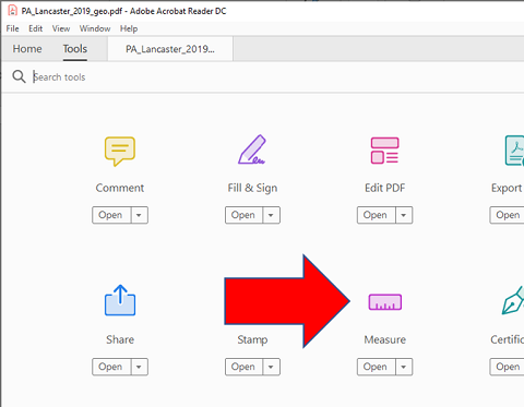
The second significant difference between a conventional PDF document file and a GeoPDF file is available if you click on the "Tools" tab just above the map window in Adobe Reader. A collection of document tools is displayed, one of which says "Measure." More will be said in a future unit about these tools.
Introducing GIS
What is GIS?
GIS usually stands for Geographic Information Systems, but sometimes for Geospatial Information Systems and sometimes for Geographic Information Science; the latter are used by practitioners who are not geographers (in the case of Geospatial Information Systems) and by GIS theorists (in the case of Geographic Information Science). But fundamentally GIS is a set of computer hardware and software, data (including the digital maps) and people (the users of the software) working toward the purpose of creating digital maps and making geographical (or geospatial) decisions.
The ArcGIS Software User Interface
ArcGIS is actually not a specific computer program, but represents a GIS "environment" populated by several programs. They all have common roots and a relatively consistent user interface, but serve different purposes. Because GIS has applications in so many different fields of research and in so many different government agencies at all levels, non-profit organizations and private corporations and consultants, Esri (the company that created and sells ArcGIS), has also created many customized analytical tools and data sets for specific groups of customers. Those applications, in turn, have spawned a few different ways to package the core functionality. ArcMap is the main product for creating 2D maps and spatial analysis. ArcGlobe and ArcScene provide somewhat different takes on 3D GIS. ArcCatalog is Esri's data and file storage interface, customized for geographic data. When installed on a PC, most users will see multiple programs presented in a folder in the Start menu. The only ArcGIS program we will use in this course is ArcMap.
Virtually all software operates in a windowed environment, with a row of menus at the top. GIS software, like many others, also tends to favor the use of various sets of "tools," represented by icons and arranged in toolbars below the menus. Note that, because toolbars are movable and because complex programs such as this have additional toolbars that can be added and/or removed over time, your toolbar area may not look exactly like the images you will see in this text.
However, there are differences with how GIS software works compared to most other software. First, let's examine the ArcGIS software window.
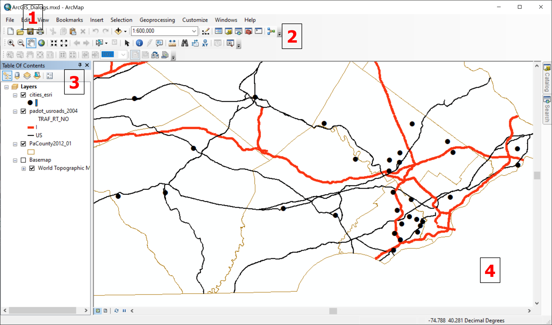
- Menus
- Toolbars
- Table of Contents
- Map
ArcMap's interface is actually an older style than most current Windows programs. The more common interface now uses "ribbons" or tabs of menus above the working area of the program window. The ArcMap interface is based on Menus, which drop down with additional choices, and toolbars, featuring icons representing tools that respond by performing actions within the software (map operations in the case of GIS software) or by opening up dialog boxes or other program components for further interaction. We will use relatively few of the menus and tools in this introduction to GIS. Even so, it is important to learn to recognize them by their locations and (especially in the case of tools) appearance. It turns out that there are frequently multiple ways to accomplish the same operation using different tools or using menu choices instead of tools. In reality, most ArcMap users will learn one procedure with one set of tools or menu choices and stick with that.
Once running on your PC (see next section, below) your basic workflow involves starting the program, creating a new map or opening an existing one, and adding and manipulating map layers. ArcGIS allows for the full range of types of map layers: points, lines, areas and aerial photographs. The maps can be any size and shape, and can be published for distribution on paper, via computer documents, or on interactive webpages. The map features in a layer can come from many sources: layers published and distributed by existing websites, layers created in the course of research fieldwork, or even layers created by compiling a list of latitude-longitude locations or street addresses. In short, ArcGIS can take care of pretty much any map scenario out there.
Accessing ArcGIS Software
ArcGIS
We must start by recognizing that teaching with ArcGIS presents challenges. The ArcGIS software that was used to illustrate the concept above, and which will be used to learn about GIS in this course, is the most widely used and respected program available. However, ArcGIS can be expensive outside academia. Fortunately, we have free access to it as MU students and employees. On the other hand, it only runs on Windows PCs, not on computers with the (Apple) OS X or Linux operating systems, which causes difficulties for use in a larger class such as this. It is also a very large and complex computer program, which can be intimidating.
Note, there are quite a few alternative GIS software products available, and some of them are free. You are welcome to try any others you may come across or that are recommended to you. Although I have not tried very many of these, the ones I have tried are similar to ArcGIS. Icons and workflows may vary, but the same conceptual program elements are generally present, and they even use the same data file formats.
If you Don't have a PC...
If you are operating a Mac (or related product) or a Linux machine as your computer, you must use the vLab View Client as a virtual machine to access ArcGIS, unless you have the ability to (dual) boot your computer to Windows. If you have a Windows PC, you have a choice of installing a student-licensed version of ArcGIS or using the vLab virtual machine version. The advantage of the latter is that it will consume less memory and other resources of your computer because most of the work is happening on the university’s servers. There are also versions of the vLab View Client that will run on tablet devices, but I do not recommend that for trying to run ArcGIS. ArcGIS is really designed around mouse and keyboard use to an extent that fingers or tablet pens cannot reproduce.
ArcGIS Licensed for Students
To obtain the ArcGIS software for use on a Windows 10 PC, you will download it and install it. First, however, you must be given an Authorization Number (I will send it to you via e-mail, so please contact me as soon as possible). You must then register with Esri on-line before attempting to download and install the software. Repeat: your authorization number must be activated by first creating an on-line student account with Esri before you can install and use the ArcGIS software. This is a full working version of the program, but your license to use it expires after one year (at which time it can be re-installed).
If you want to install the downloaded copy of the ArcGIS Student Edition software, please keep in mind that the program is huge (nearly 1 Gb, or gigabyte), so you will want to do it via the fastest connection possible.
Once installed, access it from your Start menu, where you will find a folder named ArcGIS with a group of different programs that are all part of the bigger ArcGIS software package. Again, the only one you will use for this course is ArcMap.
Running ArcGIS using the vLab View Client
These instructions will enable you to create a "virtual machine" by installing a product called the "vLab View Client" from VMware, also identified as the "VMware View Client" and "VMware Horizon Client." The vLab View Client is essentially an imitation Windows PC with preinstalled software that runs within a browser-type window on your computer. The vLab computer has ArcGIS already installed. To run it, double click on the ArcGIS folder on the vLab desktop and then double click on "ArcMap." The only reason for using vLab in this course is to be able to run ArcGIS, but you may find that other programs installed within the vLab View Client are also useful. It basically reproduces the setup of any of the MU public computer lab PCs.
The access point for using the VMware View Client is accessed here within the MU "Wiki" system: "vLab: the VMware View Client. If my link does not work for you, go to the main university webpage and search on "vLab." The first search result takes you to that same page. There are actually two options for using vLab, although that is not clearly stated for you.
Option 1: If you follow the link on that main vLab page, rather than install anything on your computer, you are just opening a link in browser on your computer. It opened in my Firefox browser just fine. I can imagine that a browser with greater security settings might not accept the website; in that case you could try opening the link in a different browser. If you use this version, you will find difficulty with saving files; once you close that browser window, anything you did within that virtual PC is gone, even if you thought you saved it to the vLab desktop. You do have alternatives. They involve having an online file storage site, such as Google Drive, OneDrive, DropBox or something similar. Each of those sites has apps that you can install on your computer to access them easily, but you can also log in to those sites from a browser window. Accessing them through a browser within the vLab webpage view will allow you to save files you create when you run ArcGIS within vLab so that you can access them later from your own computer. NOTE: All MU students have a free OneDrive account as part of your university computing privileges. On campus, you can access it when you log in to campus computers (I believe), but it will not show up on the vLab View Client. To access it from the vLab View Client, type "onedrive.com" into the address bar of a browser, and sign in with your MU username and password.
The most awkward aspect of using the vLab View Client, especially if you are a Mac user and not a PC user, is understanding where files are stored. For non-PC users, the Windows program used to find files is called File Explorer. In File Explorer, the left side of the program window shows the folder tree. It has two sections, one labeled Libraries and the other labeled Computer. It is important to keep in mind that these refer to the remote computer on which the vLab View Client is really running, not to your computer. Your best option, while your vLab browser window is open, is to save all files to the vLab "Desktop" and then copy them to an on-line storage site, as described in the next paragraph.
On-line storage sites: Currently, the only way to copy data files from your computer to the vLab virtual machine displayed in your browser or from that machine back to your computer is via an on-line storage site. All MU students have one called "OneDrive – Millersville University" or you might have your own Google Drive, DropBox or something similar. On campus, you can access OneDrive when you log in to campus computers, but it will not (yet) show up on the vLab View Client (apparently that feature is coming soon). To access it from the vLab View Client, type "onedrive.com" into the address bar of a browser within vLab and sign in with your MU username and password.
Option 2: Another option is to install a vLab program on your computer. On that main vLab instructions page do not follow the main link, but scroll all the way down to the link at the bottom of the page that says "Check out the vLab FAQ." The page that link takes you to is the older introductory vLab page. In the first sentence under the "How does it work" heading is a link in the text "install the VMware View Client" that is supposed to allow you to install the client as an app. It was designed for Windows and Mac computers, but I understand that MacBooks have some differences from standard Mac computers. If you try this and it still doesn’t work, then I recommend either following the previous paragraph (above), or you could call the MU Help Desk at 717-871-7777 and see if they have any suggestions.
At the time I followed those installation instructions, the links on their instruction page did take me to viable download sites, but the MU Wiki installation instructions’ illustrations did not match my experience. Essentially, the software installed itself on my Windows 10 PC, and when I started the program it prompted me for a VM View Client server. I copied and pasted "vlab.millersville.edu" (without the quotation marks) from the MU Wiki instructions page into that dialog box, and the MU View Client immediately loaded.
With Option 2, in addition to the option to transfer data files between your computer and the vLab virtual machine via an on-line storage site (see paragraph above) is that when you first log in to the app, if you have a flash drive plugged into your computer, it will prompt you with the option to recognize and use the flash drive. You must have the flash drive already plugged in; when I plugged in a flash drive after logging in it was not recognized.
GIS Data Sources
Maps Show Data
Geographers love data. Well, not all geographers, perhaps, but enough that it becomes necessary in a course such as this to talk about the importance of data to geographers.
As important as maps are in geography, and as important as it is to get the locations, shapes and other spatial characteristics of features right on those maps, the maps are also a means to present other non-spatial descriptive information about those mapped locations and areas. The descriptive information, or data, comes in a variety of formats.
Maps are Data...
- Maps are data in the sense that the producers of maps are often those who collect the data.
- Maps are data in the sense that maps are efficient ways to display data.
- Maps are data in the sense that mapmakers must understand the nature of the data portrayed on the maps.
- Maps are data in the sense that to be an effective user of maps you must become an effective user of data.
Keep in mind the distinction between topographic and thematic maps, presented earlier. The distinction was based on the number of types of information present on the map. Thematic maps present a simplified version of reality, mapping one statistical concept (or a couple of statistical concepts) at at time. For example, one map might show the average household income for each county of Pennsylvania.
Another useful distinction is based on the different types of data that can be stored digitally. Later in the course we will dig deeper into different ways to organize and classify data, but a simple distinction that will help over the next few units is the difference between numerical and textual data. A data file that stores the average household income for each county of Pennsylvania is obviously storing numerical data. Math, science and social science classes will refer to average household income as a variable. Variables can also store text data, such as the name of each of those Pennsylvania counties. Think of GIS data files as having the ability to store both the spatial instructions for drawing every geographical feature in each layer and multiple data variables describing those features.
In fact, this way of organizing the GIS information needed to create maps and analyze spatial information is so fundamental to GIS that the ArcGIS software menus and educational support materials talk much more about data, especially "data themes," and relatively little about "layers." The word "layers" is a good description of how the software works, but the concept of "data" is more fundamental to the fact that it is software and not just a collection of map techniques.
The data for such a map come from information collected by the federal government in its decennial (every ten years) Census. Every time you fill out a form for any official purpose, you are feeding the federal data machine. But, the same thing goes every time you interact with websites on-line. They, too, are collecting data about you, possibly to learn more about you personally, but definitely to learn more collectively about the larger numbers of people who visit and explore their websites.
Data Quality
In both of the senses in which we have examined maps and data, the making of maps and the collection of data for display on those maps, quality is a prime consideration. Map quality depends on accurate location of features and identification of those features. Data collection quality depends on attention to detail. Government and business decisions depend on that quality. Part of the operation of government is the communication of information to the public, and the distribution to the public of much (not all) of the information used by the government is part of that practice, as we have seen.
Government Sources:
Much data for conducting research may be available in already-collected and published formats.
Keep in mind that there is a tremendous amount of data collected by the US government, and even more data are collected by every state and local government agency. Through your university education, you are learning to be knowledgeable and considerate users of those data. In this course, you are focusing on the map-related data.
Given the challenges of collecting, maintaining and disseminating data (including via maps), the government does a commendable job of making it available via the various .GOV data portals. It has to serve many different audiences, with many different needs and skill sets.
It will be worth your while, both in this course and in others, to become and remain aware of the US government agencies whose responsibilities parallel your areas of interest, and of the websites where they make that data available. Become as expert as you can in the terminology and organization of government-collected data, and the similarities and differences between those data and data from other non-US and non-government sources.
A prime example of easily accessible published data is any data collected by the US and state governments, and published on the Internet. Every state and federal agency is likely to have a Website, and many of those agencies have some kind of statistical bureau or office. The US Census Bureau as a specific example of an agency that produces a prodigious amount of data and makes it available on their Website. Keep in mind, though, that such great quantities of data may be difficult to sift through in order to find just what you are looking for.
Sample federal data sources include:
- Census Bureau (US Department of Commerce) - publishes both the decennial population census and quinquennial economic census of the US
- Bureau of Transportation Statistics (US Department of Transportation)
- National Center for Health Statistics (US Centers for Disease Control and Prevention)
- Bureau of Justice Statistics (US Department of Justice) - publishes crime data
- National Center for Education Statistics (US Department of Education)
- National Agricultural Statistics Service (US Department of Agriculture)
- A number of agencies publish environmental data
Government-produced data and government-funded data are, in the US, considered to be in the public domain, as long as they do not reveal personal information about people. That means that most such data are free (except that some nominal charges to cover printing or distribution costs may be imposed; the USGS topographic maps are a prime example of this). The reasoning is that our tax dollars have already paid for the data collection. If such data are available, then acknowledgement is due to its publishers.
Some data are collected by independent organizations, and are therefore not free. There are also private companies who take free government-collected data, repackage it in various ways, and sell it.
The US government has established a policy to make GIS data created by its agencies as freely available as all other types of data. In other words, unless it can be manipulated to reveal personal information about individuals, it is made available free of charge to download because taxpayer money was spent to create it. State and local levels of government have generally taken the same approach, but have not necessarily collected information in the same categories or of the same quality as the federal government (or as each other). Non-governmental organizations and foreign or international governments and agencies have also been less consistent in their data sharing policies.
The "flip side" of the data coin, however, is that the federal government usually does not need its data to be as detailed as do state and local governments. If you try making a map of the MU campus using only files from federal sources, it will be frustratingly unrealistic. At the same time, even though local governments have the need for greater detail in their maps, they are often burdened with a more expensive process to create the detailed data. Consequently, while many have made those financial expenditures, and have reaped great rewards for having done so, there is great inconsistency at the local level.
Here are two governmental data sources suitable and appropriate for many of you (the links will take you to the respective pages):
- The US government orignially found itself with many different agencies producing GIS data for different purposes, but often with great duplication. They formed an inter-agency commission, the FGDC or Federal Geographic Data Committee, which now serves as a single source for all federal geographic data. The FGDC has compiled many data sources in one website, which they call GeoPlatform.gov (FGDC) They ask you to register on this website, but this provides access to a large quantity and variety of government data..

The FGDC's "GeoPlatform" site. - The state of Pennsylvania had one agency, PennDoT (the Pennsylvania Department of Transportion), take an early interest in GIS. As interest in GIS grew, and they faced similar inter-agency overlap, PennDoT took the lead. They also teamed with Penn State to create a GIS data repository, which is now used by all Pennsylvania state government agencies. The site is known by its initials, PASDA, which stands for Pennsylvania Spatial Data Access (PASDA). PASDA also allows local governments (counties, mostly) to use the site to distribute their data. An easy way to start is to look for state government agency names in the "SEARCH BY DATA PROVIDER" search/list box.
The Pennsylvania Spatial Data Access or "PASDA" site.
Try it:
Use PASDA
Visit the PASDA website (use the link above) and find the link on the right side of the PASDA homepage to the list of "Boundaries" data.
Look for the row with the "Pennsylvania county boundaries" layer in the table that appears next; this layer serves as a good base layer for most maps of Pennsylvania. The layer name is a link to the Data Summary page for that layer. The second link below the layer title ("Download") is the one that starts the download process. The other icons offer different ways to preview and download the data files, but the Download link is the most straightforward.
When the file download has completed, find it in your computer's Downloads folder. It arrives as a ZIP file, which is a special format commonly used to download data from online sources. Its purpose is to compress the file to make it smaller so that it downloads faster. Click on the file to select it, and then right click (in Windows) or control-click (on a Mac) to reach the procedure for unzipping (or extracting) it. That step will probably save the data files (see Shapefiles discussion below) in their own folder, but the best thing to do is to copy them from that folder and save them to the data folder you have created for GIS data.
In your GIS software use the Add Data tool to navigate to that data folder and bring the shapefile (layer) into your map window.
Before you leave the PASDA site, search for a state highways layer or a layer on any other data theme that interests you. This site has hundreds of layers available, Some of which are county layers or come from other very specialized projects.