Basic Map Design Concepts
Review the Basic Mapping Process
Recall the four-stage process to create a map:
This topic will build on our previous discussion of cartographic basics. There we explained the importance of establishing a clear purpose for the map, and we also reviewed the decisions we make to compile the map. Now we will focus on the additional cartographic guidelines for composing maps.
- Determine the map's purpose.
- Compile the map.
- Decide which layers to include: consider precision and accuracy.
- Decide the map's scale: determine its size and extent.
- Decide how to resolve distortion issues: determine the map projection.
- Decide on all map symbols.
- Decide which features need labels.
- Compose the map.
- Add all other information: statistical or textual (title, legend, etc.).
- Position all the above elements within the viewing page.
- Publish or present the map.
So, map composition starts with acknowledging that the map fits within a document or stands alone as a separate composition. The discussion about map composition must recognize that the audience, who are vital to the map's purpose and the selection and styling of the map's content, which is the visual focus of the map's compilation, must integrate with the map's appearance. The reader's view of the map takes place on a page in a book or periodical, or even on a poster. Map composition is taking the information content of the map, both within the map's area of the page and just outside that page space, and making it comfortable, clear and even appealing. This aspect of cartography owes a lot to the study of design undertaken by many who have studied art.
GIS Software for Cartography
Even though GIS is a powerful tool for collecting and integrating map-based data, and building maps for analytical purposes, the same software does not necessarily produce great presentation-quality or publication-quality maps. The professional-grade GIS software, such as Esri's ArcGIS, is gradually becoming better cartographic software. At the same time, the software is the computer programmer's translation of how cartographers work, and the programmers don't quite have it completely right yet.
In ArcGIS the process for compiling the map takes place in the map window we have been using for all of our work so far. In this unit, though, you will begin using the Layout window, explained below. This represents Esri's acknowledgement that the compilation or construction and functionality of the map has considerations that are separate from the composition, or presentation, of the map.
The cartographic approach of ArcGIS is built around the concept that the Map fits within a Page. The page is not necessarily a sheet of paper (or its digital equivalent), but any rectangular space within a document. Having an accurate sense of the dimensions of those spaces helps in scaling the map, its legend and other map page components (these will be further explained below).
Goal:
Since your first assignment requires you to make a map using GIS software, I want to stress the importance of making clear and effective maps. Colors should be used effectively and fonts should be chosen that are easy to read. The map and page area that it fits into should be uncluttered, and any information that I require as part of your assignment should be large enough to be easy to find and to read.
Cartographic Context
The Map "Page"
The map page is generally rectangular and the map itself could be rectangular, like the USGS quadrangles have been, or could be very irregular in shape, such as a map of the US or North America. We will start with the concept that a rectangle or box could be constructed that fits the map tightly. We will call this rectangle the "map area," in contrast to what we have been calling the "map page." It is worth noting that this representation is becoming blurred by the fact that a "webpage," while clearly a "page" even in the traditional sense, is often virtually dimension-less because of the variety of lengths and widths imposed on it by various browsers and devices. Still, it is worth developing the concept of the map page since there are many other means for publishing or presenting maps.
Starting with the map area, the map page must provide space for all these elements:
- Map area(s): includes the main map and map insets, such as Alaska and Hawaii on a typical map of the United States.
- Title, Subtitle (may include data date): not used if there is a caption.
- Legend: not needed if symbols are self-explanatory.
- Scale: allows for distance measurements, but also to demonstrate relative sizes.
- Grid or Locator Map: used for location reference.
- Grid or North Arrow: used for direction reference.
- Source(s): should include source dates.
- Cartographer/Publisher identification: this should be minimal, but should include the publication/copyright date (just the year). The publishing organization's logo can substitute for this.
Each of these map elements must be assigned a relative importance. The cartographer has to look at this list, decide which elements will be required on the map being created, how much space to give each element and where that space should be. The map area should be the largest element in the map page, because that is the point of creating the map in the first place. Everything else is subjective; there are no fixed rules. However, realize that every element has its relative important, which should correlate to its size within the map page. For example, the identity of any information source(s) and the identification of the Cartographer or Publisher, while necessary to avoid charges of plagiarism, will usually appear in the smallest font sizes on the map page.
Positions within the map page are also subjective, but should follow similar guidelines. The more important elements should be higher or more central on the map page, and those that are less important to understanding the map contents can be pushed to marginal areas lower down within the map page. The following image shows the concept of the Visual Center of the rectangular map page. This is the spot within the map page where the reader's eye is drawn first.
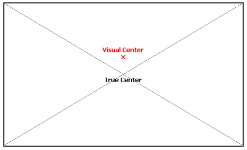
The other subjective goal is that these elements of the map page should be visually "balanced," so that there is as little empty white space within the map page as possible. For example, do not left-justify all of the map page elements; instead, left-justify some, center some (especially the map area) and right-justify some.
Topographic Map Design
Topographic Map Elements
One way to exercise your understanding of the concepts being presented here is to look at existing examples of topographic maps published for viewing by others. Of course, the Internet provides many examples, though in the context we are discussing here such sites as Google Maps will not work. Ironically, the USGS topographic quadrangles may not be the best examples either, because they were published as a series and intentionally decided not to reproduce the legend on each map page (although all of the other map elements are presented well); of course, they are also a good example of map design in the sense that their symbols are well chose to the point that the legend probably is not necessary anyway. Rather, use the Google Image search engine and find examples of stand-alone images of maps that are presented as well-composed pages and that contain multiple map elements. It is very true that the Internet contains as many examples of poorly designed maps as it does well designed maps, so part of your "exercise" here should be to decide which ones are accomplishing the goals suggested here and which ones have not.
Good examples of topographic maps to think about in this cartographic context, are:
- Highway maps produced by state highway departments, AAA and similar organizations
- Classroom wall maps
- National Geographic's many general purpose maps
- Textbooks for courses about specific regions of the world
- Government-produced general purpose maps of specific areas within their domain (international, national, state, county, etc.)
Topographic Mapping Conventions
One of the principal functions of most topographic maps is to show measurably accurate locations. They present a comprehensive view of a map area, combining multiple types of information, because it is usually important to see where those different ground features are located relative to each other. By "relative" there, we mean how far apart objects are, and what direction is one object from another.
Great topographic maps are difficult to produce quickly or automatically, as you will see if you spend a little time exploring the on-line map sites such as Google Maps and similar sites. One of the conventional practices you will find is that the widths of roads on the maps are not as narrow as the actual road surface, but are as wide as the lettering for the road name labels. Even the USGS quadrangles suffer from this problem. They have established a minimum symbol size for certain features, the best example of which is the line thickness with which small local two-lane roads are depicted. If you physically measure that line thickness and multiply by the map scale, it would prove to be much wider than most standard roads.
A good practice for high-volume cartographic work (such as for a government agency or publishing company) is to create a list of map layout conventions you will follow on a particular map project. This can also be extended to include compilation decisions as well as composition practices. Such composition decisions as where to position the map title and what font and font size to use, or where to position your organization's logo in the map margins make the larger workflow much more consistent and easy to accomplish.
The ArcGIS Layout View
Map Composition starts with the Map
Open A Layout View
Map compilation work in ArcGIS generally occurs in your map as displayed on a Map view (tab) in the main part of the program window. In fact, most of your interaction with ArcGIS Pro's compilation capabilities happens in the Contents list on the left side of the Map window along with some icons in the menu ribbon and dialog boxes that open from the right side of the window. As noted in the list above, compilation includes adding layers, setting the map scale and map projection, symbolizing and labeling each layer. All this work must be done before the map composition work begins.
Map composition takes place in a "Layout" view. There is no layout view by default, so you will have to add one as an additional tab in the main area of the window. This is one part of your work in ArcGIS Pro that will take you outside of the Map menu ribbon. There are two steps to adding this layout view displaying your map.
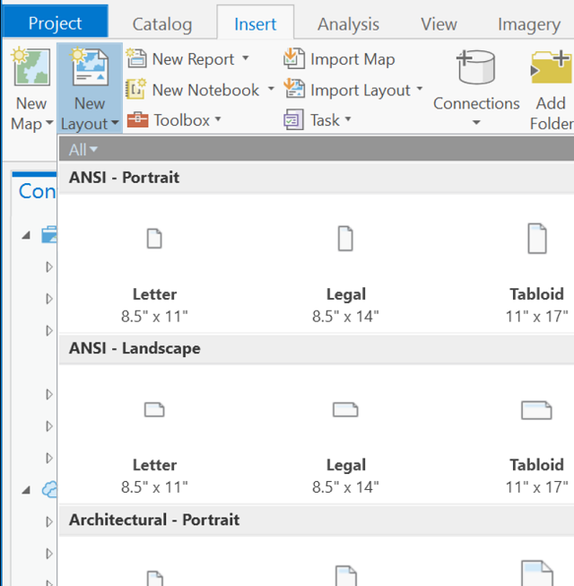
- On the Insert menu ribbon, the second icon is the "New Layout" icon. It initially opens a panel that allows you to select a page size and shape; choose one that fits the proportions of your map, even if you do not intend to print it on paper. For most applications you will find it beneficial to make sure that the page size is set for 8.5" x 11" (Letter) and the page orientation is set to whichever best fits your map. If you are creating a poster or another large-format map, change it to that size selection. The goal is that whenever you specify font sizes or symbol sizes, you are more likely to get what you expect. Click on the selected layout format to add the Layout tab to your ArcGIS Pro project.
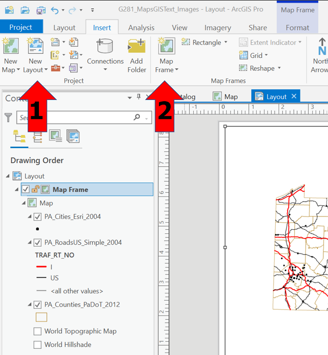
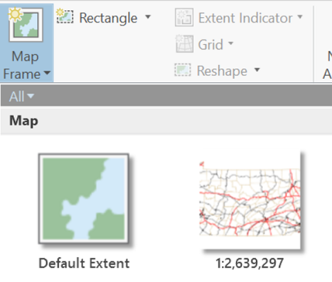
- Initially, the Layout view will be blank. On the same menu ribbon (Insert), find the "Map Frame" icon. Click that to expand a list of available map frames, which is how ArcGIS Pro defines your Map view. It is possible to have multiple maps in ArcGIS Pro, but at this level you are likely to have only one. Select the one that is a small image of your map with your map's scale stated below it. Click on that small image. Initially nothing will happen; to make the map draw on the layout view, click in one corner of the blank layout and drag a rectangle to the diagonally opposite corner. Your map will appear.
As noted above, it is advisable to finish all map compilation actions before switching to a Layout view. While it is possible to switch freely between the Map view and Layout view, there can be unexpected consequences to the Layout if you change something as significant as the map scale or map projection in the Map. Even simple changes such as changing one layer's symbology from Single Symbol to Unique Values will have an impact on the Layout view if the legend for that layer (see below) has already been added to the layout.
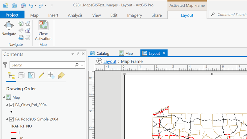
It is also important, once a Layout view has been added to the project, to pay attention to which tab you are viewing at any time. You will notice that both have a Contents list to the left of the map, so the two views are easily confused. Also notice that the former Map menu ribbon has been replaced by a Layout menu ribbon.
As an example of the confusion that can result when you have both a Map view and a Layout view in your project: on the Layout menu ribbon the Navigate tool now moves the entire page and the tools to its immediate right also control the page. Using the zoom controls will not change the map scale; they will only change the page size. There are a few additional tools toward the right end of the Layout menu ribbon that can be used to zoom the map in or out within the layout in a limited way. Greater control can be taken by clicking on the "Activate" icon within that same area of the ribbon. The menu ribbon then switches back to the familiar Map menu in its normal position at the left end of the menu ribbons; at the same time a different Layout menu ribbon (for the "activated" map frame) has been added at the right end. To get back to the Layout view controls click on that Layout menu ribbon and click on the icon labeled "Close Activation."
Additional Layout Controls
Again, working in a Layout view reflects the fact that your work is now focused on the finished map. The main advantages to working in Layout view come if elements such as a map legend and title are required on the finished page.
The Map Title and Other Text
The purpose of a map title is like the purpose of a book or essay title. It should be relatively brief and it should convey the purpose or content of the map, so as to attract a potential map reader to look at it a little more closely. Some titles are relatively dry but informative, such as "Population Density of Pennsylvania Counties," while others can be a little more provocative, such as "Where to Go for the Best Ice Cream." The style you choose, of course, must depend on the map's purpose, which as we said includes consideration of the projected audience for the map.
The need for a map title depends on whether the map stands on its own, as a separate document, or the map appears within the space of a "figure" with a caption in a text document such as a book or article or essay. In the case of a stand-alone map, such as a poster or a handout at a meeting, the title must be the second most visible element on the map page (after the map itself). In the case of the captioned figure in a published document, especially where that document is more academic, the caption will include the map title, some description or explanation of the map's purpose, and probably the source citations for data or map layers used in the map. Since books or essay projects are usually on 8.5" x 11" paper or smaller, the advantage of using figures with captions is that rest of the map elements (the map, its legend and other necessary elements) can be a little larger within their relatively small allocated space. In either case, whether the figures have captions or not, the text of the document should refer the reader to examine the map and tell the reader what to look for.
Adding a map title happens in an area of the Layout view's Insert menu ribbon. Toward the right end of that menu is an icon group labeled "Graphics and Text" (see below). If your intent is to add a map title, the third option, whose icon is a capital A, works best; if you hover your mouse cursor over it, it will be labeled "Straight text." Once you click on it you will be presented with a small dialog box asking for the map title. Type the title and close the box, and you will be able to move the title into position.
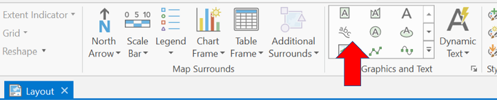
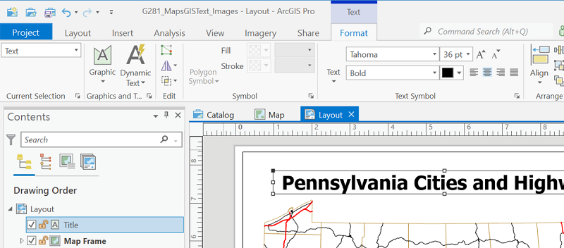
The title, or any other text features you add, may need some additional formatting. To accomplish that, the types of controls you see in word processing software are needed, which ArcGIS Pro does provide. AFter the text item (map title or other text) is added you will see a new entry, probably labeled "Text," in the Contents list to the left of the Layout view window. When you click on that item in the menu an additional menu ribbon is added titled "Text Format." The image below shows a shortened version of that ribbon but the Text Symbol group of icons is clearly visible above the selected map title.
Looking beyond the map title, the other important text elements are usually explanations of details about the map, such as presenting your data sources or other content decisions that are not easily explained in the map legend. For stand-alone maps, any details related to the data sources, map limitations or other ideas should be included. The reason is that this is likely to be the only resource the map reader has to understand the context of the map. The cartographer has to treat the stand-alone map like any other document and cite sources so as to avoid any appearance of plagiarism. If the map is within a document in which the writer explains the significance of the map, then significant details can be included in the text or the caption, and any additional details to be included on the map alone should be relatively minor and therefore appear in relatively small text positioned lower within the map page.
The Map Legend
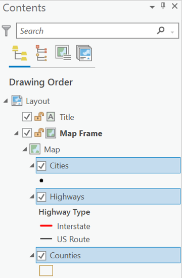
One of the keys to having an effective legend is to make sure your layer is represented well in the Table of Contents. This starts with effective symbology, as covered in an earlier unit, but also includes the labels next to each symbol in the Contents list.
- The layers get named after the shapefile used to add them, but you can change the layer name simply by double-clicking and retyping it. Changing the layer name in the Contents list does not change the file name on your computer. When you create the Legend, though, it uses whatever layer name is showing in the Contents list.
- For a layer that is symbolized using categories, such as "Unique Values" or "Quantities" symbologies (which we will examine later in the course), the Contents will show the attribute table field name under the layer name. These names will also appear in the default legend. As stated for the layer name, changing the data field name here does not change anything in the attribute table, and to change the field name in the Contents list, just double-click it and type a new name.
- Also if the layer has multiple feature categories defined in a Unique Values symbolization based on the values in one attribute table field, the Contents list will show multiple symbols for that layer. Next to each symbol is the corresponding attribute table value. Like the two scenarios above, you can change the individual labels next to each symbol in the Contents. Also like the other scenarios, changing what is displayed here in the Contents list does not change the data values contained in the attribute table, but does affect what appears in the legend. Remember to capitalize where appropriate.
Remember that the Contents list is visible in both the Map view and Layout view. For changing labels, it does not matter which view you make the changes in. However, it is best to do all this work renaming map elements in the Contents before you add the legend to the map page. It can also help to understand that in addition to changing the labels in the Contents list for a layer's name or the name of an attribute field containing categories (but not for the category names), you can delete that name. It will delete it from the Contents list and also from the legend, which can sometimes remove awkward legend appearances.
Also keep in mind that not every layer in the Contents list has to appear in the map Legend. Examples of layers that you could avoid including are those whose symbols are very conventional (like a layer of rivers and streams) or layers that are secondary to the primary purpose of the map (like the layer of county boundaries on the map above). Remember, though, that decision must be based on your map's purpose and audience. My revised labels are shown in this version of the Contents list for the Layout view.
Designing the legend is a little more complex than adding the title. It starts the same way: with the Layout view active. It is important to keep in mind .
- In the Contents list, select (hold down Control key while clicking on additional layers) each layer name that should appear in the legend, as illustrated above.
- On the Insert menu choose "Legend." The first thing you see will be a set of choices that all look the same. The first choice is the simplest. Upon making that selection, nothing appears to happen. The legend will appear after you move the cursor to the area of the map where you want the legend to fit and click once to start a rectangle and once again to close the rectangle surrounding that space.
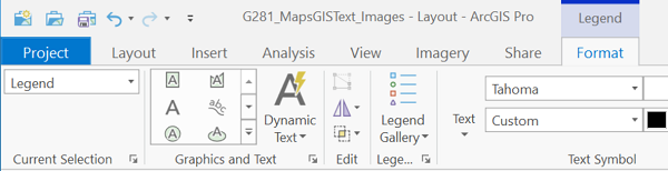
- The first attempt is usually not acceptable. Click within the legend and you will see a Legend Format ribbon menu appear above the map. It is important to remember two things: first, that the Legend is linked to the Contents list; and second, that the legend, even a simple one, is treated by the software as a potentially complex collection of boxes, symbols and text. The Legend Format ribbon is challenging to navigate and is a difficult dialog in which to find specific controls or measurements. At the level of this course, we will not worry about achieving the perfect legend. Some aspects can be controlled by changing the width and height of the legend box.
- Here is one example of the steps needed for a simple legend change. One of my pet peeves is that ArcGIS gives the legend a heading that says "Legend," as if your map's readers will not know that. If your legend is complex or you are adding multiple legends, then there may be some need for a descriptive legend title, but that is not common. To remove that heading, first make sure the first box at the left end of the Legend Format ribbon says "Legend." Click on the arrow to the right of "Current Selection" below that box, as shown in the first image below. That will open a dialog on the right side of the main window area shown in the second image below. The second set of controls is titled "Legend" and includes a checkbox labeled Title. Uncheck that box as indicated below and the legend heading will be deleted.
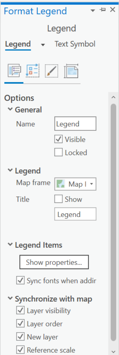
The final thing to note is that when you have added a legend an entry is added to the Contents list in the Layout view. This gives you two pathways to make changes to the legend: either double-click within the legend on the Layout view's map, or select and expand the Legend entry in the Contents list. The Contents list Legend entry also has the conventional checkbox allowing you to turn the legend off or on.
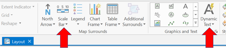
North Arrow
Another common element of maps is the North Arrow, which can also be added using the Insert menu, although it is usually not needed. One challenge we have already talked about is that north arrows are usually wrong on smaller scale maps, where a latitude-longitude grid would be teh best way to include direction indicators. Another challenge that points to the north arrow being unnecessary is that they are usually superfluous in the realm of digital mapping. Nearly all spatial GIS data sources locate features using established grid coordinates, usually latitude-longitude or a related projected coordinate system. The map projections (or lack thereof) with which the maps are usually displayed have coordinate systems that place North at the top of the page. It is to the point where a north arrow that points in any direction other than the top of the page is very unexpected. Especially if the audience for your map can be presumed to be familiar with the mapped area, it is usually best to omit the north arrow. Even if you have an empty space on the map where the north arrow would fit "perfectly" all it does is to add one more element for map readers to take in: more visual clutter.
In cases where the direction details of the map are important to achieving its purpose, especially for smaller scale maps, adding a grid is a better alternative. The grid can serve two purposes: providing that sense of direction and also providing the location context. If the map appears in a document that refers to locations using their latitudes and longitudes, then the grid becomes important. However, if the grid is less essential, it is best to avoid it as it adds more clutter to the page. On topographic maps, clutter is the enemy of readability.
There are two general options for adding grids in ArcGIS. Grid layers are available that can be added during the compilation stage of the mapping project, which you can customize with particular line colors and position where you need them in the layer stack. For example, if the grid should be visible over oceans but not over continents, it can be stacked below the continents layer in the Contents list. Adding labels for the latitude or longitude of each line can be challenging, however.
On the other hand, there is a procedure for adding a Grid in ArcGIS Pro on the Layout view's Insert menu. It will not be visible at all in the Map view. The Layout grids have default positions for the labels and add a box (called a neat line) around the entire map. The dialog for setting up the grid and for overriding the defaults (such as whether the grid lines appear over all other layers or how the labels are formatted) has many controls, and can be intimidating. As with the other Layout view options mentioned so far, if you add the Grid element to the map, an additional entry will appear in the Contents list along with a checkbox that lets you to turn the Grid off or on.
For the sample map that is being developed in this unit and previous units, the identity of North is not a significant need. The map is projected using a northern hemisphere conic projection and the curvature of the southern border of Pennsylvania is concave toward the top of the page, which tells us that north is also toward the top of the page. Pennsylvania is also a well-known shape for our intended audience of university students, so nothing would be gained by being more specific about direction here.
Map Scale
The decision about which type of map scale to display on a map comes down to how the map is expected to be used. Remember this advice given in the unit on Scale, Distance and Area: When it is possible or likely that a map will be enlarged or reduced from its original published scale, the only type of scale that will retain its validity is the graphic scale.
In ArcGIS Pro a map scale can be added from the Insert menu in Layout view. In explaining the concept of map scale in the previous unit, three types of map scales were presented and all are available in ArcGIS Pro, though as we have seen with other geographic concepts Esri has chosen to change the names of each. The verbal scale is called a Relative Scale, the graphic scale is referred to as a Scale Bar, and the representative fraction scale is called simply a Scale.
There are two different entry points for adding these scale options. To add a representative fraction or verbal scale, choose the "Dynamic Text" option toward the right-hand end of the Insert ribbon menu. Dynamic text has several different functions in ArcGIS Pro, as you will see if you click on this menu option. The first set of options at the top of the drop-down menu is a section titled "Map Frame" and it includes both the Scale (for adding a representative fraction scale) and Relative Scale (for a verbal scale). You will also find a few variations on these two options. The benefit of using these, as opposed to typing your own text, is that if you later decide to zoom your map to a larger or smaller scale, these scales will automatically adjust.
The point was made in the unit about Map Scale that the representative fraction and verbal scales work best when the principal numbers are well-rounded ones. There is an opportunity to adjust the map scale in the Layout view to achieve that. In fact, if you switch between the Layout and Data views, you will probably see a different scale in the representative fraction box below the map. Simply type a new number in to the representative fraction scale box (you can only change the number after the colon) in Layout view to make that adjustment. Because you are using the representative fraction scale box to change the scale, this works best for that type of scale; if you need a verbal scale, you will have to work with the representative fraction scale to figure out the corresponding verbal scale. Thus, deciding the most appropriate scale to fit the map page may be a trial and error process, but your goal should be to avoid having awkward numbers after the colon or equals sign.
The other option (again, on the Layout view's Insert ribbon menu) is for a graphic scale which ArcGIS Pro calls a "Scale Bar." Making this choice opens a relatively simple Scale Bar selector dialog showing a variety of graphic scale styles in either imperial or metric units (see below); selecting any of them inserts a version of the scale with default characteristics. As with the map frame and legend, the scale will not be inserted until you click and drag a rectangle in your preferred location on the page. Note that ArcGIS will set default segment lengths and labels that present a reasonable scale. The simplest way to modify these is to adjust the length of the scale.
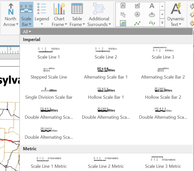
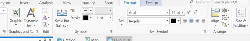
As with other Layout view elements, adding a graphic scale also adds another entry in the Contents list. While that Scale Bar entry is active, two new ribbon menus are added. One is called Format which allows you to make adjustments to the appearance of the basic components of the graphic scale such as the text elements, as shown below. The other is named Design and it enables modifications to the sizes of the segment lengths and positions of the labels in the scale. The latter also includes a setting to add what we called a "fractional part" to the graphic scale (their terminology is "Show one division before zero").
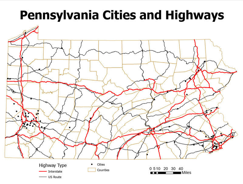
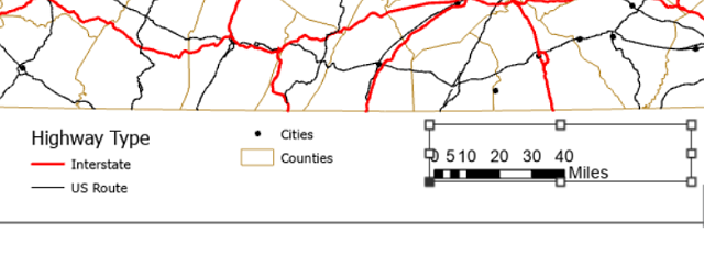
We are now at the point to display the finished product for this simple map. The layers were chosen to show the relationship between cities and highways in Pennsylvania. The map's symbols reflect the features being shown without distracting from each other. It was determined that labeling the cities would produce excessive clutter. The page dimensions fit the shape of the state well. After the map, the title, legend and scale are the most important features, while a north arrow was deemed unnecessary. The finished product is below.