Terrain Representations
What is Terrain?
The surfaces on which most maps are presented are flat. Of course, we know that the Earth is round; we dealt with that added complexity by introducing map projections. But, more than that, the Earth is also uneven; most of its land areas are not smooth flat surfaces like the paper or computer screen that maps are usually viewed on. That uneven surface is what is meant by the term "terrain." The purpose of many topographic maps is to represent terrain in a way that allows map readers to investigate such elements as the slope and orientation of a hill or the direction of flow of a river.
All the techniques for representing terrain that are illustrated below are constructed beginning with contour lines. The results are different in each case, but if you recognize that common starting point, then it will probably improve your understanding of both the interpretation of contours and these terrain-representation techniques.
It turns out, though, that until the advent of interactive computer graphics (to be discussed below) the only ways to show you the unevenness of the Earth's surface required the cartographers to lie to you. The cartographer or illustrator had to devise ways to trick you into seeing the land area depicted on a map as uneven, even when the paper or computer monitor it was drawn on was flat. Using techniques borrowed from artists and verified by psychologists or psychiatrists to insert deception between your eyes and your brain, these terrain representations almost always work.
Layer Tint Maps
The Layer Tint Concept
Layer Tint maps are generally used as classroom wall maps, although you will find them in a few other applications, too. The color scheme is standard, each color representing an area with a certain range of elevation. The colors invariable start with a darker green at the lowest elevation, continue with lighter and lighter greens representing the next couple of elevation ranges, and then proceed into yellow, possibly orange, and then brown. Some layer tint maps finish with the highest elevations in white, suggesting the existence of snow-capped peaks at the highest elevations.
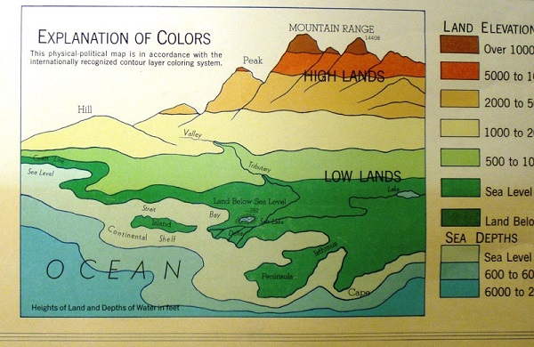
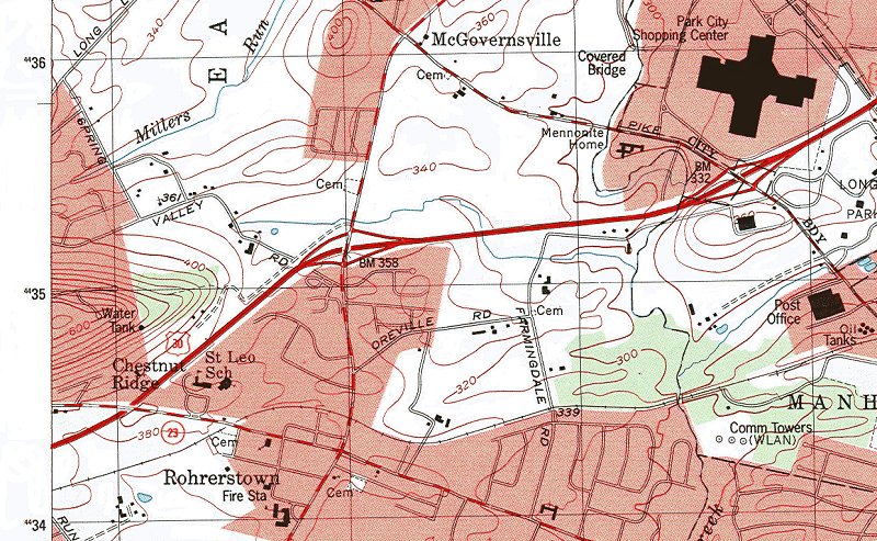
Notice that the lines separating the colors are contour lines. Contour maps represent the groundwork for every layer tint map. The contours shown are certainly in a range that could be found on USGS maps, but the contours on these smaller scale maps are much more "generalized." This means that they do not show the same amount of detail, that the USGS maps do. This is not the "lie" that we referred to earlier, though. Generalization on smaller scale maps is standard cartographic practice.
Layer Tint Maps: The "Lie"
The "lie" that is told to us on layer tint topographic maps has to do with the color scheme of the map. Notice that an association with vegetation characteristics is implied by the color and elevation choices. In low-lying coastal areas we expect to see more lush vegetation. At higher elevations we expect the vegetation to thin out, partly because of precipitation changes, and possibly in some areas because of temperature changes. The yellow areas tend to occur at the elevations of the dry southwestern US, or other desert areas on world maps. The brown (and white) areas tend to depict the high mountain ranges of the world, including the Rockies and the two mountain ranges along the west coast of the US. We know that high mountains reach an elevation where trees will no longer grow, "the tree line," so this looks reasonable.
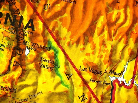
The problem is that this is not a vegetation color scheme; it is an elevation color scheme. Some areas will not be represented accurately if that vegetation connection sticks in our heads. The best example of this is the representation of Death Valley, California, shown below. With elevations that reach below mean sea level, Death Valley is represented by the darkest green on the map. How accurately does that represent Death Valley's vegetation characteristics?
Hill-Shaded Topographic Maps
The Hill-Shading Concept
Hill-shaded maps, also known as shaded relief maps, use an artistically added shadow effect to suggest the vertical dimension of the landscape. The shadow suggests that we are looking at a three-dimensional landscape. How does a shadow come to exist in a landscape? Obviously, sunlight shining across the landscape illuminates one side of a mountain, or one side of a valley, and the opposite side is cast in shadow. You see the same thing when you look at a house or a car. You even see it when you look at a friend's face. The presence of shadows is what allows us to see the world around us as three dimensional.
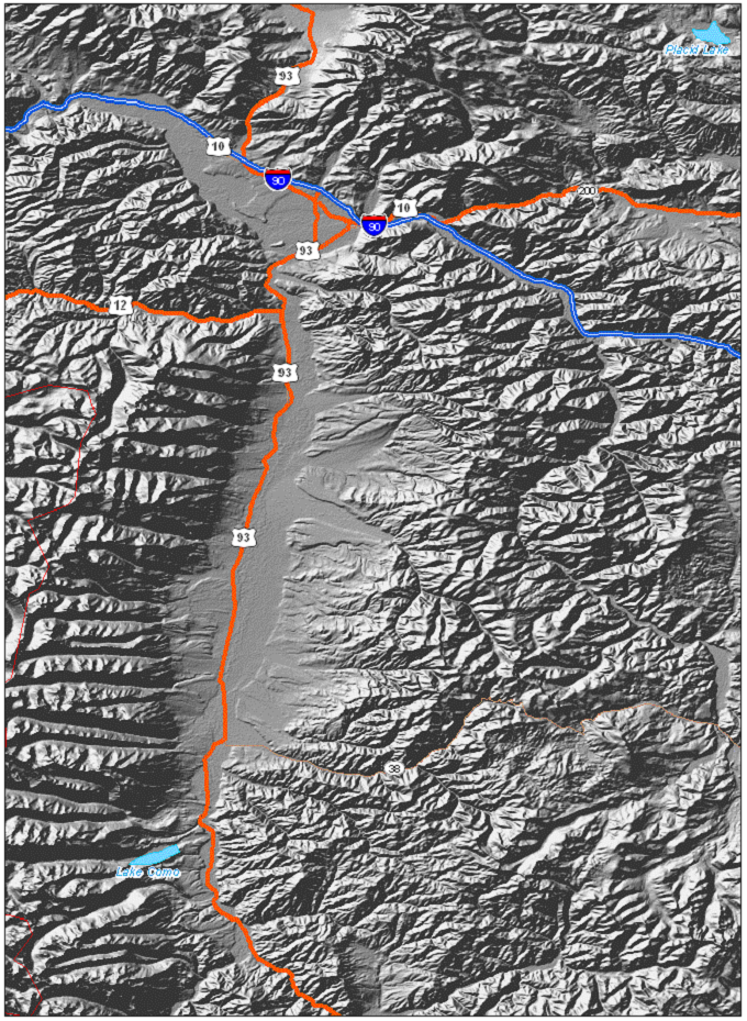
Consider the landscape area shown below. This is an area in the western United States. We see a fairly rugged landscape, with steep hills or mountains creating shadows that help us to see river valleys and other lower-elevation areas. The highway shown on the map was clearly constructed through the main valley in the scene. Which side of the hills is in shadows, and which side is illuminated? The southeast side of the hills is in shadows, and the northwest side is illuminated by the light source, supposedly the sun. So, where would the sun have to be positioned if it was to be the source of that illumination?
It is important to note that these maps are not made by copying the shadows from aerial photographs. They are "constructed" by cartographers who take the detailed contour lines from topographic maps, determine the steepness of each slope and the direction it faces, and selectively add the shadow effect based on that information. The close-up of Death Valley on the previous two pages is perhaps a more obvious example of the artistic nature of this representation.
Hill-Shaded Maps: The "Lie"
Once again, one aspect of the representation of the surface shadows is a lie. Look at the landscape image again.
Do you remember from high school Geography or Earth Science classes that the sun is only ever directly overhead between the Tropic of Cancer (23.5 degrees north of the equator) and the Tropic of Capricorn (23.5 degrees south of the equator)? The southernmost point of the continental US, the southern tip of Florida, extends to about 25 degrees north latitude.
The sun will never be northwest of any part of the continental US. Only Hawaii has that possibility, and then only around the peak (sorry, no pun intended) of summer. The sun generally shines on the US from the south.
So, the "lie" is that the sun can never shine on the landscape from the apparent direction shown. Look one more time at the map above. On the image just below I have rotated the same shaded relief image by 180 degrees, to represent the light shining on that landscape from the southeast. Do you still see the same hill features as hills and the same valley features as valleys?
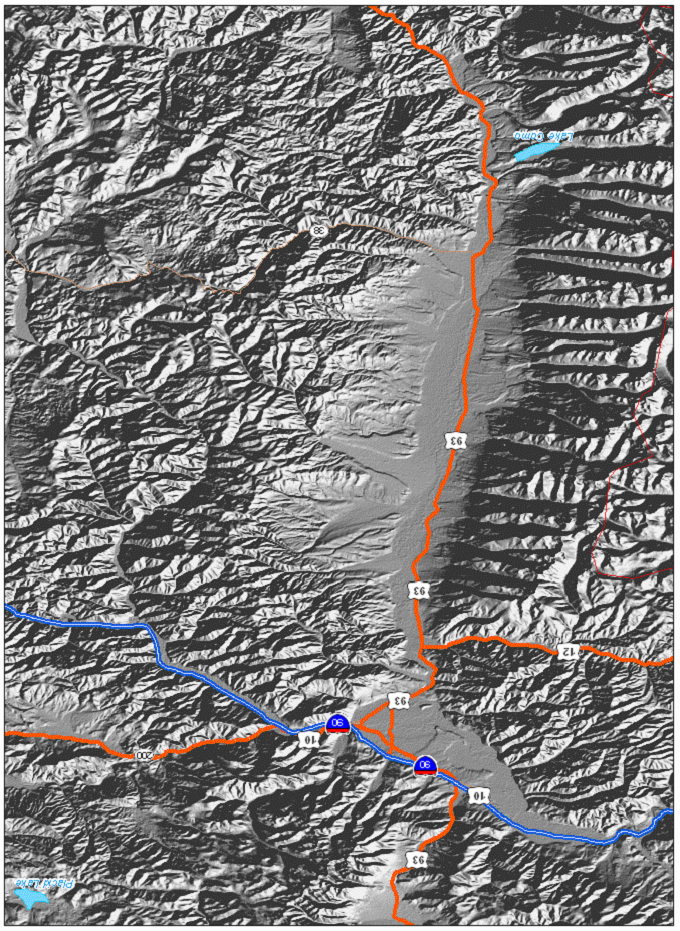
Why do they artificially represent the sun shining from the northwest? The answer is "because otherwise we would not see the mountains as mountains and the valleys as valleys." You are used to seeing the tops of things, like your friend's head, illuminated, and the undersides of things, like your friend's neck and chin, in shadow. It's how your brain knows that some features protrude and others recede. If we are going to use shadows to represent the protrusions and recessions of the Earth's surface, then we need the light source to come from the "top" of the picture.
Raised-Relief Topographic Maps
The Raised-Relief Concept: It's Plastic
Unfortunately I cannot really show you a plastic raised-relief map here on the computer. It is three-dimensional. You "see" it by feeling it with your hand as much as by looking at it with your eyes. (There is a picture of one below, but of course the picture is flat.) Hopefully you have seen one, and you can see three of them, showing Pennsylvania, the United States and the World, if you visit the Geography Department Geo-Graphics Laboratory.
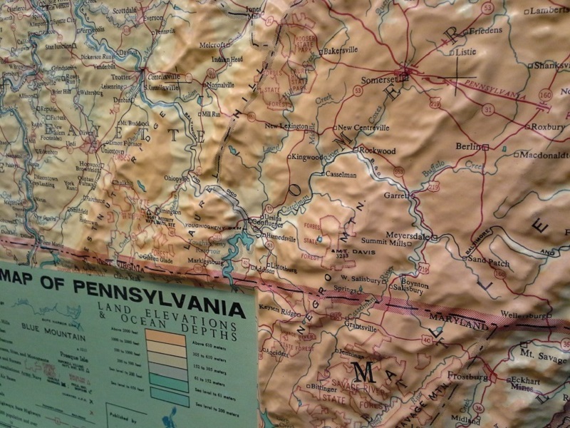
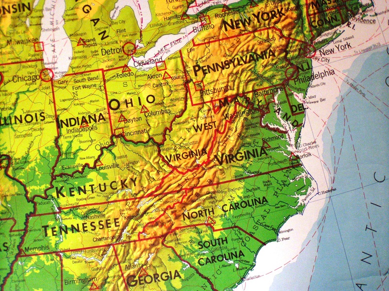
Raised-relief maps are constructed by a process similar to one some children may have been taught in elementary school or in Scouts. Look at Chestnut Ridge again in the map below. Imagine tracing the 400 foot contour line onto a thick sheet of cardboard and then cutting out the base of the hill on that line. Then repeat that process for the 420 foot contour line and stack it in the right position on top of the first cutout. Repeat the procedure for all of the elevations up to 620 feet (the top of Chestnut Ridge). You would have made a 1:24,000 scale model of Chestnut Ridge. You can even make it less "stepped" by adding a fill of plaster or similar substance to smooth out the surface.
That is the same procedure (except with more industrial-quality materials) used by the companies that make raised-relief maps. They then have the ability to apply the graphic representations of all of the lines, colors and text that you see there.
Raised-relief Maps: The "Lie"
It is an Issue of Scale: The plastic raised-relief map is really not a very good "scale model" of the real thing. Everything will be in the right location; our map-making abilities are certainly good enough for that. But the third dimension is actually poorly represented.
Find the highest point on a raised relief map, and then find the lowest point. If you can somehow measure the height difference and then use the map scale to see what real measurement that represents, you might be surprised.
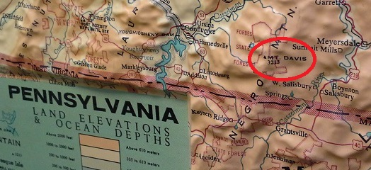
On the Pennsylvania raised-relief map in the Geo-Graphics Lab, Mount Davis, the highest point in Pennsylvania (see below), is about three eighths of an inch higher than the Delaware River at Philadelphia. The elevation of the latter location in reality is sea level, the same elevation as the Atlantic Ocean. According to the map's scale, three eighths of an inch is equivalent to a distance of about 2.5 miles, or about 13,200 feet. However, that distance does not make sense as an elevation. Mount Davis's actual elevation is a little over 3,200 feet above sea level.
That effect is what cartographers call vertical exaggeration, again a standard practice for this type of map. Without it, students would not appreciate the terrain differences around Pennsylvania. With it, though, they get the impression that Pennsylvania is more mountainous than it really is.
Terrain Basemaps
Terrain View in Google Maps
In Google Maps you can add a hillshade "layer" to whatever map area you are viewing. Google calls this its "Terrain" view. To activate the Terrain view, look to the left of the Search bar in Google Maps. Clicking on the three grouped horizontal lines, referred to as "the hamburger," opens a menu of many customizations of the map view and contents. Near the top, click on "Terrain." Initiating Terrain view removes some layers from the map in order to allow the impact of the terrain its maximum impact.
Needless to say, adding the terrain representation to a map gives a much more realistic representation of its landscape that a topographic map without it. In addition, a region with a rugged landscape will look much more dramatic than one with a relatively flat landscape. Just remember that Google's terrain layer has the classic characteristic of hill-shaded maps in which the apparent “sun” is north of the current area.
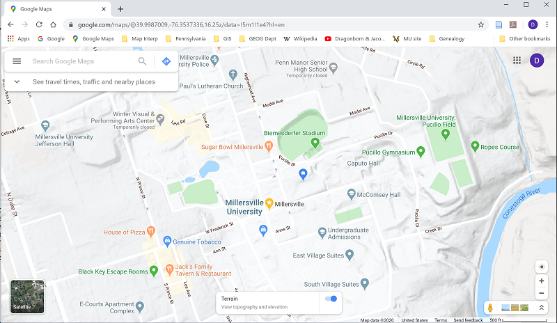
The amount of detail visible depends very much on how far in or out the map is zoomed. Zooming in very close causes the shadow effect of the hillshading to fade. Zooming out slowly from that large scale darkens the shadows and also, at one scale, "turns on" a layer displaying contour lines. The contours are not as clear as they are on the USGS quadrangles, but Google does follow the USGS convention of representing certain contours in the local sequence of elevations with thicker lines.
Terrain Basemaps in ArcGIS
Information Sources
One of the standard basemap choices in ArcGIS is the Terrain basemap. The Terrain basemap adds hill shading to the map with a range of shades of gray. This map layer is based on datasets from the US Geological Survey, so it is very well matched for maps of the US or states. Its suitability for larger-scale maps of smaller local areas in foreign countries would depend on the source(s) of their data there.
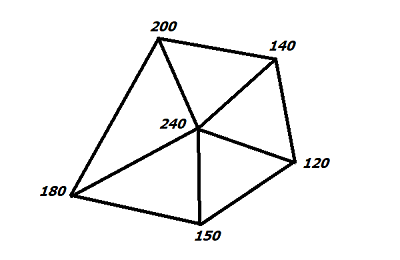
The USGS and their counterparts in most world countries have created terrain basemaps starting with the process described previously to turn surveyed elevations into contour lines. A parallel process is to turn those spot elevations into what is called a TIN, a triangulated irregular network, by connecting every elevation point with its nearby neighbors using straight lines (see below). These form a set of triangles, each of which has different elevations at each vertex. That means each triangle has unique slopes along each edge, and the surface of the triangle has a general slope (or steepness) to it. Additionally, that surface faces a specific direction relative to true north, called its "aspect." The calculations of slope and aspect can then be combined with calculations of a hypothetical sun position to decide how much shadow that triangle should be represented with. Note, the same kind of calculations are used to decide the potential for any area to benefit from the use of solar energy. Finally, the whole product is stored as a raster image.
One of the factors that makes the TIN suitable for creating hill-shaded maps is the frequency of spot elevations used to create the triangles. In the US, historically, such data have been collected many times using different technologies. No longer is manual surveying with human surveyors the primary data source. Now it is accomplished from aerial and satellite surveys using a digital device, such as a laser distance meter that sends laser pulses toward the Earth's surface and calculates the elevation based on how long it takes for that light to reflect off the surface and return to the device. The spacing of those spot elevations is from one meter for much of the continental US to 30 meters for foreign areas. A collection of spot elevation locations as features, together with all attributes collected at each location, is referred to as a digital elevation model, or DEM.
As you might suspect by now, ArcGIS has the ability to perform all mapping and calculations associated with taking a starting map of spot elevations, creating a TIN, calculating slope and aspect attributes for the TIN triangles and creating different representations of such features. These are capabilities that few users will ever need, but it does illustrate the power of GIS software.
Terrain Uses
Given that the Terrain basemap displays the natural landscape, it would generally not be appropriate to use it for some types of topographic maps. For example, if your smaller scale map's purpose is to illustrate political, as opposed to physical, features, it is still considered a topographic map. If you add such layers as international boundaries, major cities of the world, the headquarter locations of multiple international organizations and locations of on-going military conflict, it is not likely that adding the physical landscape appearance will enhance the information, and may even make it harder to see.
On the other hand, almost any map illustrating environmental topics will benefit from depicting the land surface. Elevation influences temperatures and precipitation. Terrain impacts transportation accessibility, water flow and weather patterns. As always, consider the audience and other aspects of the map's purpose when deciding to add such a "busy" map layer.
It is possible to add multiple basemap layers. Their positions in the Table of Contents stack work just like the other map layers: higher layers in the stack cover the lower layers. Another way the basemap layers imitate the other map layers is that they can be made transparent to any degree. The best way to use the Terrain basemap in this way is to make the other basemap layer partially transparent and to position it immediately above the terrain layer. This will add the hill shading to the landscape depicted in the other basemap. This use of the terrain basemap makes the most sense if your primary map features, such as selected point features or lines across the map are relatively sparse, and the basemaps will be of primary importance for giving the map its focus and context. In such cases those primary map features will have to be symbolized with strong color and size characteristics to stand out against such a complex background.
3D Mapping
What is 3D?
Traditional maps are two-dimensional, of course. That means that they are defined primarily by sets of x and y coordinates, expressing locations in longitude and latitude (or comparable coordinate systems). Three-dimensional locations require the third dimension, z, expressing elevation. There will also be additional attribute data to add the ability to symbolize your three-dimensional surface.
Think about what 3D data really does. It positions whatever feature it represents or is part of on a three-dimensional version of the world, and every point has a true position in relation to every other point. Viewing 3D features means putting an additional point into that context, the three-dimensional location of the viewer. Whereas two-dimensional maps always assume that you are overhead looking down, 3D frees us from that limitation, while at the same time adding a lot of complexity to the representation.
3D views are constructed as if viewed from an angle other than directly overhead. In a sense, internally the software is creating a 3D model, deciding on a 3D point from which a pretend viewer might look at the model, and then redrawing the model as if viewed from that perspective. It is all a matter of mathematical equations featuring x, y and z calculations.
3D Data and Software
Extensive work has been done modeling the surface of the Earth in 3D, but there is not a lot of 3D data for map elements on the surface of the Earth available yet. Higher priced GPS devices have the technology to record elevations precisely and accurately. Other data can be created by having accurate land elevations and then measuring the heights of buildings, bridges, dams and other features. That land elevation data is available, of course, from the USGS or related agencies.
Even the TIN concept discussed above adapts well to 3D data scenarios. Consider that every vertex for those triangles is a point at which the elevation has been recorded. Triangles like those shown above can completely cover an area. Creating all of the triangles possible from a given set of points simulates a real surface. TIN representations can be very complex. In addition to the initial points and resulting triangles, they can accommodate lines which interfere with the continuous nature of the surface, like dams and large retaining walls; these are known as "breaklines." The TIN can also accommodate holes in the surface, which are areas within the larger map area with unknown elevation or with a constant elevation such as lakes.
To view three-dimensional data will require additional software beyond the ArcMap program you are using in this course. ArcMap has complementary options, some of which work within ArcMap and some which are used as separate programs. "3D Analyst" is what is called an "extension" that runs as part of ArcMap after being activated. However, 3D Analyst only gives you tools to integrate and manipulate the z-coordinate data in your map; it does not include a way to view the Earth in three dimensions. ArcGIS does have companion products for that capability: they are ArcScene, ArcGlobe or ArcGIS Earth. ArcScene is appropriate for local-area (large-scale) 3D viewing while ArcGlobe is for global (small-scale) viewing. Both are part of ArcGIS Desktop, along with ArcMap and other programs. ArcGIS Earth is Esri's online answer to Google Earth, and allows users to view layers draped over an interactive globe.