Geographical Data Characteristics
Data Terminology: Observations and Variables
We saw, early in this course, that Geography is a discipline of great breadth. The types of research that geographers conduct extend over a wide range of academic concerns. While not all geographical research is spatial, and not all geographical research requires data collection, the vast majority do meet both of those criteria. Our focus in this unit is on just such spatial data.
Data in general have two defining characteristics:
- They represent entities, including people. Examples include states, customers, water samples, etc. These entities are referred to as "observations."
- They record one or more types of information about each of those entities. Examples include the state's population, the person's name, the water's pH, etc. The types of information are referred to as "variables."
The Geographer's Data Table
No matter how they are collected, to be useful in geographic research, data should fit the data table format illustrated below. This format is nearly universal in its usefulness. It is the same format as the ArcGIS attribute table shown in earlier GIS units.
The primary features that define the geographer's data table are the contents of its rows and columns. The rows are the "entities" described above. In mathematical discussions they are referred to as "observations," and the GIS user will refer to them as map features, corresponding to points, lines or areas. Spatially, these are the places or areas that appear on the associated map. Spatially and non-spatially, they represent the people or things being studied. The columns are the different types of information describing the observations. Mathematically, the columns are data "variables." Geographically, both spatially and non-spatially, variables define characteristics of the geographic features. In GIS terms, as in other disciplines that use software called databases, the columns are also referred to as "fields."
| Features | Variable 1 Population |
Variable 2 Area |
Variable 3 Pop. Density |
|---|---|---|---|
| Alabama | |||
| Alaska | |||
| Arizona | |||
| (etc.) |
The key point is that geographers will rarely work with data in a table organized with its rows representing the variables and the column headings containing the names of geographic map features. Table-based software, such as Microsoft Excel, will allow it, and some of the on-line data providers (even when it is spatial data) might present or deliver it that way, but sooner or later, if it is going to be included on a map, it will end up in this format.
Keep in mind that, in the GIS context we have been considering, the table will generally be associated with one map layer.
Data Variables and Summary Statistics
Once geographers collect and organize their data in a geographical data table, they will generally begin with some very basic data analysis, just to get a "feel" for the data. This basic data analysis is performed before any mapping or more advanced analysis of the data.
Data Variables and Summary Statistics
There are several ways to calculate summary data statistics for individual variables. Each summary statistic that we calculate will reflect some characteristic of the variable, such as its average value or its range of values. The summary statistics are sometimes data values that can be mapped, but more often they are values that allow us to make a generalization about the variable. We will stick with the most obvious and easily calculated examples.
For purposes of this discussion and the rest of this unit, we will use the data table displayed below. A word of explanation is in order about it. It contains selected data from the data table of a US states GIS data theme. In the format of the Esri (ArcGIS) shapefile the header (top) row contains the names of the variables, or fields, and each field name must be 10 characters or less, and contain no special characters other than "_" (the underscore). Additionally, field names should start with a letter, not a number or an underscore. Since it may be challenging to interpret some of the feild names in the table below, here is an explanatory list:
- STATE: The name of each state.
- STATE_FIPS: A two-digit number assigned by the US Census Bureau to identify each state in its extensive data tables.
- SUB_REGION: These are regions of the US that the Census Bureau uses in analyzing census data.
- POP2010: State population as recorded in the 2010 census.
- SQMI: The area of each state in square miles.
- POP10_SQMI: The population density of each state in people per square mile; based on the 2010 census.
- GOVNR_PRTY: The political party of the governor of each state.
- MED_AGE: The median age of the population of each state.
- MEDAGE_GRP: The median age of each state organized into data groups.
| STATE_NAME | STATE_FIPS | STATE_ABBR | SUB_REGION | POP2010 | SQMI | POP10_SQMI | GOVNR_PRTY | MED_AGE | MEDAGE_GRP |
|---|---|---|---|---|---|---|---|---|---|
| Alabama | 01 | AL | East South Central | 4779736 | 51716 | 92.42 | R | 36.4 | 3 |
| Alaska | 02 | AK | Pacific | 710231 | 576594 | 1.23 | R | 33.6 | 1 |
| Arizona | 04 | AZ | Mountain | 6392017 | 113713 | 56.21 | R | 34.8 | 2 |
| Arkansas | 05 | AR | West South Central | 2915918 | 52913 | 55.11 | R | 36.1 | 3 |
| California | 06 | CA | Pacific | 37253956 | 157776 | 236.12 | D | 34 | 1 |
| Colorado | 08 | CO | Mountain | 5029196 | 104101 | 48.31 | D | 35.1 | 2 |
| Connecticut | 09 | CT | New England | 3574097 | 4977 | 718.12 | D | 38.5 | 5 |
| Delaware | 10 | DE | South Atlantic | 897934 | 2055 | 436.95 | D | 37.4 | 4 |
| Florida | 12 | FL | South Atlantic | 18801310 | 55815 | 336.85 | R | 39.4 | 5 |
| Georgia | 13 | GA | South Atlantic | 9687653 | 58629 | 165.24 | R | 34.1 | 1 |
| Hawaii | 15 | HI | Pacific | 1360301 | 6381 | 213.18 | D | 37.2 | 4 |
| Idaho | 16 | ID | Mountain | 1567582 | 83344 | 18.81 | R | 33.7 | 1 |
| Illinois | 17 | IL | East North Central | 12830632 | 56299 | 227.90 | D | 35.2 | 2 |
| Indiana | 18 | IN | East North Central | 6483802 | 36400 | 178.13 | R | 35.7 | 3 |
| Iowa | 19 | IA | West North Central | 3046355 | 56258 | 54.15 | R | 36.6 | 3 |
| Kansas | 20 | KS | West North Central | 2853118 | 82197 | 34.71 | D | 34.7 | 2 |
| Kentucky | 21 | KY | East South Central | 4339367 | 40320 | 107.62 | D | 36.7 | 3 |
| Louisiana | 22 | LA | West South Central | 4533372 | 45836 | 98.90 | D | 34.5 | 2 |
| Maine | 23 | ME | New England | 1328361 | 32162 | 41.30 | D | 41.5 | 5 |
| Maryland | 24 | MD | South Atlantic | 5773552 | 9740 | 592.77 | R | 36.4 | 3 |
| Massachusetts | 25 | MA | New England | 6547629 | 8173 | 801.13 | R | 37.7 | 4 |
| Michigan | 26 | MI | East North Central | 9883640 | 57899 | 170.70 | D | 37.6 | 4 |
| Minnesota | 27 | MN | West North Central | 5303925 | 84520 | 62.75 | D | 36.3 | 3 |
| Mississippi | 28 | MS | East South Central | 2967297 | 47619 | 62.31 | R | 34.5 | 2 |
| Missouri | 29 | MO | West North Central | 5988927 | 69833 | 85.76 | R | 36.5 | 3 |
| Montana | 30 | MT | Mountain | 989415 | 147245 | 6.72 | D | 38.8 | 5 |
| Nebraska | 31 | NE | West North Central | 1826341 | 77330 | 23.62 | R | 35 | 2 |
| Nevada | 32 | NV | Mountain | 2700551 | 110670 | 24.40 | D | 35.8 | 3 |
| New Hampshire | 33 | NH | New England | 1316470 | 9260 | 142.17 | R | 40.2 | 5 |
| New Jersey | 34 | NJ | Middle Atlantic | 8791894 | 7508 | 1171.00 | D | 37.4 | 4 |
| New Mexico | 35 | NM | Mountain | 2059179 | 121757 | 16.91 | D | 35.3 | 2 |
| New York | 36 | NY | Middle Atlantic | 19378102 | 48562 | 399.04 | D | 36.3 | 3 |
| North Carolina | 37 | NC | South Atlantic | 9535483 | 49048 | 194.41 | D | 36 | 3 |
| North Dakota | 38 | ND | West North Central | 672591 | 70812 | 9.50 | R | 35.5 | 3 |
| Ohio | 39 | OH | East North Central | 11536504 | 41194 | 280.05 | R | 37.4 | 4 |
| Oklahoma | 40 | OK | West South Central | 3751351 | 70003 | 53.59 | R | 34.9 | 2 |
| Oregon | 41 | OR | Pacific | 3831074 | 97074 | 39.47 | D | 37.3 | 4 |
| Pennsylvania | 42 | PA | Middle Atlantic | 12702379 | 45360 | 280.03 | D | 38.7 | 5 |
| Rhode Island | 44 | RI | New England | 1052567 | 1045 | 1007.24 | D | 37.8 | 4 |
| South Carolina | 45 | SC | South Atlantic | 4625364 | 30867 | 149.85 | R | 36.4 | 3 |
| South Dakota | 46 | SD | West North Central | 814180 | 77195 | 10.55 | R | 35.6 | 3 |
| Tennessee | 47 | TN | East South Central | 6346105 | 42092 | 150.77 | R | 36.7 | 3 |
| Texas | 48 | TX | West South Central | 25145561 | 264436 | 95.09 | R | 32.6 | 1 |
| Utah | 49 | UT | Mountain | 2763885 | 84872 | 32.57 | R | 28.7 | 1 |
| Vermont | 50 | VT | New England | 625741 | 9603 | 65.16 | R | 40.4 | 5 |
| Virginia | 51 | VA | South Atlantic | 8001024 | 39820 | 200.93 | D | 36.1 | 3 |
| Washington | 53 | WA | Pacific | 6724540 | 67290 | 99.93 | D | 36.2 | 3 |
| West Virginia | 54 | WV | South Atlantic | 1852994 | 24229 | 76.48 | R | 40.1 | 5 |
| Wisconsin | 55 | WI | East North Central | 5686986 | 56088 | 101.39 | D | 37.3 | 4 |
| Wyoming | 56 | WY | Mountain | 563626 | 97803 | 5.76 | R | 36 | 3 |
Central Tendency
One type of summary gives a measure of the "central tendency" of a variable. The central tendency can be interpreted as a typical or representative value for that variable. One well known such measure is the mean or average: the sum of the values in that column divided by the number of values. For example, the mean of that Population Density variable, which is the average Population Density for all of the states, is 190.67.
Another common measure of central tendency is the median: the middle value when the values are re-ordered from smallest to largest. In our sample data, the median age of each state is that middle value, the age at which half of the population of that state is older and half is younger. However, declaring a representative measure of central tendency for the US based on this data table is a little trickier. Either the mean or the median of that variable could be used. The average of the median ages for the 50 states is 36.33, and the median of the same variable is 36.30. Often the mean and median will be similar values; that is especially true in this case because the individual state data values are themselves measures of central tendency for that state. When the mean and median differ, it is usually because the data set contains one or a few outliers: values that are significantly higher or lower than the rest of the values. Each outlier pulls the mean away from the median in the direction (higher or lower) of the outlier's value. For example, the median of the Population Density variable is 97.0, so the mean, which was 190.67, is much higher.That shows that the outliers are mostly located at the high end of the range of data values, which is obvious when you look at the number line graph.
A third measure of central tendency, which is best used by only certain types of variables, as will be explained below, is the mode. The mode is the most frequently occuring data value in a variable (column). The variable in the data table that records the political party of the state governors has a mode of R, or Republican, because there are 51 Republican governors and 49 Democratic governors.
Dispersion
Additional information about variables can be gleaned from measures of dispersion. The range is calculated by subtracting the lowest value of one variable (column) from the highest value of that variable; the amount of that difference can give you a sense of how much variability is there. For our Median Age variable in the US states data, the low is 28.7 (in Utah) and the maximum is 41.5 (in Maine), a range of 12.8 years of age. By itself, that doesn't tell you a whole lot, but if you had other variables' ranges to compare it to (such as the Median Age range for 1960, or the Median Age range in 2010 for the provinces of Canada), you might then be inspired to look for explanations of any great differences.
A more technical measure of variability or dispersion is the standard deviation, used extensively in the branch of mathematics known as statistics. The standard deviation for our Median Age variable is 2.16 years of age. Unfortunately, as it was shown for the range, it is difficult to make sense of the standard deviation of one variable; like the range, you can use the standard deviation to compare two variables that have the same units of measure. For example, in the 2000 US Census the Population Density's standard deviation was 252.1 people per square mile and in the 2010 Census the Population Density's standard deviation is 255.1, which tells us that the population densities of the states became more spread out in its data range over that 10-year period.
Creating Data Variables
One simple form of preliminary data analysis is to create additional columns or variables from the existing ones. You might create a variable that is a ratio between two other variables, and express some of those ratios as percentages or in other standard units. For example, if your map layer represents the US states, its data table is likely to have a column in the data table with the area (the number of square miles) of each state. From that area variable a new density variable can be created by dividing one variable that represents a total count of something in each state by the area of each state. If that count variable was the state's population, you would calculate the population density, the number of people per square mile. In the data table shown above, the population density has already been calculated. However, if you encounter a similar data table in which it has not been calculated, or if you decide on a differently calculated new variable, Excel and ArcGIS provide tools to make such calculations easier.
A percentage is most often a smaller quantity divided by a larger quantity of the same type of thing, so we can calculate the percentage of Hispanics (the smaller quantity) out of the total population (the larger quantity) in each US state, since both variables represent counts of people. An interesting example of a ratio might be one in which the number of Hispanics in each state is divided by number of Spanish-language radio stations based there.
What gives these new variables added interest is that we can create thematic maps of the calculated variables to see whether any spatial patterns are present.
Levels of Measurement
Another data characteristic that is standardized in many different fields of study is the "level of measurement" of a data variable. The level of measurement of a variable summarizes several characteristics of the variable. It reflects the units of measure for that variable. It reflects the kinds of analysis that that variable is suited for. And, as we shall see in the next Unit, it reflects the kinds of thematic maps that variable can be used to make. So, when you are presented with a table of data, one way to begin to assess its potential is to identify the level of measurement of each variable.
The three levels of measurement are:
- Nominal, or Qualitative
- Ordinal, or Ranked
- Interval/Ratio, or Quantitative
Nominal, or Qualitative, Variables
Nominal variables assign an identity or classification to each observation. "Nominal" and "qualitative" refer to the fact that the data value in each row of that column is a name used to show that the observation is either like or different from the other values (names) in other rows. The key concept here is "difference." The word or name differences do not imply that one name is better or worth more than another; they are just different.
There are two ways in which a variable can be called nominal, or qualitative. For the first way, consider that in every data table there is a column (usually the first column) which names each observation (row). We generally don't consider this identifier to be a variable because it is not used for analytical purposes. Occasionally you will see columns like the second and third in our data table. The STATE_FIPS codes and the STATE_ABBR are also nominal variables used for identification purposes.
The second type of nominal variable also uses words to differentiate the observations, but allows many observations to have the same value and has a relatively small number of different values in the column. Two examples from the data table above are the SUB_REGION (Census region) variable and the GOVNR_PRTY (governor's political party) variable.
If a data column is filled with words or names, then it will usually be considered a nominal variable; there are occasional exceptions to this, however. There are many cases, though, where number values in a data table column can be part of a nominal variable. A simple example is if, in a data table of store customers, the store has recorded the five digit zip code of each customer. (Did you ever wonder why they sometimes ask for it?) It is not significantly different from asking you what town you are from (or what neighborhood in a big city), but it saves the cashier from having to ask you how to spell it, or even from needing to have a keyboard attached to the cash register. What is significant is that these 5-digit numbers are not counting or measuring anything. It would be meaningless to calculate an average or median zip code.
As we saw above, though, one measure of central tendency is appropriate when assessing a nominal variable in which data values are repeated. The mode of the governors' political parties was the example used above. In the case of zip codes requested by the cashier, it can tell the store owners which zip code most of their customers come from.
One additional concept makes the nominal variable valuable. When it is the type of nominal variable in which the column has only a relatively small number of different values (like our example of the state governors' political parties), it can be used to group the observations. All of the observations that have the same value for that variable (e.g., Republican governors) form one group, also called a class. If each governor is either a Democrat or a Republican, then we can only form two classes of states. If any are Independent, then three classes are formed. Grouping, or classifying, allows for additional types of analyses: for example, comparing other data about the Democratic states versus the Republican states. It also allows for specific types of thematic maps, as will be demonstrated in the next unit.
Ordinal, or Ranked, Variables
Ordinal variables assign a classification or rank to each observation. In some data sets there will be a variable that groups the data, like the nominal level of measurement we were just describing on the previous page, but in which it is clearly possible to rank the groups relative to each other. The ranking specified in the groups will be the result of a previous data analysis in most cases. For example, a data table of data for the US states might have a column (variable) which records whether each state in the US is in the top tier, the middle tier or the bottom tier for some economic indicator describing its level of economic success. All of the observations that have the same value for that variable (e.g., the top tier) form one group. The data table column would just need to show "top," "middle" or "bottom" appropriately.
If all you knew were the values in such a data variable, and you did not know how those values were determined (but you trusted the source), you could still extract useful information by graphing the variable. Like the examples used for nominal data graphs, the bar chart or pie chart would work.
In the data table above, the last column holds a variable that was created by classifying the Median Age (a quantitative variable) of each state into one of five ranked groups (the quantitative classification process is described further below). The differences between the five groups are noted by the numbers 1 through 5, which also serve to rank the groups from the lowest median ages (Class 1) to the highest median ages (Class 5). If that column were the only one present in your data table (if you didn't have the column with the exact median ages next to it as the table above does), then all you would be able to say is that a state in Class 3 has a higher median age than one in Class 2.
The charts would simply let you know which class or group in that data variable had the largest (etc.) number of observations. You would get a good graphical visualization of the differences in size between those classes. You would just have to decide whether not knowing how the classes were determined was a problem.
Interval/Ratio, or Quantitative, Variables
Interval/Ratio, or quantitative, variables consist of numbers that represent a quantity or measurement. The vast majority of data variables will be quantitative. Some quantitative variables represent a count, such as the state population totals as recorded in the US states data table. Other quantitative variables are calculated by mathematical operations such as those we described in the previous discussion of data variables: calculating ratios, percentages or densities.
In the sample data table we have been using, above, it is mostly easy to identify the interval/ratio variables: POP2010, SQMI, POP10_SQMI, and MED_AGE. It might be tempting to identify the STATE_FIPS and MEDAGE_GRP variables as quantitative, since they hold numbers, but an examination of the numbers should confirm that they do not represent any kind of quantity, count or measurement.
One system for naming the levels of measurement prefers the terms Interval and Ratio for describing quantitative data. These two terms actually represent two different types of quantitative values. For a "ratio"quantity, the value of "0" (zero) represents the lack of whatever that variable is measuring. An example of where that is meaningful would be a data column recording the density of beef cattle per square mile in each US state. A zero value in that column for one of the states really does mean that the state has no beef cattle. For an "interval" variable, values in the data column that are recorded as "0" (zero) simply represent a relative position on a continuous scale, like 0 degrees in temperature is colder than 3 degrees but warmer than -1 degree; 0 degrees, though, does not mean the complete lack of temperature. For most geographical calculations, that subtle difference in meaning is not significant. For example, you can just as easily and meaningfully calculate the average of a list of temperatures as you can the average of a list of the numbers of beef cattle per square mile. That is why the two types are grouped together as Interval/Ratio.
Of primary importance in working with quantitative, or interval/ratio data, is that you keep track of the units of measure of the quantities. It is good practice to make sure you understand the variable's units of measure.
Data Presentation with Graphs
Graphing Grouped Variables
Graphs can be a powerfully effective way to visualize data. As mentioned earlier, the type of graph used and what it can tell you depend in large part on the level of measurement of the variable. We start here with the nominal and ordinal variables whose values identify groups of observations.
Bar Graph and Pie Chart
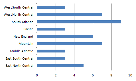
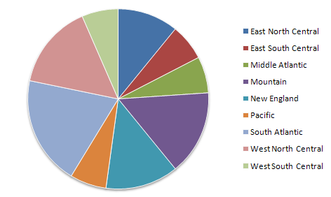
For a nominal variable the bar graph (above) or pie chart can be effective. The number of bars in a bar chart and the number of wedges in a pie chart show the number of classes in the variable. More importantly, though, the length of the bar chart bar for each class is proportional to the numbers of observations in that class. Similarly in a pie chart displaying the same data (below), the total number of observations in the data set corresponds to the 360 degrees of a circle, and the number of observations in each class is the equivalent proportion of 360 degrees. Pie charts have the added distinction of appearing to have no implied order to the classes.
Both bar charts and pie charts are easily made in Excel by first selecting the single data column holding the grouped variable.
Representing a Quantitative Variable
If you are trying to evaluate and make some initial decisions about a quantitative-level variable in your data set, there are two options. The first and most common choice is the histogram, which resembles the bar chart but is adapted for quantitative data use. However, the other option, which is the number line graph, is actually the prerequisite for making a histogram.
The Number Line Graph
A number line graph is one-dimensional, in the sense that it has one scaled axis that corresponds to the range of data values for the quantitative variable. We add observation values to it by plotting each observation as a dot (similar to a map's point symbol) positioned using that scale.
The number line graph makes the most sense for visualizing quantitative data. Ironically, it is a graph that is not available in Microsoft Excel or even in several quantitative or statistical analysis computer programs, though there are ways to create an approximation of the number line graph.
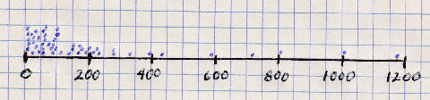
Two different ways to create a number line graph will be explained using the Population Density variable (2010 census) from the US states data table (above).
The Number Line Graph on Paper
- Start by calculating the data minimum and maximum. In this case they are 1.2 people per square mile and 1171.0 people per square mile, respectively. To make the graphing easier in this case, round the minimum down to 0, and the maximum up to 1200. The number line's scale will have a data range of 1200 units.
- On a sheet of graph paper, draw a horizontal line to represent the population density variable. For this example, a six-inch line is easy to draw on graph paper that has 4 grid squares per inch.
- Next, mark the scale for this graph along that line. The low (left) end will be 0 (zero) and the high (right) end will be 1200. VERY IMPORTANT: this scale must be "even," which means in this case that every inch will represent 200 people per square mile. (These last two steps may sound easy; however, there is actually a little trial and error involved in finding the right line length and the right scale for the given data range.)
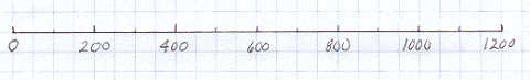
- Plot each data value as a point just above the number line. Do not label any of the dots, because the purpose is to be able to see the overall arrangement of the dots without anything cluttering up the view. With this example, in which there are many dots needed in the lower end of the data range, stacking the dots higher above the line makes each one visible and makes the graph sort of two-dimensional (it really is not two-dimensional because there is no scale to define how far above the axis the dots are placed).
The Number Line Graph in Excel
As suggested above, even though Microsoft Excel does not have a built-in number line graph, such a graph can still be created. Following the example of our geographer's data table, the variable will be stored in one column in Excel. However, we will need two columns to make the correct type of graph. At the far right hand end of your data table, add a new column. In the top row (the variable name) type the title you want to appear across the top of the graph, such as "2010 Population Density." Fill the rest of the cells in that column with zeroes (that is, the digit 0).
Select all of the cells of your Population Density data column: drag the cursor from the Row 1 cell (containing the variable name) to Wyoming's data value in Row 51 of that variable column. While that is selected, hold down the Control key ("Ctrl") or its equivalent on a Mac and select all of the corresponding cells of the new "zeroes" column.
With the two columns still selected, find the menu or icon to create a "chart;" it might be in different places depending on which version of Excel you are using, but is usually on the Insert menu ribbon. Choose the "Scatter (X,Y)" chart type; there are several options, but choose the first one, with no lines connecting the points. An example of the output is:
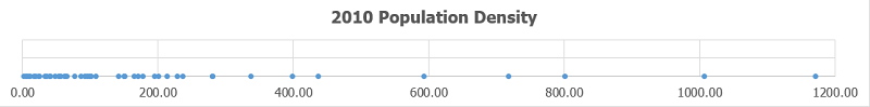
The obvious difference between the Excel version of the number line and my hand-drawn version is that all of the data points are on the number line in Excel. While that tends to conceal some clusters of tightly spaced values, it still allows even the smaller gaps to be visible, usually. The number line graph executed in this way portrays the dispersion of the points very effectively.
Data Classification
The Classification Purpose
Creating Ordinal Data from Quantitative Data
One way to examine and assess a quantitative-level data variable is to graph it using the number line graph just described. The real value of the number line graph is that it allows us to see the scaled positions of each observation. Another type of graph for quantitative data, the histogram, makes it easier to draw quick conclusions. The histogram is similar to the bar graph in that it uses bars of varying lengths to show the relative distribution of data values. Yes, we talked about bar graphs in the context of grouped nominal and ordinal variables.
The histogram is a little harder to make from a quantitative variable than the bar graph is to make from a grouped nominal or ordinal variable. The histogram requires defined ranges of data, essentially subdivisions of the number line scale. We must first create groups, or "classes," of observations based on their values within that quantitative data column. The process for determining these classes is known as "classification."
The underlying concept is that two quantitative values that are near each other on the graph belong in the same class, while two values that are far apart belong in different classes. "Near" and "far" in this context are relative terms. Also, like many analytical concepts in the social sciences, the classification process will have to make allowances for unique circumstances.
The classes we will create are essentially the same as the groups defined in nominal or ordinal variables. The difference here is that we directly process the data to form those groups. It still comes down to the same outcome, though. Classification is the process to create an ordinal level of measurement variable out of a quantitative level variable.
The Classification Procedure
Natural Breaks Classification
Which data values belong together in any one group? How many groups should there be? These are the two key questions of the classification process. There are actually a few different ways that we could accomplish this. I am going to teach you only one of the processes, though, because in the context of geography and maps it is usually the one that works best. It is called the "natural breaks" classification process.
The task of forming classes of observations is actually a task of setting the "breaks" between the classes. To work through this process it will help to have, in addition to the graph, a copy of the column of data values arranged in rank order from smallest to largest. As the steps are described, I will refer to the data values for the Population Density variable, and also to the gaps between those values.
- Start with the number line graph of the variable.
- Look for the biggest gaps between groups of data values. In the example, there are some large gaps at the upper end of the graph, but the classes they would form would only have a very small number of observations. Considering that there are 50 observations and that we don't want too many classes (or it would be hard to describe general patterns), I will insert the first break at 300 people per square mile. We can describe this class as the high end of the graph where values are spread out but consistently high.
- The next class is pretty obvious. I will place the next break at 125. The class between 125 and 300 consists of data values that occur in a somewhat smaller class range. The point to the left of that gap has a (rounded) value of 107.6, and the point to its right is 142.2; 125 is a nice round number to use as the break value.
- The next gap is smaller, but still distinct, between 65.2 and 76.5; I will mark this break at 70.
- I have a problem, now. My lowest class is compact, so they clearly "belong together," but it has 20 observations in it, nearly half of the data set. To create one more break, making a total of four breaks or five classes, I will scour the lower values in my data set for the largest gaps between data values in that range. I will concentrate near the middle of that 0-to-65.2 class's range: I have settled on the gap between 24.4 and 32.6, and will set the break at 30.
- The final task is to realize that each break that represents a division between two classes for our quantitative variable requires us to identify two values, the upper limit of the class before that break and the lower limit of the class following the break. If we take the values just identified to be upper limits by adding ".00" to those numbers, then the lower limit of the next class will be that value plus ".01," chosen because all the values in the POP10_SQMI data column have two decimal digits. Those limits have to be chosen in such a way as to prevent any possible data value from falling into a gap. For example, if we had specified the upper limit of one class to be 30.0 (equivalent to 30.00) and the lower limit of the next class to be 30.1 (equivalent to 30.10) and it turned out that there was an observation whose value was 30.05, then that observation technically would not belong in either class.
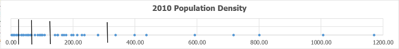
To summarize, here are the 5 classes:
| Class 1 | 0 (actually 1.23) to 30.00 | 9 observations |
|---|---|---|
| Class 2 | 30.01 to 70.00 | 12 observations |
| Class 3 | 70.01 to 125.00 | 8 observations |
| Class 4 | 125.01 to 300.00 | 13 observations |
| Class 5 | 300.01 to 1200.00 (actually 1171.00) | 8 observations |
Display Class Breaks on the Number Line Graph in Excel
The graph or chart made in Excel appears as a separate floating element within the current worksheet. At this point you can either accept all of Excel's defaults or learn to control the different elements within the chart, such as the grid lines, the axis labels, and the chart title. It is really worth learning to control these elements of Excel, so we will explain the basics here. In particular, for the classification process we need to add the "break lines" to the number line graph, which will help later when creating some types of thematic maps in ArcGIS.
Start with the graph title. The "Scatter" graph in Excel is actually a two-dimensional graph, and that type of graph is designed for comparing two data columns, one scaled along the X axis and the other along the Y axis. In those situations, the Y axis variable is usually the variable of interest in data analyses, so Excel's default is to use that variable name as the graph title. That was the reason for giving the new column of zeroes a title that was essentially the same as the data variable, though we worded it in a form that was easier to understand. If, at any point, you are unhappy with that choice for the graph title, just double-click on it within the graph and type whatever new title you prefer. It will not change the column heading in the data table.
The next common step is to change the dimensions of the graph. When it appears there are small circles indicating the four corners and the middle of each of the four sides of the graph. Because the real content of the number line graph is down on the X axis, it makes sense to reshape the graph to be vertically short but horizontally long, as you are seeing in my examples on this page. If you can make it longer, while still fitting within the width of a typical Word document page, it can be easier to differentiate points in crowded sections of the graph.
Another common need is to adjust the scale on the X axis. If you click (once) on the graph either on the X axis line itself or on one of the labels for its scale, a rectangle will appear. Double-click within that rectangle, and a panel titled "Format Axis" will open on the right side of the main Excel window. The first two typable options are for the Minimum and Maximum "bounds" of the X axis. Excel will have made its own guess about the appropriate minimum and maximum points, but tends to be rather conservative. Think carefully about choosing a Minimum that is a rounded number as close as possible to the data minimum for that variable, but still Less Than that data minimum. Do the same for the Maximum for that X axis scale, choosing a Maximum that is a rounded number as close as possible to the data maximum for that variable, but still Greater Than that data maximum. Identifying the best rounded numbers possible, in the context of the data range for that variable, is tricky to explain because every data set and every variable are different. This is a very subjective process. If it is done right, though, it will improve the readability of the graph.
Finally, to show the results of the classification procedure, it is important to add vertical lines representing the class breaks determined in the steps listed above. Excel does not provide any way to use the graph's X scale values when positioning the breaks, so it becomes a matter of estimating the right locations. Excel will allow you to hover the mouse cursor over any of the points, and will then display a small pop-up showing the point's data value. That will at least allow you to place the break in the correct gap in the data.
To draw the break line, we will again use the Insert menu ribbon. We are adding a simple line to the graph; Unfortunately Excel again makes it difficult to find the correct menu place for doing so. The Insert menu ribbon includes many "groups" of menus, like the Charts group where we found the Scatter graph. The simple line is part of a selection of Shapes. The Shapes menu is generally toward the left end of the Insert ribbon. In my current version of Excel it is in a group called "Illustrations." When you have found the menu and clicked on the Shapes icon, and then the first (simplest) of the Lines, move the cursor over the graph and notice that the curor is now a large plus sign. Click once above the X axis and once below it to draw that line. Subsequent break lines sometimes go in rather awkwardly; just remember that once they are on the graph you can click on the line to select it and then use the mouse cursor to move the ends of the lines (represented by circles) however you need to.
You can "style" the break lines so they look different from their default appearance. As you select a break line the menu area in Excel adds a new menu ribbon called "Format." The new ribbon has a menu group called Shape Styles that opens to show a variety of choices. Since the breaks must show up against the collection of dots on the graph, choose a color and line thickness that maximize the contrast.
Conclusions about Natural Breaks Classification
Revisiting the Histogram
Now that we have created the classes, we can create the histogram. The chart appears below. Unfortunately, the steps for creating the histogram and for modifying it to look its best are rather complicated. The require an "add in" data tool and the navigation deep into several dialogs.
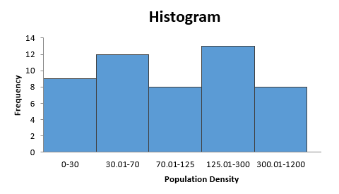
Interestingly, the process starts with the two elements we have described. The first is the column of data, in our case the POP10_SQMI variable. The second required element is the list of class breaks we worked out. In Excel these are referred to as "bins." The values Excel uses are the upper limit of the five classes: 30, 70, 125, 300 and 1200.
The key to understanding the purpose for all the work described in the classification process is that essentially the histogram is another version of a bar chart. The bars are in the order dictated by the positions of the breaks on the number line scale, but the lengths of the bars still reflect the number of observations in each class.
Excel's version of the histogram helps us see that the observations are pretty evenly distributed among the five classes. Even more importantly, we are now ready for mapping the Population Density data on a thematic map, in the next unit.
Reflections on Natural Breaks
The most obvious conclusion is that it is a very subjective process, and two different people examining the same data set might not choose the same breaks. Despite that, it is a process which forces you to become very familiar with your data set, and which we can call "true to the data" more than a more systematic process. For example, a simpler process would be to arbitrarily decide that there should be five classes and they should all have the same range (1200 divided by 5 yields 240, so the lowest class would be 0 to 240, etc.). That would be called an "equal intervals" classification. There may be situations in which equal intervals classification is preferred or required, but you should always recognize that the reason for the natural breaks classification is to avoid evenly spaced classes, or classes with equal numbers of observations (another classification technique called quantiles classification), which might arbitrarily split clusters of points. Natural breaks classification lets the natural clustering of point values be the primary consideration.
The breaks and classes were not all identified for the same reason or with the same internal characteristics. Despite that, there is still a consistency within each class (even if it is a different consistency from the next class). That consistency is the key because it means that the values in that class really do "belong" together. We will really see this concept pay off when we use this classification process as the basis for creating a thematic map, in the next Unit.
Notice that I did not pre-judge how many classes there should be. That unfolded during the process of identifying the class breaks. Again, the "natural" part of the name for this natural breaks process says that the data will determine that number, to some extent. But, while there is no definitive number of classes to create, part of the goal is to create somewhat balanced classes (no one class should have an extremely large proportion of the observations). A "rule of thumb" that some cartographers promote is that, when the data are being used to create a classification-based thematic map the best number is four to six classes.
One thing that I did before starting the classification process was to look closely at my data column for potential difficulties. The original data set consisted of the 50 US states plus the District of Columbia (DC). DC can cause problems with many types of geographical analysis. It is the only designated part of the US that is entirely urban. There are other small states, and other states which are highly urban, but none come close to DC in proportion to its size. If you only compared DC to other cities, then it would be comparable. But with almost every spatial/social science variable that is related to cities and people, DC will be "off the charts." For example, DC's population density in 2010 was 8804.8 people per square mile.