Types of Thematic Maps
The Value and Frustrations of Thematic Maps
We learned back near the beginning of this course that thematic maps constitute one of the two main types of maps. The purpose of a thematic map is to display statistical information about a set of geographic features. The use of thematic maps can be a powerful way to communicate magnitudes of data values as well as comparisons between areas and places at any scale of interest. It is always frustrating to look at a newspaper or website and see tables of geographic data with no corresponding map. It is as if the writers expect you to look down the list of places with the numerical or text information in the table and form your own spatial conclusions by mapping the information in your mind.
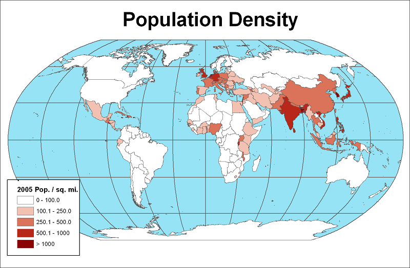
The function of a thematic map, like this map of population densities of the countries of the world, is most often to represent the spatial arrangement of one data variable for one set of geographic features. There are also ways to overlay two thematic maps in order to show how two variables relate to each other spatially, though not all types of thematic maps (see below) work well in this scenario.
Thematic maps are a great way to illustrate the results of simple data gathering efforts, or to demonstrate the conclusions of complex spatial data analyses. The concepts in either of those scenarios are the same, but there are many conditions and limitations that you will need to keep straight. That constitutes the other great frustration when browsing the newspaper or the Internet and coming across situations where maps have been used: so many times the mapmaker did not observe the simplest of rules about the type of thematic map chosen.
This is the first of six units that will examine all the types of thematic maps in detail. The purpose of each type will be explained, in both data terms and visual terms. How to create most of these thematic maps (there are two that are not easy enough for a beginning course on maps and GIS) and how to present them will also be key considerations.
Data Requirements of Thematic Maps
A thematic map is a visual presentation of one variable (population density, in the map above) applied to one map layer (the world countries). There are seven different types of thematic maps, which we shall identify next. One important concept we have learned about variables, their level of measurement, and one important concept we have learned about GIS map layers, their geographic feature type, will help us to decide what kinds of thematic maps are appropriate for a given data situation.
Table of Thematic Map Data Scenarios
We will start by setting up a table (not a data table) to show the different combinations of levels of measurement and geographic feature types, both of which are concepts we studied earlier in this course.
| Geographic Feature Types | |||
|---|---|---|---|
| Levels of Measurement |
Points | Lines | Areas |
| Nominal, or Qualitative |
|||
| Ordinal, or Ranked |
|||
| Interval/Ratio, or Quantitative |
|||
Following this chart will be the best way to organize our understanding of the types of data shown on thematic maps. That does not mean, however, that it will make things easy. Each cell in the table is a combination of a level of measurement and a type of geographic feature. For some cells that feature type/level of measurement combination dictates one specific type of map you would have to use to represent the data. A few more of the combinations allow for two map options. Two more allow for more than two map options, with data requirements that are more specific than just the level of measurement. Inconsistencies like these will mean that we have to pay attention to all those details.
For example, one concept that can be challenging to grasp is that some of the same map types show up in both the Ordinal vs. Interval/Ratio (I/R) levels of measurement. The key thing to keep in mind will be that Ordinal means categories while I/R means numbers. Therefore, we will (in an later unit) distinguish between choropleth maps based on I/R data and those based on ordinal data. We will continue to introduce conceptual challenges like these in this unit, and you might notice something of that difference in the examples below, but will present the solutions in the coming units.
The Seven Types of Thematic Maps
Here are the names of the seven types of thematic maps, along with brief descriptions of how they are used. Further down the page you will see examples of each type.
- Choropleth Maps: Areas are shaded or colored according to one variable.
- Graduated Symbols Maps: Symbols such as circles are sized according to one variable.
- Flow Maps: The thicknesses of lines, representing a flow of goods, etc., vary according to one variable.
- Dot or Dot Density Maps: The number of dots in each area represent a count according to one variable.
- Isolines Maps: Like contour lines, isolines represent lines of equal data values.
- Cartograms: Areas on a map are distorted and sized according to one variable.
- Heat Maps: Irregular areas on a map have colors applied according to their relative quantity and density of a set of points.
Thematic Map Solutions
Let's examine the same table with the framework filled in. In the rest of this unit, I will describe the distinguishing features and the data requirements of each type of thematic map. Your goal by the end of this course should be to be able to identify each of the seven types of thematic maps, to articulate why your identification is correct and, as mentioned above, to make most of them. So, we start here with identification.
| Geographic Feature Types | |||
|---|---|---|---|
| Levels of Measurement |
Points | Lines | Areas |
| Nominal, or Qualitative |
Descriptive Point Symbols | Descriptive Line Symbols | Descriptive Area Patterns |
| Ordinal, or Ranked |
Classified Graduated Symbols Map | Classified Flow Map | Classified Choropleth Map Classified Graduated Symbols Map |
| Interval/Ratio, or Quantitative |
Discrete Phenomena Proportional Graduated Symbols Map Heat Map Continuous Phenomena Isolines Map |
Proportional Flow Map | Absolute Counts Dot Map Cartogram Proportional Graduated Symbols Ratios or Densities Classless Choropleth Map Isolines Map |
The overarching goal here is to make the best match of feature types with design characteristics that enhance their visibility. For points and lines, visible differences are easiest to see when their sizes are made to vary. Color variations are less obvious, especially when the point or line symbols are smaller. Area features can have attention drawn to them in several ways. Size variations are generally not as effective as color variations through color brightness or contrast. Area size variations are the main feature of cartograms, but the difficulty in seeing those variations helps to explain why it is a less popular type of thematic map.
The point is that other combinations of design choices and feature types are possible, but they have generally not made it to the mainstream because they are not effective.
Examples of the Seven Types of Thematic Maps
Choropleth map:
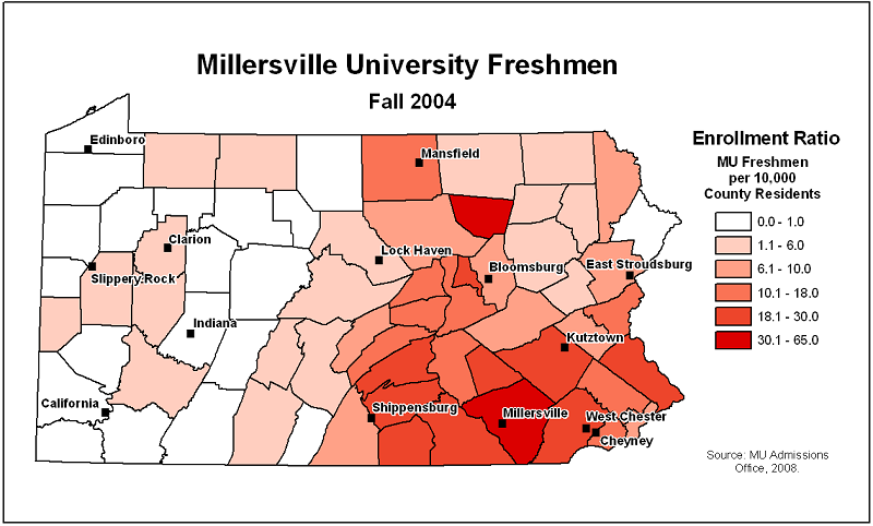
Choropleth maps represent area features at the ordinal and quantitative levels of measurement. The vast majority are ordinal level maps like this one, with a limited number of classes, each class represented by a color and with each class's color and defining values displayed in the legend. The colors are generally similar or related, while getting darker or brighter as the relative class value increases. In the map below, the darkening shades of red represent increasing proportions of the county's population. A choropleth map is called a "graduated colors" map in ArcGIS.
Graduated Symbols Map
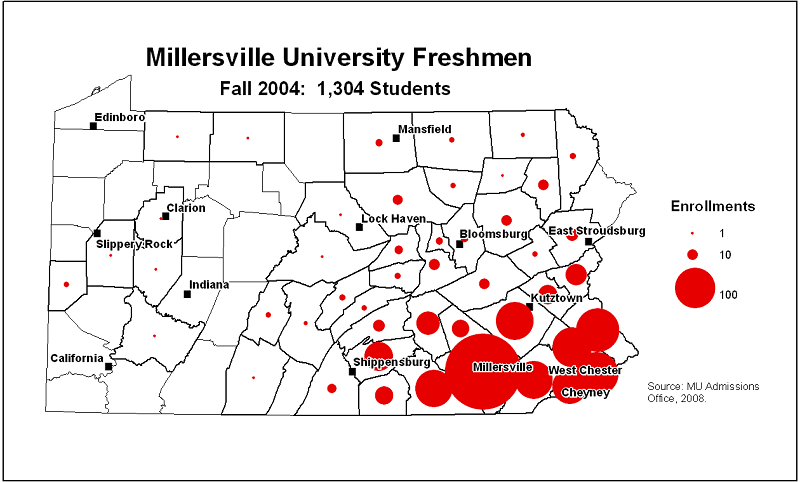
Graduated symbols maps are unusual among the map types in that they can represent either point or area features. When the features are points, the graduated symbols are centered at each point's location. In the case of area features, the software decides on a central point within each area and centers the graduated symbols at those points. On top of those spatial subtleties, there are data considerations. The number values in the data field used to determine the symbol sizes should be counts recorded as integers. Then, we will have to work out how the numbers are reflected in the symbol sizes and represent that in the legend. In the map below, the number of admitted students determines the circle size.
Flow Map
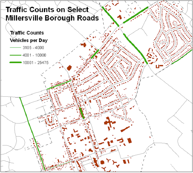
Flow maps are the only thematic map type suitable for line features. Many things flow along lines, whether they represent roads (like below), pipelines or electric wires. That line represents the path of the flow, and flow maps are used to represent the volume of "stuff" (traffic, in this case) that flows along that line. The line thickness increases with increasing volume flows, and that specific relationship has to be determined and represented in the legend.
Dot Map, or Dot Density Map
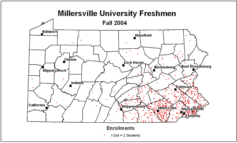
Dopt maps are another alternative for representing data about area features and, as with the graduated symbols map, the data variable being mapped should only be a count. In the map below, the number of dots in each county is relative to the number of students from the county. The dots on dot maps should always represent more than one of the counted items and that number will be a constant throughout the map. That makes the dot map's legend one of the simplest of all the thematic maps.
Isolines Map
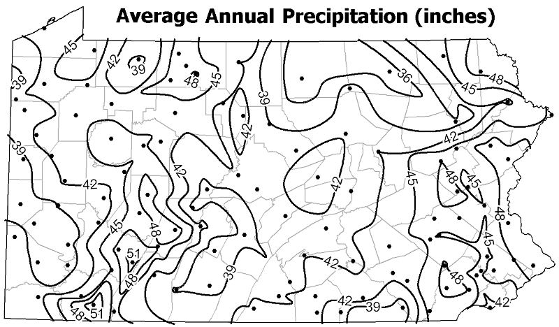
Isoline maps are also unusual, being able to represent either point or area features. The map below represents point features: the weather stations that recorded the precipitation amounts. The isolines in this map are like elevation contours, but they represent lines of equal total precipitation. The isolines are created in exactly the same way as the contour lines we learned how to draw earlier in the course. They start as point locations for which isoline values are determined, and the lines' pathways are interpolated between those starting points.
Cartogram
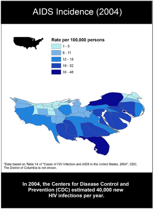
Cartograms are not common because they are rather hard to interpret easily. To understand cartograms you have to learn to "read" the distortions. They work best when the original area features are well known, such as the US states in this map. The shape distortions are meant to allow for size (area) adjustments, which is the real thematic representation of the relevant data value. The majority of cartograms you come across are, like this one, combining two thematic maps. In this map the area distortions make the size of each state proportional to the number of AIDS cases reported in that state. The color of each state is based on a variable whose value was calculated by dividing that number of AIDS cases by the state's population. Mapping two variables like these on the same map shows the relationship between the two variables. Here, it appears that the states with more AIDS cases also have higher percentages of their population infected with the disease.
Heat Maps
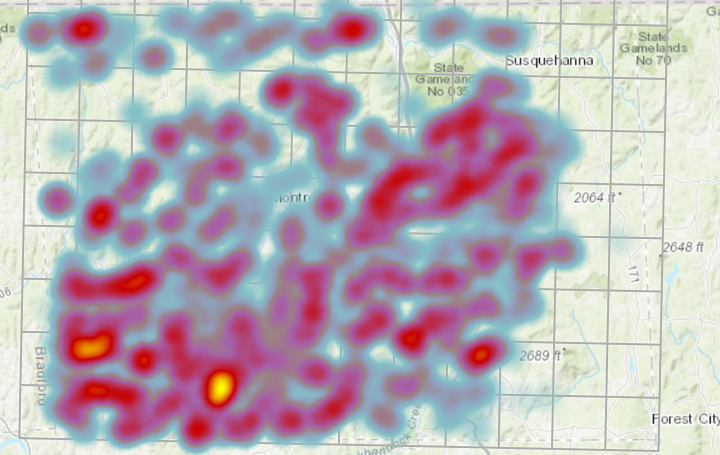
Heat maps are a little deceptive because they use area symbology to represent information about point features. To be effective, the point feature layer you start with should have a large number of locations relative to the size of the map area. The "heat" name comes from the most common color scheme, which uses "cool colors" such as white and blue at one end of a color range and "hot colors" such as bright red and yellow at the other end. If the points are larger in number and closer together in one area of the map, the area will be given hotter colors, but in an area where the points are more spread out the cooler whites and blues, or even no color, will be applied. The map below started as a map of natural gas wells in Susquehanna County, PA.
Thematic Map Principles
For the Cartographer:
Creating thematic maps is one of the more practical applications of GIS. The most fundamental concept to keep in mind is that each of the seven basic types of thematic map is created for one map layer, using one column in its data table. More complex scenarios are common and will be discussed in subsequent units, especially the use of other GIS map layers in order to add context (such as rivers and lakes), but this basic concept is sufficient to get you started.
When choosing to create a thematic map, you must pay attention to the two characteristics that also helped you to identify types of thematic maps: the type of feature that the thematic map layer is (point, line or area), and the level of measurement of the data variable to be mapped (nominal/qualitative, ordinal/ranked, or interval-ratio/quantitative). You must become good at identifying a variable's level of measurement; it may seem to be a rather abstract conceptualization of data, but it has great significance.
ArcGIS, in particular, is not always good at helping you to create effective thematic maps. ArcMap does not attempt to tell you when you have chosen the wrong type of thematic map. It will allow graduated colors to be applied to point and line symbols, for example. Sometimes that extra flexibility can be used to enhance standard thematic maps, but more often it leads to wrong choices.
It turns out that with all of its capabilities, some types of thematic maps are more difficult to create with GIS software than others. Choropleth maps are probably the easiest, with fewer steps needed to produce the simplest examples. Graduated symbols maps, flow maps and heat maps are close behind choropleth maps. Cartograms are so difficult to create that we will have little more to say about them. Isoline maps and dot maps are also complex to create, though ArcGIS does have options for creating them. Yet, in all of these cases, to create the maps correctly we will have to dig deeper into the various options and parameters built into the ArcGIS procedures.
For the Map Viewer:
If the cartographer used the wrong type of thematic map to represent a particular data variable, be ready to criticize or ignore the map. It is more likely to misrepresent the data than to give you any valid expression of geographic patterns or relationships.
The principle that will guide our work through the remaining units on thematic maps is that the best way to know how useful they can be and the best way to understand how to use them, is to practice making them.
What do all thematic maps have in common?
The primary requirement is for the map layer to have a data field with exactly the right type of information needed to make the intended point. Such data considerations will be the focus of the next unit.
This discussion started with a reference back to the contrast made early in this course between thematic and topographic maps. We saw in the many discussions about topographic maps that there were design considerations there, aimed at enhancing a map's ability to describe the landscape of the area depicted. Most of those design decisions worked best when they incorporated natural associations between the colors and shapes of the symbols with the landscape elements they represented.
In many ways, creating thematic maps requires more of a designer's eye than creating topographic maps. Thematic maps are about data, not landscapes. Data are, in a sense, an abstract way of seeing something either real or constructed in the world. So the design challenge in creating thematic maps is to turn those numbers or names into those map representaions. How best to show an area's average income or a stream's water quality? How does one take data characteristics and turn them into visual characteristics?