Maps and Data
Data for Thematic Maps
Thematic maps display data.
Think of looking at an alphabetical list of the states of the US along with the percentage of millionaires in each state and trying to make sense of those numbers. For example, is there one area of the country that has higher percentages? The list format makes answering that question take a lot of time and effort to try to figure out.
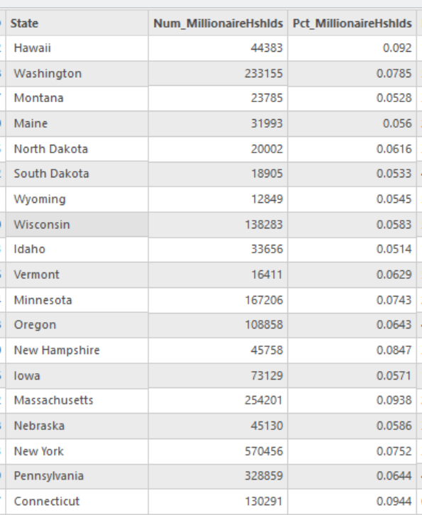
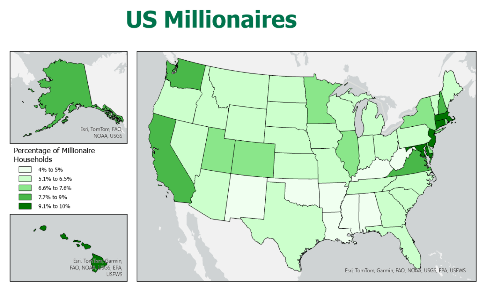
Looking at a map of data about millionaires makes it a lot easier its spatial distribution.
The thematic map is the ideal solution to that challenge, and ArcGIS Pro is an ideal tool for creating the thematic map. However, there is still work to do in order to make even the simplest of thematic maps. Most thematic maps are symbolized using one attribute table column. Sometimes you will get lucky and find the shapefile that has the data you are looking for already stored in its attribute table. But more often, you find a GIS layer with the features you need from one online source, and the ideal table with the data you need from a different source (the list above came from Wikipedia). Then, just because the table is available does not guarantee that it is in a format that can be used within ArcGIS Pro.
Most attribute data for thematic maps start out as non-GIS table data from sources responsible for collecting data for those sets of spatial features. For example, early in the semester we talked about the many different US and state government agencies responsible for different aspects of government operations and, ultimately, for different aspects of the American landscape and population. We will review some of those agencies below. We will also review some of the similar agencies, along with non-governmental organizations, that collect useful data elsewhere in the world. Non-governmental organizations also collect data about environmental and human phenomena for which governments have not yet established oversight.
At some point in this thematic map development process, you will have to decide which type of thematic map is most approprate for this data variable. For several types of thematic maps, that selection also drives some decisions about what format the data must be in and, therefore, whether any additional data processing is needed. Below, we will describe one procedure for adding data found in tables from non-GIS sources into your GIS project.
A Thematic Map's Purpose
Keep in mind the distinction between topographic and thematic maps, also presented earlier in the course. The distinction made then was based on the number of types of information present on the map. Topographic maps have many types of features, while thematic maps display only one or, at most, a few. As we gained GIS skills you understood that those "types of features" were layers, which we also identified as shapefiles.
Thematic maps present a simplified version of reality, usually mapping one statistical concept at a time. For example, one map might show the average household income for each county of Pennsylvania. The data for such a map come from information collected by the US Bureau of the Census, a federal government agency and one of the data sources looked at in more detail below. Occasionally, a thematic map can be used to display a couple of statistical concepts representing different types of geographic features in order to show a relationship. In essence, you would be creating a single map with two layers symbolizing two different types of features (such as a layer of points and a layer of areas) with two different data variables (such as income and population size). For example, our GIS layer of Pennsylvania county incomes combined with a GIS layer showing city sizes could help us to decide whether living near a larger city is strongly related to income.
Data for Research
Given the challenges of collecting, maintaining and disseminating data (including via maps), the government does a commendable job of making it available via the various .GOV data portals. It has to serve many different audiences, with many different needs and skill sets.
It will be worth your while, both in this course and in others, to become and remain aware of the US government agencies whose responsibilities parallel your areas of interest, and of the websites where they make that data available. Become as expert as you can in the terminology and organization of government-collected data, and the similarities and differences between those data and data from other non-US and non-government sources.
Much information or data for conducting research may be available in already-collected and published formats. A prime example of easily accessible published data is any data collected by the US and state governments, and published on the Internet. Every state and federal agency is likely to have a website, and many of those agencies have some kind of statistical bureau or office. The US Census Bureau is a specific example of an agency that produces a prodigious amount of data and makes it available on their website, as will be discussed below. Keep in mind, though, that such great quantities of data may be difficult to sift through in order to find just what you are looking for.
Because of the challenges of making something as "dry" as tables of data interesting, more thought is going into how to make data more accessible and appealing. The trend is to create "dashboards" and "portals" that feature graphical displays of commonly requested or interesting data themes. Sites allowing you to download spatial data (usually shapefiles) offer map previews and detailed "metadata" (information about the data's format, accuracy, precision and history).
Data Science is a relatively new field of study contributing to many business applications and taking advantage of new trends in Artificial Intelligence. It is beginning to be applied to environmental science, social sciences and other applications consuming large volumes of data. The power of data science comes from the use of conventional data collection technologies, such as temperature data from digital thermometers and sales data from credit card transactions, which are continuously accumulating. The goal is to draw useful conclusions that are easily visualized. Much of this data visualization uses traditional graphs and charts, but maps fit the requirements just as well.
The other realization that is important to attain is that all the published data made available, from government as well as non-government sources, come from research projects much like the ones you are helped to accomplish in your upper level courses in your major. For all the data that researchers have learned to collect and make use of, there is still much more that has only been attempted experimentally. That is the process by which all currently available data have been developed: identifying data through research, establishing the value and procedures of that data collection through academic review and government decision making, and thereby justifying the effort and expense of adding it to the established government data collection programs. That justification often hinges on the principle that spending money to collect a certain body of data will help the government to save money in the long run.
Data Requirements
The Data Search
Of course, it is easy to identify a topic you are interested in and simply Google that topic. Including the word "shapefile" in that search might help you to find existing layers with the data already encoded in its attribute table; there is not a great likelihood of success with that strategy. Layer searches might reveal "gems" but might also reveal disappointing quality data.
There are many data sources in shapefile format suitable for ArcGIS Pro. Usually, the main concern in searching for those shapefiles is that they provide an accurate representation of the boundaries or other features needed. The availability of suitable data in the layer's attribute table is usually of secondary importance. Here are some data quality considerations for selecting suitable shapefiles:
- Boundaries, line features and point locations are sufficiently accurate.
- Features, which appear as rows in the layer's attribute table, are identified by standard names or identification numbers.
- The data source organization does not claim any copyright control over uses of their data. (American government agencies will generally not assert this control because US taxpayers have basically funded all their operations).
If you are looking for additional data to supplement the shapefile's attribute data, consider these requirements:
- Again, features are identified by standard names or identification numbers which can be matched to feature identifications in the shapefile's attribute table.
- The data are recent enough to reflect current quantities and relationships (unless, of course, it is historical data you are after).
- The data are sufficiently precise; there are enough significant digits and decimal places to meet your needs.
It is essential to be able to identify such data characteristics as: level of measurement and feature type.
US Data
Federal Government Data
As shown much earlier in this text, sample federal data sources in the US include:
- Census Bureau (US Department of Commerce)
- Bureau of Transportation Statistics (US Department of Transportation)
- National Center for Health Statistics (US Centers for Disease Control and Prevention)
- Bureau of Justice Statistics (US Department of Justice) - publishes crime data
- National Center for Education Statistics (US Department of Education)
- National Agricultural Statistics Service (US Department of Agriculture)
- A number of agencies publish environmental data
Each of these agencies produce both spatial data and related attribute data. The Census Bureau probably takes the production of spatial data the furthest with its own system of areal subdivisions (listed below), but if you think about an education area such as a school district and all of its individual schools, and the region surrounding a hospital (or cluster of hospitals) and various affiliated doctors and clinics as their service area, you get a sense there are many possible spatial entities. Defining the locations and boundaries of those spatial entities are important to making sense of the attribute data.
Government-produced data and government-funded data are, in the US, considered to be in the public domain, as long as they do not reveal personal information about people. That means that most such data are free (except that some nominal charges to cover printing or distribution costs may be imposed; the USGS topographic maps are a prime example of this). The reasoning is that our tax dollars have already paid for the data collection. If such data are available, then acknowledgement is due to its publishers.
Some data are collected by independent, non-governmental organizations, and are therefore not in the public domain. There are also private companies who take free government-collected data, repackage it in various ways, and sell it. They are counting on customers in the private sector or organizations such as libraries, who want more user-friendly ways to access the data they need. Because the government sources have to support access to all the data they collect, their user interfaces can be complex and intimidating. By limiting the data offered, these repackaging options can fit the data choices to their user-friendly interface.
Focus on the Census Bureau
One of the most prolific collectors (and publishers) of data and creators of maps is the US Bureau of the Census. The Census Bureau is part of the US Department of Commerce. The Census Bureau attempts to survey the entire US population every ten years in a project known as the decennial census. They also survey a smaller subset of the US population every year and survey all businesses in the US every five years. All their work has implications for understanding government functions and the nation's economy.
The Census Bureau was one of the first federal government agencies to adopt GIS technology. Knowing where to send all those Census surveys required them to have effective maps of street addresses and of governmental boundaries for states, counties, municipalities, and other defined areas so they could assign each counted person to the correct areas. Early computers were slow and computer memory was limited, compared to today's devices, so many of those map files were "low resolution" representations of streets and boundaries.
"Census Geography" describes the Census Bureau's spatial organization of their data into a hierarchy of areas.
- The Census begins their spatial organization of the US with the country itself.
- The Census Bureau has divided the US into nine multi-state regions which are sometimes used to show very broad patterns.
- The next level of Census Geography is the state .
- The next level deviates from the "nesting" of the structure. The Census Bureau also reports data for Metropolitan Statistical Areas which is their formal way of saying that the effective activity areas of some cities spill across state lines. Each MSA is centered around and named for a city (or two or three nearby cities, in some cases) and is made up of one or more counties whose populations are strongly influenced by those cities. For example, the Lancaster City MSA is Lancaster County, while the Philadelphia-Camden-Wilmington MSA covers about nine counties in three states.
- Back in the conventional Census geography hierarchy, the next level is the county.
- The next level organizes data by municipalities (townships, boroughs and cities) all of which are primary level for subdividing counties.
- The Census then subdivides the municipalities into areas called Census Tracts.
- The next finer level of detail for census data are the Census Block Groups (subdivisions of census tracts).
- The final, most detailed level of census data are for Census Blocks (subdivisions of block groups).
Relatively speaking, not much of the data available to the public is at the last two levels, but the Census reports it to Congress and the US states every 10 years. The states use the Census data to rearrange the boundaries of political districts for the US House of Representatives (and for the state legislative districts), in order to rebalance the number of constituents for each Representative.
Pennsylvania State-level Data
The same principal behind spatial data usage at the state level applies to the related attribute data. When looking at state vs. federal sources of spatial data, we made the point that the state will need more precision in its data than the federal government will. (The same goes for county and local data vs. state data). Maps of Pennsylvania that are produced by the federal government will never look as detailed as maps of Pennsylvania produced by the state. State maps are more likely to use smaller data areas, such as municipalities and census tracts, than federal data. Imagery collected, published and used by the state government agencies are likely to have a finer resolution than imagery published by federal agencies. Such detail would complicate and slow down the workings of the federal government agencies but are necessary for the state agencies.
Attribute data has the same kind of precision issues. Many types of data are likely to vary more nationwide than they are within one state. With less variability at the state level it would be more important to improve the precision of the data in order to detect more subtle differences.
The names of many federal government agencies, such as those listed above, are often duplicated as the names of state government agencies. For example, both Pennsylvania and the US have Departments of Agriculture, and Transportation, and Education. There are often reporting lines through which the federal government collects their data from their state equivalent. There is likely to be what is called "data aggregation," in which the greater precision of the state data is aggregated or generalized to the lower precision needed by the federal government.
At both the federal and state levels data can be accessed by special websites. Both the federal government and Pennsylvania (probably in other states, too, but that is not guaranteed and has not been checked) established single websites for distributing GIS-ready spatial data (PASDA and the FGDC, covered earlier in this course), but attribute data are dispensed by individual agencies. That does make for extra work for GIS users, because it makes it necessary to "join," or associate, the data in the spatial attribute data files with the data in the separate data files, as described below.
International Data
Foreign Data vs. Global Data
Foreign Data
Foreign data represents data from other countries. It is the case that most countries will have agencies that correspond to the agencies of our government. As noted above, most US agencies are part of the executive branch of the government and are funded by federal taxes. The US is a relatively wealthy country and is readily able to afford such expenditures. Other countries will have different priorities for data collection, and significantly different abilities to spend tax moneys on such data collection efforts.
The other countries that can afford it are likely to collect data that are similar to ours, but even when that is the case there are many potential differences. For example, the US does a complete population count every 10 years (making it a "decennial" census) and has done so since 1790 (our base year), so our census years' dates end in "0." Other countries may use a different frequency, though 10 years is common, and a different base year.
Regional Data
Several areas of the world, usually identified as continental regions or cultural regions, have formed international organizations. Examples are the European Union, the Caribbean Community and the African Union. These organizations may have different purposes, such as promoting trade cooperation and peace, but they must collect and share data to be able to set and achieve goals.
Other international organizations are defined by their purpose, such as the Organization for Economic Cooperation and Development, the World Bank and the Universal Postal Union. They engage the membership and cooperation of as many countries as they can, within the scope of their purpose. Again, to be effective, they must set goals and have some way to measure progress toward those goals, so they have shared data collection efforts.
Global Data
Global data, on the other hand, are data collected throughout the world, in every (or nearly) country of the world. Such efforts are organized by the United Nations and other truly global organizations. The biggest challenge to the use of such data is the degree to which different countries can produce data of consistent quality. Returning to the theme mentioned above, the UN or other organization can provide incentives to meet certain standards, including the contribution of money and expertise to some of those data collection projects within poorer countries.
Sources of International Data
Government Sources
When seeking foreign data for a particular country, it makes sense to go to government websites in that country. However, there is no consistency in how such sites are maintained. Many foreign governments will not have the same "public-domain" attitude about their data that the US has. In many cases, it will cost money to obtain such data, which takes you into the realm of currency exchanges.
Organization Sources
Non-governmental organizations (NGOs) may offer data for download. Their attitudes about the ownership of the data, and about the value to them if they make it publicly available will be weighed. Some might represent agencies promoting peace, environmental protection or economic aid. The advantages to publishing the data for free access range from improved press coverage to new positive analyses and interpretations. The disadvantages include misinterpretations and the financial cost of that technical support.
For-profit organizations also publish international data, just like they do domestic data. Their ability to do so profitably is enhanced if they are able to "buy in bulk" and take on the language translations and currency exchanges. Of course, much gets made in the news about individuals and organizations who access protected data and make it available illicitly.
Historical Data
Data from the Past
Historical data can be used to show past locations or spatial distributions of features of interest, of course, but they can also help to show current rates of change or movement. Keep in mind that "history" can represent hundreds or thousands of years ago, but it can also represent days, weeks or months ago, depending on the context. It is determined more by the rate at which new data are arriving than by how much time has passed since the data were collected.
In the contexts in which we have been describing data, in this unit at least, there is a substantial difference in the quality and availability of tables of historical data versus that of maps of historical data.
Tabular data is much more abundant. In many areas of the world people have been keeping detailed written records of people, events and conditions for centuries. Even in places where that is not the case, technologies have been developing for decades allowing us to analyze current soil, rock, air and other conditions to unlock evidence of those past conditions. A simple example can focus on people. Some countries have census records going back centuries that allow us to reconstruct many characteristics of past populations including their total numbers of inhabitants. In other cases, the use of all manner of other written records can give us approximations of such totals. We have even learned to isolate genetic markers that allow us to reconstruct the biological characteristics of the past populations back to long before written records were kept anywhere.
In our modern digital age, we have become almost obsessed with capturing data about all manners of phenomena. Of course, today's current data become tomorrow's historical data. We are hoarders of that data, too, to the point where a new field of study called "data science" has emerged to find efficient ways to store and process all the data. The quantity of data that they are looking at is so huge that the target of data scientists is referred to as Big Data.
The digital technologies themselves drive a lot of the data collection. We can record air temperature continuously now, not just daily or hourly. Internet searches, bank transactions and cell phone texts are stored as readily as major events used to be. Even sports analysts keep coming up with new measures of athletic performance and attempt to apply those measures to past players. We may well have reached the point (if not, we are approaching it) where all historical data that ever appeared in print form (at least where the printed documents still exist physically) has now been "digitized," put into some digital form. Historians are just as likely to be data scientists as meteorologists.
Historical Spatial Data
Historical maps are another matter, however. While the maps have most likely been scanned into digital images, transforming them into GIS data is much more involved. Map digitizing was a big deal in the early years of GIS, especially the 1980s to 1990s. Then, the focus was on getting such maps as the then-current generation of USGS quadrangles stored in ways to allow for geographical analysis. Once those were scanned, georeferenced and otherwise digitized, the attention shifted to establishing newer technologies to replace the manual surveying and cartographic work. There has been much less interest (though not a complete lack) in reconstructing historical boundaries, coastlines and transportation routes.
Another factor in assessing available historical mapping has to do with spatial precision, or resolution. Early digitizing technologies captured lines and boundaries with many fewer points to show their twists and turns. Part of the cause was the need to refine the scanning and other data capture equipment, but a larger reason was concern for how much data would need to be stored, and how difficult it would be to distribute such data.
A very relevant branch of Geography in this discussion is Historical Geography. Historical geographers know that the spatial arrangement of entities from houses to international borders have changed substantially over history. Since a lot of data are tied to political areas such as countries, states and counties, some types of historical spatial analysis might depend on historically accurate boundaries. Lancaster County in 1760 looked very different than it does today. That makes comparisons of county populations irrelevant unless we have good maps of those early boundaries.
An interesting exception to this difficulty is the Census Bureau's use of census tracts as spatial entities. The goal is to keep each census tract's population relatively consistent with the census tracts around it. However, many areas of the country go through growth spurts, which makes it necessary to divide tracts into smaller areas. The Census Bureau thought of this eventuality when they first defined what are now known as census tracts (source: https://www2.census.gov/geo/pdfs/education/CensusTracts.pdf). Over time, census tracts can be created or combined, but once their boundaries are established they do not move.
So, the bottom line is that, if your interests are historical, be prepared to either capture the data yourself from the original documents, or at least the original scans of those documents, or be prepared to spend time reprocessing those early digitizing efforts. In some areas, that work is moving more quickly than in others. We now have historical map layers for most census data. That means, though, that to show census tract data, for example, you will need a different map layer for each decennial census. You will also need to allow time to ensure that the census tract ID numbers in your tabular data source lines up perfectly with the census tract map layers.
Adding Thematic Data to ArcGIS
Adding a Data Table to ArcGIS
You learned early in this course that data tables are integral to GIS in general and ArcGIS in particular. The files that make up a shapefile are primarily separate data tables integral to the inner workings of ArcGIS. ArcGIS attribute tables store data about every feature in the associated layers. There are also scenarios in which ArcGIS Pro can use additional tables of data. Many such scenarios are possible, but two that are frequently used to create thematic maps will be introduced here.
Data are efficiently stored in table form. Data tables are most often found in Excel files, but can also be found in other formats, such as Word documents, Adobe PDF documents and other text files with filename extensions such as TXT or CSV. Few of those formats are compatible with ArcGIS, in particular only Excel (XLSX) and "comma separated values" (CSV) text files among the more common data file formats.
An Excel XLSX file is also called a "workbook" and can contain multiple "worksheets," which are accessed using tabs at the bottom of each worksheet. Each worksheet is a grid of rows and columns of cells. Users in different professions will set up the rows and columns differently, so that the data they need are in the location they are most likely to look for it. Many of the cells in the Excel file are also likely to contain formulas that can reference other cells on the same worksheet or on different worksheets. It is these capabilities that makes Excel such a powerful data storage and manipulation tool.
ArcGIS Pro does allow you to add data from an Excel file to a map project. The primary purpose for doing so is described below. However, ArcGIS treats the Excel file like other GIS tables: ArcGIS can only recognize a single worksheet as a table, and the worksheet must be formatted according to strict rules. There can be multiple worksheets opened as tables in ArcGIS, and they can exist in the same Excel workbook file, but each worksheet must be added to ArcGIS separately. The format of each Excel worksheet must be exactly like the geographer's data table: one row at the top reserved for the column (or variable or field) names, and at least one column containing the names of, or some other way of identifying, each geographical feature. The rest of the columns in the worksheet can contain any data or formulas. While the worksheet is opened in ArcGIS, any formulas are just displayed as the current value of that formula. A worksheet opened in ArcGIS cannot also be open in Excel.
To open the Excel worksheet in ArcGIS, use the same Add Data button you have used to add shapefile data. Just remember that you cannot add the entire file; once you locate the file, double click on it to see a list of the worksheets and select one worksheet to add.
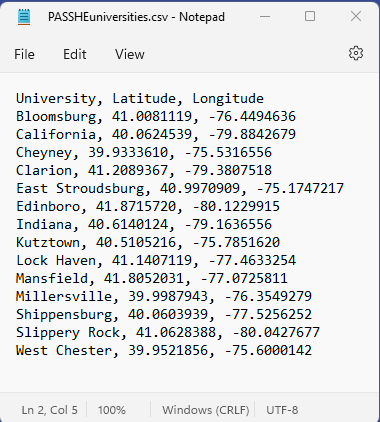
A CSV file has restrictions similar to those of the Excel file. The file format is very different, though. A CSV file stores its contents in what is known as "plain text." A program called Notepad, which can be found on any Windows PC, can only open files stored as plain text. Notepad's normal filename extension is ".txt" and it can store paragraphs of written content or it can store lines (rows) of numbers. Making lines of numbers in a plain text file (TXT or CSV) look like a conventional table is a bit more challenging. If the table has numbers with varying numbers of digits, then you have to add varying numbers of spaces between numbers in each row to make it look table-like.
Plain text files can also be opened in Microsoft Word or Excel. The easiest way to test this is to open Notepad, copy some text from an existing document in another app (even from a webpage open in any browser) into Notepad, and then save it as " filename.txt." Then, open Word or Excel to a blank document or worksheet, respectively. Single-click on the TXT file in your file explorer, drag it onto Word or Excel and release the mouse button. It will open in that program. Word is usually more suited to this type of activity, since Excel's columns will not be used as such.
A CSV file has one more powerful feature: if it contains table-like text properly formatted, it can open in Excel with rows and columns intact. To view a multiple-column plain text file containing rows of numbers in Excel, first open it in Notepad. In every row replace any number of spaces between the data values that should appear in adjacent columns with a single comma. A file that starts out like the one just above should look like this:
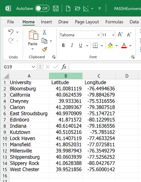
Next, close the file and change its filename extension from ".txt" to ".csv" (click OK on the warning about the dangers of changing file types that pops up). Open the now-CSV file in Excel using the same drag-and-drop strategy described above. It will show up with its columns, like the image below. Notice that Excel used the commas as cues to move the next data value in that row to the next column. Of course, that also means that none of the numbers in your data file can use commas to separate the thousands, millions, etc.
One benefit of this process is that many scanners can turn a scanned page of text or data table into a simple TXT file. You now have a way to take a scanned data table, convert it to a CSV file and then open it in Excel. From there, with a little extra effort, the data can be used in ArcGIS. The next two topics present some of the many options for working with data tables in ArcGIS Pro.
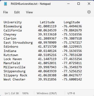
Creating A Points Layer from a Data Table
One you have a table containing latitude and longitude added to ArcGIS Pro, like the example tables above, you have a couple of options. Both are enabled most readily when the data table includes decimal degrees longitude-latitude coordinates and when the coordinate systems for the other layers in the map view were known when those layer were added. Even if the map has been projected to a different coordinate system, ArcGIS Pro will interpret the locations correctly.
The first method uses ArcGIS Pro's Right-click menu in the map view. First select (click once on) the table in the Contents list and then right-click. The menu that drops down includes the option to "Display XY Data." The dialog box that opens from the right edge of the ArcGIS Pro window shows the following parameters and turns the table into a points layer within the current map view.
- The Input Table name is alread filled in with the current table's name.
- The Output Feature Class entry assigns a name to the new layer. You can either accept the default name or type your own.
- The X Field entry identifies what ArcGIS Pro thinks is your longitude field. Correct it if necessary.
- The Y Field does the same for the latitude field.
- There is an entry for a Z Field in case the table has an elevation field.
- The Coordinate System entry identifies what ArcGIS Pro thinks is the coordinate system for your data. Correct it if necessary.
The second method accomplishes the same result using a different menu location, a different "tool," and a different dialog. Again, the procedure assumes the table has already been added to your map view using the conventional Add Data dialog. This time, use the Add Data access point a second time, but instead of clicking on the icon directly, click on the small downward-pointing triangle to the right of it; choose "XY Point Data" from the menu that drops down. Again, a dialog box opens from the right edge of the ArcGIS Pro window; this time it is titled the XY Table to Point geoprocessing tool. The tool shows the exact same list of parameters shown above for the Display XY Data dialog. Clicking the OK button in the lower right corner again turns the table into a points layer within the current map view.
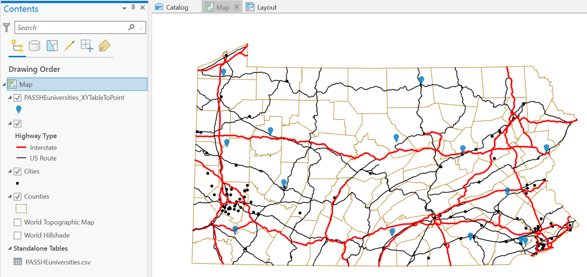
From either tool, the output looks like this. It should be noted that the table could include any number of additional columns of data (numbers or text) that can also be used to symbolize the new points layer. There are additional steps that can be taken to export the layer in order to use it in other map projects, but that will be covered in a different GIS course.
Joining A Data Table to A Layer
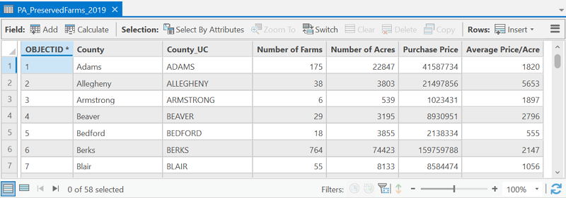
More typically the data table you import will have data for the same set of features as an existing layer in your map project. An example would be adding a table of Pennsylvania counties Census data downloaded from the US Census Bureau website. By itself, it does you no good in your map because it is not explicitly spatial. However, if you also have a layer of PA counties, you can "join" the counties layer's attribute table to the separate data table in such a way that the columns of the census data table appear as columns in the counties layer's attribute table. With that connection, you can symbolize the counties using any census data column. Of course, the counties spatial data is available from the PASDA website, described back near the beginning of this text, and tabular data about Pennsylvania counties is available from sites like that of the Census Bureau.
There is one requirement that must be met before this procedure will work. There must be at least one column in the existing attribute table for the GIS layer that identifies the layers features in exactly the same way as an existing column in the data table. For our Pennsylvania counties example, a column in both the attribute table and the data table can hold the names of the counties, or a column in both tables could hold the unique "FIPS" codes for the counties. The key to this is that the contents of both columns have to be able to be matched character for character. One cannot have the county names in all capitals while the other only has upper-case and lower-case letters: "LANCASTER" and "Lancaster" will not match. As another example, Pennsylvania has a county called McKean County. ArcGIS will not match "McKean" in one table to "Mckean" in the other table. FIPS codes are often preferred for table "joins" like these because they are strictly numerical and therefore less vulnerable to such issues.
Here are the basic steps, using the example of the Pennsylvania counties:
- Add the Excel data file to the ArcMap map document. Follow the conventional sequence using the Add Data dialog, but instead of searching for a shapefile, look for an Excel file. Remember, when adding, you can only add one "worksheet," not the entire "workbook" (XLSX file). Note: if attempting to add the XLSX file does not work, save the worksheet that contains the data as a CSV or XLS data file (use Excel's "Save a Copy" option).
- Open both the GIS layer's attribute table and the added data table. Confirm that they both have matchable data columns, or fields, and note their field names. In this example we are going to use the version of the county names in all-capital letters. Then close both tables.
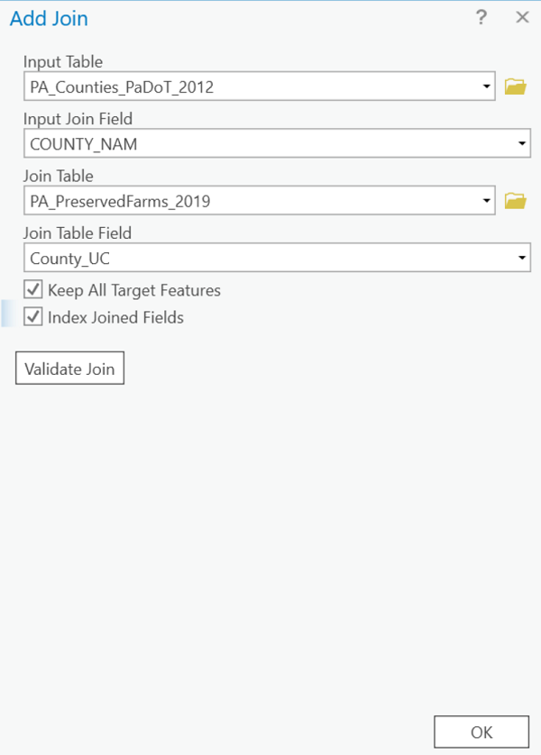
- Right-click on the Counties layer name and select Joins and Relates from the menu that appears, and then Add Join from the sub-menu that opens next.
- A dialog box will open in which you identify the field name containing the county names in the attribute table of the layer you are starting with. Further down the dialog box you identify the name of the data table, and then the name of the field in that table which should match the layer's attribute table. Click OK to run the join process.
- Right click the Counties layer name again and this time open the Attribute Table. You should see the data table's columns added to the attribute table and the data values occupying those columns.
- Symbolize the layer using any field in the now-joined tables.
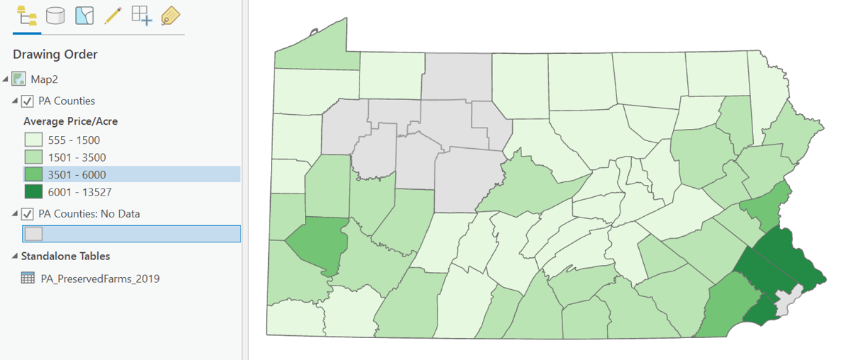
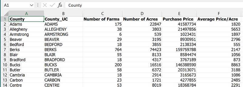
In the example, the original attribute table was missing a field for displaying the counties' average price of farm goods per acre. Following the join, that field is available. Another point you might notice is that the counties layer has been added twice. It turns out that several counties had no data recorded for the average price per acre. When that happens in ArcGIS Pro the county is not drawn at all (no fill or borders). We don't know whether there is production that wasn't recorded (unknown data values) or whether there was no production at all (data values of zero), so the correct decision is to draw it with a color that is not part of the sequence used for the data values. The layer depicting all counties with a single gray fill symbol enables those counties to show with that gray color. Below is the resulting map.