Symbology
Basic Requirements
Nominal Thematic Maps vs. Topographic Maps
Early in this course text you learned to distinguish topographic from thematic maps. The distinction was based on whether the map displayed many types of information, which we now understand to be represented by many GIS layers, or focused on a primary set of information, with that minimum being one GIS layer. Another way to describe the difference is to distinguish between maps that generally describe the map area and maps that display data about the area.
So, the general or most common purpose of thematic maps is to display one primary layer's spatial data pattern. Additional layers or, as implemented in ArcGIS Pro, basemaps can add landmarks and other spatial context, but the user's attention should focus on the primary layer. Nominal-level thematic maps that follow that model could include:
- A map of fishing spots in a region in which the symbol at each location varies according to the type of fish most commonly caught there.
- A map of all the utility lines (such as water, sewer, natural gas, electricity) within a borough's boundaries.
- A map depicting which US states have legislative branches featuring two chambers (similar to the US government's Senate and House of Representatives) and which have different organizational structures.
However, this focus on nominal-level thematic maps will demonstrate that the topographic and thematic categories are not really as distinct as that earlier content might have made them appear. In the table introducing the combinations of geographic feature types and data levels of measurement appropriate for thematic maps, the map type names used in the row representing the nominal level of measurement did not include any of the specific names of types of thematic maps introduced on that same page. Insteaad, the map type names include the word "Descriptive," indicating that the nominal (or qualitative) maps of points, lines or areas often have a somewhat more limited purpose than thematic maps at the other two levels of measurement.
Thematic Layers and Nominal Data
Referring back to the table of feature types, levels of measurement and types of thematic maps again, we will start by focusing on the three types of geographic features: points, lines and areas.
- Point features can depict true point locations, such as fire hydrants, utility poles, or points of impact for traffic accidents. Points can also be more suggestive of relative locations. For example, a layer of point features can represent cities on a state or national map, or street intersections on a city map. In these cases, there is a point in zooming in on each feature where the size of the feature becomes larger than the point representing it.
- Line features can show true pathways across a landscape, or (as with the description of point features) they can be more suggestive of such pathways. A true pathway would follow the exact line of a stream or road. An example of a more suggestive pathway is a layer of routes represented by lines whose origin points are accurate and destination endpoints are accurate, but the lines connecting them show greatly simplified travel routes. Examples include maps of global oil shipments, migratory bird flight paths, and even human migration.
- Area features show spatial extent surrounded by boundaries, outlines, or edges. For formal areas such as countries, school districts, national parks, and property parcels, those edges are declared very precisely in legal documents. Less formal areas include boundaries that are drawn as part of the layer, but that represent something much less fixed. Map layers of wildlife species territories, radio transmission ranges, and the market reach of each Walmart store are examples.
While the types of geographic features will be part of the decision process for choosing symbology for our primary map layer, the nominal concept refers more directly to the variables (or columns or fields) in the layer's attribute table. Remember, the concept of the nominal level of measurement is that different values of that nominal variable are simply different. No specific value should be presented as (or implied to be) better or worse than other values of that variable. That may differ from whatever narrative surrounds the map, but as a representation of its content, the map should be impartial.
Data Considerations
Nominal variables can be of two types. These types are easily distinguished.
- Some nominal variables can be used to
identify the features (rows) in its table and layer. A nominal identification variable could be each feature's name or some kind of non-quantitative identification number. Nominal identification variables are not useful for thematic maps, though they could be used for labeling a thematic map's features, if that became necessary. - The other type of nominal variable is used to
classify , or categorize, the map features. This is a non-quantitative version of the classification process recently covered. If there are 50 features on the map, the number of different values in that classified data column will be considerably fewer. Each different value represents a different class. This is the most common data type for a nominal-level thematic map.
The fewest possible number of classes in any classified data variable is two, which allows that data variable to be described as binary. Theoretically the number of classes can be as high as the number of features, but that would result in a map that is very difficult to read. It depends on the type of symbology (discussed below), but in general it is better to have fewer classes than to have many classes. This point will be addressed again in the coming discussions about ordinal-level thematic maps.
Thus, for most nominal-level thematic maps the symbolization will be based on one classified nominal data field in the layer's attribute table. This is really where the map's nominal level of measurement is defined. The same layer's attribute table, of course, can include ordinal and/or quantitative fields as well. There can also be other data scenarios, but this covers the greatest number of situations.
Here are several examples of such nominal fields for each of our geographic feature types:
- If our points layer represents US cities, one classified nominal field could identify whether the city is its state's capital or not (the values in that binary data column are either Yes or No), and another field could describe each city's location with values such as Coastal, or Riverside, or Landlocked.
- If our lines layer represents major roads, a classified nominal field could define the jurisdiction or ownership of each stretch of highway as Interstate, or US Route, or State Route, or Other.
- An areas layer of property parcels could include a classified nominal field identifying each parcel's zoning designation (Residential, Commercial, Industrial, etc.).
Two types of attribute data lend themselves readily to nominal-level maps. The most obvious is a text data field that contains a nominal grouped variable. Each group, or class, will most likely be represented by a different symbol. The other possibility is an attribute table text field in which every value is different from all the others. Such fields are used most often to identify individual observations. Each feature in the layer with that attribute table field could be represented by a different symbol, perhaps one displayed with a unique color.
In the latter case described above, each layer can be symbolized just based on the fact that its features are different from the features in other layers. Whatever made the features different enough that the data sources store them in separate layers is justification enough that they should have different symbology, too. This is one data situation likely to result in the use of the "single symbol" symbology option (see below). Generally speaking, there is no need to even look at the attribute table.
Symbol Options
Symbology is the biggest factor in designing nominal-level thematic maps. The key symbology consideration is how to best represent the feature or its nominal-level values with appropriate symbology. Despite the fact that one data situation was identified as the most common basis for nominal-level thematic maps, there are actually two very different symbology options. One way to describe the difference is to focus on whether the purpose of the map is to display similarities or differences.
The key concept in distinguishing nominal-level thematic maps from topographic maps is that the map's purpose is achieved by making one symbol (representing a single feature or multiple features) stand out from the rest of the map's contents, or by using multiple symbols (representing multiple features in one layer or multiple layers) to demonstrate a relationship between groups of features. The core data question is whether the symbology for the feature(s) in question depends on an attribute table field or is independent of its attributes. In the former case, that field will most likely be recorded at the Nominal Grouped level of measurement. In the latter case, the fact that we are ignoring its attribute data means that any layer can be used.
Single Symbols
In situations where feature locations are of equal importance and only need to stand out against the map's context layers, they can all be represented by the same symbol. The simplest version of such a map is one with only one primary feature. In a nominal level map using a single symbol, whether it is one feature symbolized or multiple related features symbolized, it is important to make that symbol the most eye-catching symbol on the map, making it stand out from background colors or any basemap. Use size, color or intricate design (or all three) to make that primary symbol capture the viewer's attention. That is the strategy used in the map below. For example, mapping the locations of a supermarket chain's stores, the company logo (or some variation on it) would be an appropriate symbol. In fact, it might be more important to select the primary symbol before any background symbology and choose the background symbology to complement the primary symbol.
The dialog to accomplish single-symbol mapping is part of the Symbology dialog. You experienced it following the instructions in the course text unit on Map Compilation.
A related strategy is to use the single symbol to symbolize a subset of the features in a layer. There are several strategies for accomplishing this, but most of them are beyond the skill level for this course. The simplest is to make a copy of that layer's shapefile and then learn how to delete features from a layer. It is not the most efficient method, but it accomplishes the goal.
Another application of the single symbol option is when features are stored in multiple layers and each layer must be represented by a single symbol. This is especially effective if there are only a relatively few features; then each feature/layer could be mapped with a different symbol, perhaps a symbol suggestive in some way (such as color or shape) of what the feature is. That, though, leads us to the discussion of the second nominal symbology option.
Unique Values
A nominal-level map of unique values has the features in one layer displayed by multiple symbols, distinguished by some aspect of the map theme. Even though they are all the same type of feature (since they are all in the same layer to begin with), there is some reason to use symbology to show differences. The usual approach is to group the features in that layer into a smaller number of subsets, each subset getting a different symbol. The less common approach is for each feature to get its own different symbol.
The Unique Values dialog is reached in the Symbology dialog by clicking the drop-down list below the heading "Primary Symbology" and choosing the second option, "Unique Values." In the simplest usage of this capability in ArcGIS Pro you simply identify the attribute table field containing the nominal grouped data variable.Its class values will immediately be listed below in table format with the symbols in the first column. Each symbol can be clicked on to make changes, such as symbol shape or color. The process then is identical to choosing a single-symbol representation.
The main symbology advice with unique values symbols is to choose the symbols to mimic the relationships you are trying to depict. If that relationship emphasizes similarities, then the symbols can be similar in some way, but they must still be different enough to tell apart and different from the map's background. If the relationship is based on differences, then colors and shapes can help to distinguish them. Be careful, though, not to use differences that imply ordinal or quantitative differences.
In one application of this, the unique values field is a text field in which each feature has a different text value. This is redundant because all you will see are lots of different colored versions of the same symbol randomly assigned to the features. All that creates for the viewer of your map is confusion. However, if there are multiple map features of the same type that you want to differentiate, another effective strategy is to give them all the same symbol and then label each feature with the text in that one field. The labeling process was described earlier in the text when examining topographic map compilation.
Similarity to Topographic Symbology
Nominal level mapping can take advantage of lessons learned in the world of topographic mapping. For example, if symbols are well chosen, with colors or shapes clearly representing the map's content described in the title or caption, then a legend might be superfluous. Remember that the key to a thematic map's effectiveness is keeping it simple so that the message shines through.
One way to test the concept of the nominal thematic map, in fact, is to open a USGS quadrangle in Adobe Reader and turn off all layers except one. Choose a layer that is very specific and themed, such as Structures or Wetlands or Woodland, and notice that you are seeing it completely out of the context of the road network or political boundaries. Similarly, leave only two layers visible, such as Wetlands and Hydrography or Woodland and Hydrography, in order to see the spatial associations between the two map layers.
Applications for Nominal Maps
The GIS applications of nominal-level mapping are many. Often maps can be used to add visual context to a story or historical narrative, for example. Naming locations in the narrative or adding information to a basemap for context purposes are typical uses. Historical works often need such context if boundaries or travel routes have changed, if earlier names have been replaced with current ones or if the area in question is unfamiliar to the map's intended audience. As discussed earlier, this is bordering on topographic mapping; the degree of focus on the map's thematic purpose is the distinguishing characteristic.
One way to enhance that distinction between topographic and nominal thematic mapping is to consider the basemap, especially considering the choices available in ArcGIS Pro. There are several basemaps identified in the program as topographic basemaps. Using them certainly establishes a topographic purpose for the map: one in which varied landscape elements and lots of different kinds of information (GIS layers) are employed, even if it is only subtle. Simpler basemaps, such as the light gray or dark gray, tone down that variety while still maintaining a strong sense of location and even transportation connections and other landscape elements to provide context. Another strong option in some situations is not to use a basemap at all. This works well if the map area will be familiar to the target audience so that the extra context is not needed.
Another common application of nominal-level mapping is to map identifiable incidents or sites, such as crimes, tornado touchdowns, gas wells or sporting event locations. The same concept can be extended to linear or area features. Maps of one or more geological fault lines or wildfire burn zones would fit those descriptions. All these examples represent situations where the nominal features are isolated and separated from other features in the same layer. In the cases of areas and lines, the features may even overlap.
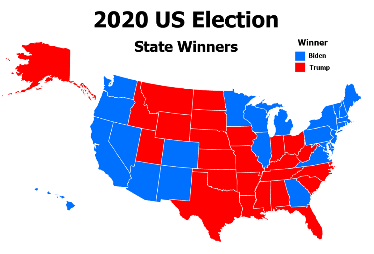
An alternative to the latter scenario is to use a layer of adjacent, contiguous areas. The easiest example is a layer of the 50 (or 48 contiguous) US states. If the attribute table for that layer includes one of the types of data described above, that can constitute an effective nominal-level map. An example is a map of election results from a recent presidential election: each state can be colored according to whether the Republican or Democratic candidate won that state. This example also demonstrates the value of using well-established color associations as symbology choices.
From our work with topographic mapping earlier in the semester, the procedures for making the symbology selections for all these scenarios should be known. The challenge is to apply the design concepts discussed here to your maps. The scenarios vary widely because they depend on the map's purpose and the nature of the data.
Example in ArcGIS
Election Results Map Procedure
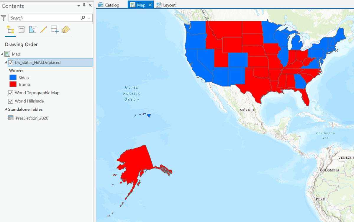
The purpose of this topic is to lay out the steps to create and improve the map above. It starts with a layer of the 50 US states in which Alaska and Hawaii have been purposely repositioned. (There are all kinds of GIS data files out there if you look hard enough!) The original purpose was to be able to fit them onto one page without reprojecting the map, but that does not really work with this particular layer. The process continues with the scenario that the election results are available as a data table, but not as part of an existing shapefile. The table will be added to ArcGIS Pro separately from the layer and then "joined" to the layer's attribute table. The steps below will illustrate how these procedures can be used to create a more effective map of the election results.
- Add a map layer of the US states (51 features because the District of Columbia has voting rights) to ArcGIS Pro. Check to see how the states are identified in the layer's attribute table. In this case, the states are identified by both their full names and their two-letter abbreviations.
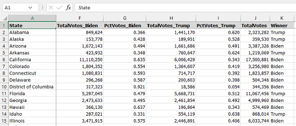
- Download a table of election results (it is more reliable to save the data in CSV format) that contains at least these two fields:
- First, the names of the states (or their two-letter abbreviations or their FIPS codes) for identification. No matter which field we plan to use, there must be an equivalent field in the US states attribute table with the same data format, capitalization and spellings.
- The election results recorded in such a way that it is easy to identify the winning party or candidate.
- Add the table to your Map view using the same Add Data dialog that you use to add shapefile layers. Once added, the table appears in the Contents list in a separate section titled "Standalone Tables" below the GIS layers.
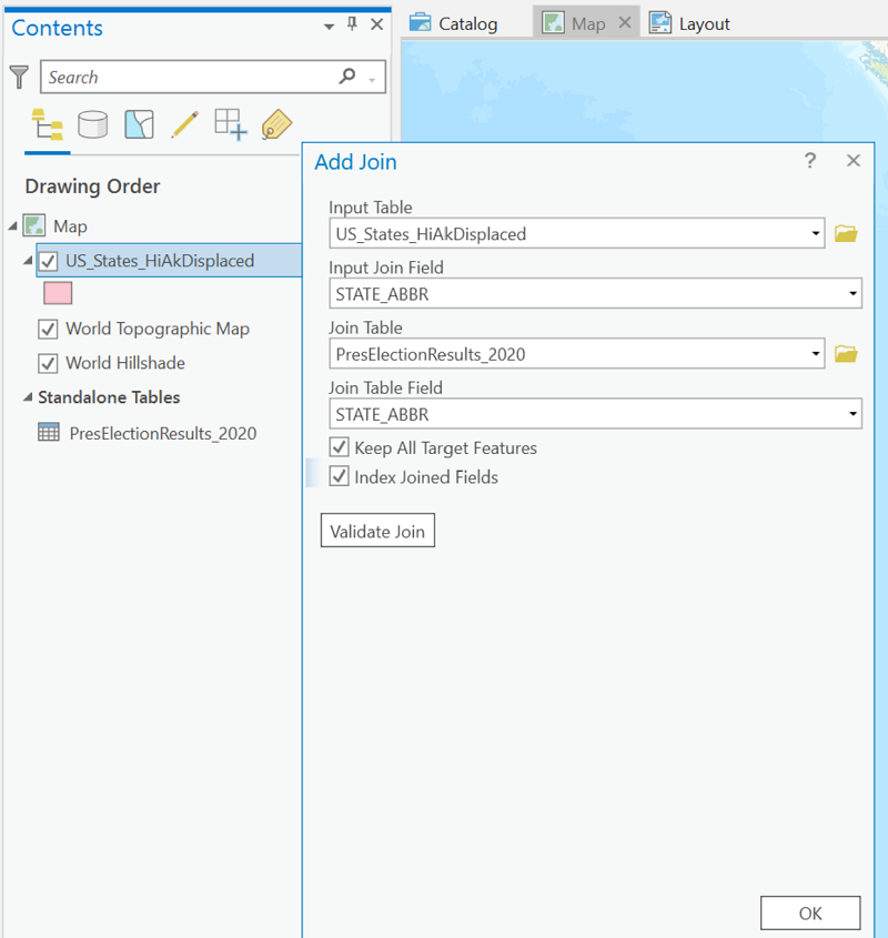
- The next step is to "join" the data table to the layer's attribute table. In ArcGIS Pro, here is the path to the Add Join dialog, accessed by right-clicks.
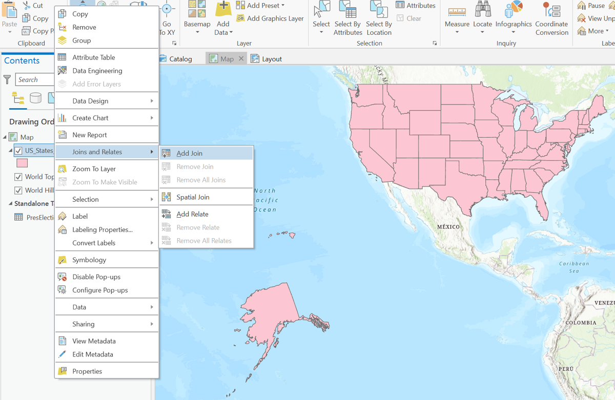
- The dialog to add a Join is shown below. The Input Table entry will be filled in by default with the name of the layer selected in the Contents list. The Join Table, two entries below that, is the name of the table containing the data, which will already be in the Contents list. The Input Join Field, the second entry, is the field in the layer's attribute table that will match the Join Table Field, the fourth entry shown. Checking both boxes below those entries will satisfy some settings in ArcGIS Pro. Click OK at the bottom of the dialog window to make the join.
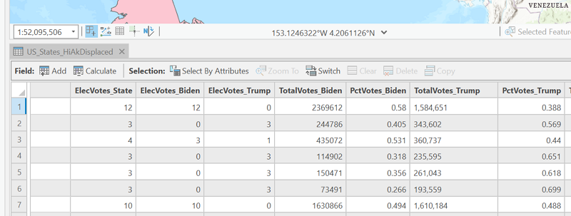
- Right-click the layer again in the Contents list and open its attribute table. Scroll all the way to the right to find the table columns now visible in layer's attribute table. This means the new fields can be used just like the normal attribute table fields.
- Symbolize the US states layer using the election results field, coloring the Republican-won states red and the Democrat-won states blue.
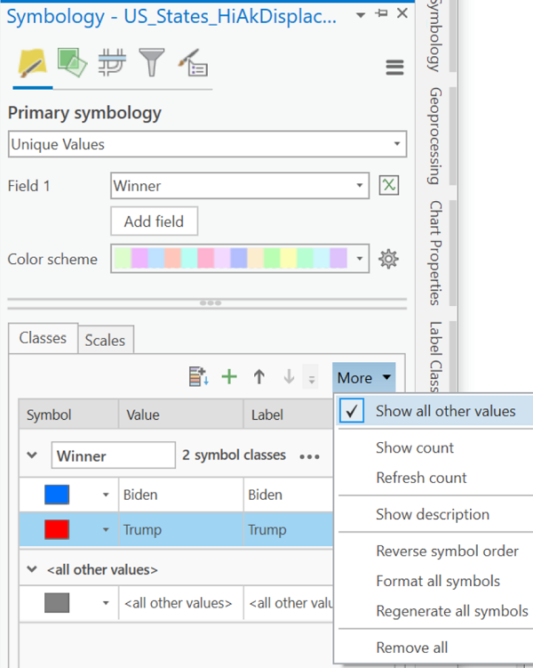
- In the Symbology dialog for the states layer, choose Unique Values for the "Primary symbology."
- In the option labeled Field 1, choose the field that contains the election results.
- All the possible data values are added to the Classes list below. In this case they are "Biden" or "Trump." A third class value appears below those values under the heading "<all other values>."
- The class values are given default random colors, so click on each color block and change it to the appropriate color: red for Republicans and blue for Democrats.
- If desired, click "More" in the row of icons just above the table of classes (shown below) and uncheck the box labeled "Show all other values" to remove that class value.
- Click back onto the map when finished.
- Once the main map is compiled to satisfaction, to complete the map shown below, it was necessary to create two additional maps in this ArcGIS Pro project. One of the extra maps focuses just on Alaska and the other just on Hawaii. This is necessary to position the two states out of their normal geographic locations (which were already wrong on this shapefile anyway). A full detailed description of the steps to do this would take up a lot of space here; just be reassured that it can be done.
- When the data are compiled to satisfaction, switch to composing the map. If you recall from earlier in the course, this means adding a Layout view to this ArcGIS Pro project.
- Once created, the initially blank Layout needs to have the Map Frames added and positioned.
- A clear title, relevant to your audience, should be added in a prominent position on this map layout (in some cases it might instead be added to a caption in the document where the map will be displayed).
- Add a legend, keeping it as simple as possible.
- Since this map has a very obvious purpose and likely displays an area very familiar to your intended audience, such extras as a grid or north arrow or map scale are not important to communicating its information.