Classified Means Ordinal
Ordinal Context
As introduced in the previous unit on Thematic Maps, the three ordinal-level thematic maps explained below are shown in the organizational table in that unit with the word "Classified" as part of their names. The classified graduated symbols map, classified flow map and classified choropleth map are so named because they require that, if the map theme is based on quantitative data, then the classification procedure (also previously demonstrated) must be considered part of the map's construction. There are data situations where that is not the case, so we will start with those.
Original Ordinal Data
The most common scenario in which you will encounter data that come to you already in ordinal form, is when the source of the data or a previous holder of the data performed the classification procedure. In that scenario, you do not see the original data values; all you see are the class names. Even if the class names or some other documentation for the data shows you the upper and lower limits of each class, you do not know each observation's original quantitative data value. You are stuck with those classification results, and you do not even know whether they performed the procedure well. The best you can do is to make the clearest map possible using the data you have. The first map on this page (below) is an example of this.
The second scenario is that the data came to you in ordinal categories because that was how it was collected in the first place. Consider a survey in which you are not asked to enter a number value in response to a question, but to identify which ordinal category you identify with. For non-spatial example, “Do you make a) $0 to $19,999 per year, b) $20,000 to $49,999 per year, c) $50,000 to $149,999, or d) $150,000 or more?” In that scenario no one ever had quantitative data. Another example that might be part of a spatial data set of the storm tracks of hurricanes (or equivalent cyclones or typhoons) would be an attribute table field recording the maximum storm categories. The values are primarily based on wind speed and duration. The possible values are "Tropical Depression," "Tropical Storm," "1," "2," "3," "4" and "5."
Ordinal Data from Quantitative Data
Most classified thematic maps are maps based on a quantitative data variable that has been run through the classification procedure, as described previously. Classification, in this context, means that the original quantitative level of measurement variable has been replaced by a new ordinal level variable for mapping purposes.
ArcGIS Pro does have a built-in ability to graph data values and does give you a default "natural breaks" classification, but neither meets the guidelines set for this course or for making the best maps. There is no number line graph in ArcGIS Pro. The Jenks Natural Breaks classification algorithm used in ArcGIS struggles with irregularly spaced outliers in the data variable, frequently creating classes toward the middle of the distribution that have too many observations. This would be easier to see and work around if it displayed the observations as you are required to do in this course: with the number line graph on which the data values are plotted as dots and with a more subjective natural breaks classification procedure.
ArcGIS leaves us with two ways to create proper classified thematic maps. The first is to interact with the data variable outside of ArcGIS, say in Excel, where it can be run through the graphing and natural breaks classification process. The final step within Excel would be to add a new data column that contains just the class names such as "Class 1," "Class 2," etc. or such as "$0 to $19,999 per year," "$20,000 to $49,999 per year," etc. You would have to keep a record of your classification decisions and may have to customize the legend's class names.
The second, easier procedure is to work out the classification in Excel, as previously taught, to decide on the class limits. Then, use ArcGIS Pro's built-in abilities to create the appropriate thematic map based on the quantitative variable. ArcGIS Pro's dialogs for thematic maps include settings for the desired number of classes and the desired class limits for each class; simply replace the default values provided by ArcGIS with yours. It may be tempting to trust ArcGIS to get it right, but we have to keep in mind that ArcGIS's algorithms are based on very general assumptions covering a wide variety of scenarios, while yours are based on close familiarity with your dataset.
The Finished Maps
Earlier in the course we learned how to transform your ArcGIS Pro "Map View" map into a "Layout View." The Layout view enables you to add a map title and legend and other elements to the map. The same process is required when producing a thematic map, though several elements on the map are likely to be different. For one thing, because the primary focus in a thematic map is on presenting the data clearly, there will be fewer layers to display in the legend. For another, because each thematic map is a way to present data, much like presenting data in a research essay, the proper thing to do is to acknowledge the source of the data. Doing so on a map usually means adding some text below the map. The right procedures for displaying these will be presented over the next few Units.
It is worth noting here, however, that legends for classified thematic maps have a unique distinguishing feature. That layer used to display the map's primary data will use multiple similar symbols, one representing each data class. The group of symbols will have similar colors, shapes or sizes, but one of those characteristics will vary within the group to show the class differences. In the legend, each symbol in the group will be labeled with the data range represented by that symbol color or size. The key thing to notice is that they are indeed ranges of number values, such as "1 - 500" and not single values such as "500."
Choropleth Maps
Choropleth Maps
In a choropleth map, areas are colored according to their data value. At this ordinal level of measurement the full data range is divided into classes with each data class representing its smaller range of data values. All the geographic features in each data class is represented one color and the color scheme is selected so that the lightest color (or shade of gray, or pattern of lines or dots) represents the lowest data values and the darkest or brightest color represents the highest data values. Between those extremes the cartographer makes the colors, shades or patterns increase in intensity gradually.
The trickiest requirement of a choropleth map, one that is often violated in published maps, is that the data should represent a density or a calculated quantity (e.g., median age), not a simple count. Most data variables are easy to associate with either of these two types. Understanding this distinction is easier if you understand the goal of the choropleth map. The darkening or intesifying colors (associated with increased data values) are an effective way to display increasing density, and not increasing quantity or count. Consider a map of the US population to be portrayed using a layer of the 50 US states. If the population count variable was used, larger states would likely always be in the higher choropleth classes simply because there is more room for more people. Texas and California are good examples. Note that Alaska does represent an exception to this relationship (it is a large state with a small population), but that one exception cannot be a justification to violate this rule. Likewise, small states such as Connecticut and Rhode Island would always be in the lower choropleth classes with their space-limited smaller populations. However, the purpose of mapping population is most often to show relative crowding in the states, which is really a density factor. Connecticut and Rhode Island have significantly higher population densities than California and Texas. Exceptions to this rule can be made if it is easily demonstrated that state sizes have no impact on data density. For example, if the data variable is the number of companies selling British cars. Or if, instead of the US states, the map layer consists of all equal-sized areas, such as a layer of equal-sized grid squares covering the US; finding data for such a map layer would probably prove difficult, but it can be calculated using GIS.
One type of data variable that can be more subtle, however, is the percentage variable. For example, to show the US population distribution of Asian Americans, it has already been shown that it should be a map of the percentage of Asian Americans in each state. However, do not calculate each state's percentage of Asian Americans as its percentage of the US population of Asian Americans. Instead, calculate each state's percentage of Asian Americans as its percentage out of the state's total population. The difference is subtle but important.
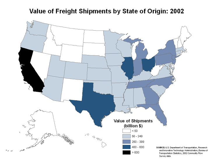
The two maps below are, respectively, bad and good examples of choropleth maps of the same data. The first map is bad because of a poor choice in its color scheme, and also because of strange alignments of Alaska and Hawaii (US Dept. of Transportation). It is likely that its cartographer has chosen the data range for each color poorly, as well. Data classes that have strictly equal data ranges are strong evidence that the cartographer who created the map did not start by graphing the data and looking for natural breaks in the data to serve as color change values. At least the map below does not make that error.
This re-creation of the map corrects the color flaws and the depiction of Alaska and Hawaii. However, it had to be created without access to their original data. Thus, there was no way to tell whether theirs was the best classification into data classes. We can only trust that they did it effectively. This is an example of the scenario laid out above of receiving ordinal data already classified.
Classification
The first step in creating any ordinal choropleth map, once it is certain that the data variable to be mapped meets the requirements, is to examine and analyze the data variable. The next step is to classify the variable. The purpose is to decide on the best number of classes and the best class breaks. As explained previously, the best graphical way to do this is to graph the data using a number line graph, either manually (e.g., on graph paper) or in Excel.
This process is easiest if the data originate in an Excel XLSX or CSV formatted file. If it is the latter (CSV), it is a good idea to save a copy in Excel's XLSX format. Be sure to keep a worksheet in that XLSX file containing the original data; this is the worksheet that can later be added to ArcGIS Pro. Add a new worksheet in Excel into which you copy just the variable needed, and in which you will create your number line graph and make your class break decisions.
Even if you don't have that separate Excel formatted file, graphing in Excel is the most practical way to create the graph. There are ways to export data from a GIS layer's attribute table and even to open a shapefile's attribute table directly into Excel, but those procedures are beyond the scope of this course.
Finally, follow the instructions in the previous topic to create the number line graph and to add vertical lines to the graph to show the positions of the class breaks. Write down those class break positions by finding a rounded number that falls within each gap where you placed a break line.
Choropleth Color Choices
The choropleth map is the thematic map type that is most commonly encountered, and with good reason. Color is a very effective way to display differences, as we also saw for topographic symbolization. Where appropriate, as also shown in the topographic symbology discussion, it is effective to use color schemes that incorporate color associations. For example, a choropleth map displaying money-related data can be shown in shades of green because that is a standard color in American currency. Green also works for agricultural productivity maps for crops, while shades of red might be more appropriate for agricultural meat production data.
Recall that ArcGIS does not use the term "choropleth" to name this type of thematic map. They emphasize the importance of color in its symbology by calling it a "Graduated Colors" map. We, however, will continue to refer to it by its proper name: choropleth.
Choropleth map color schemes are based on the concept of the "color ramp." The color ramp takes a range of colors from a light shade at one end to a dark or bright shade at the other end. The lightest shade should be associated with the lowest data values while the darkest or brightest shade should represent the highest data values. The specific colors chosen will depend on the number of classes in your classification. This is where the rule of 4-6 classes for choropleth maps becomes important: with more than six classes, the colors in adjacent classes become too difficult to distinguish.
There are exceptions and special considerations for these "color rules." The color ramp access point in the Graduated Colors symbology dialog (described below) in ArcGIS Pro is labeled Color Scheme. You will notice, when you activate the Color Scheme drop-down list, that many of the choices are not 'light to dark for a single color.' Keep in mind that ArcGIS uses the same dialog/list to provide color options for topographic mapping, so many of the options are not color "ramps" at all, but randomly sequenced colors; avoid those if you are constructing a choropleth map. Other patterns frequently found on the Color Scheme display are ramps that blend from one color into another, such as shades of yellow to shades of red. These really are inappropriate for basic choropleth maps because they imply that the data are not only changing value but they are also changing in meaning. A simple example would be a color ramp that blends from reds for lower values to greens for higher values; the context for this might be financial data that ranges from negative values representing money owed to positive values representing money earned or profits. Again, be very selective and cautious when using such color ramps.
Try it:
Start with the natural breaks classification to create the choropleth map.
- The first stage of the process, which happens outside of ArcGIS Pro, is to create or import the dataset into Excel and to save it in Excel as an XLSX file. Copy the target data variable into a separate worksheet for the next step.
- In Excel, select the target variable and process the data classification. Remember, the variable should be a density or ratio or similar variable, so creating that variable might have to be done first. Once that column of data has been processed through the classification procedure, remember to write down the number of class breaks you determine and the value of each class break.
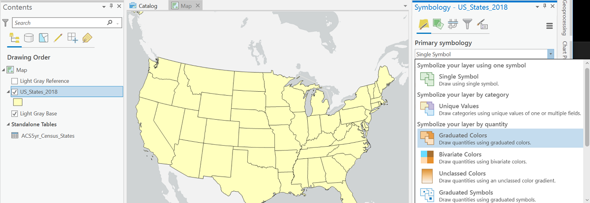
- In ArcGIS Pro, select the area layer that will be the basis of the thematic map. If the data area already in the layer's attribute table, proceed straight to the symbology dialog; if the target data are in a separate table, that table must be joined to the layer's attribute table.
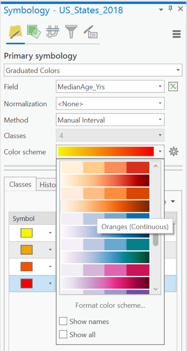
- Open the Symbology dialog for that layer. Under "Primary symbology" near the top of the window select the "Graduated Colors" option.
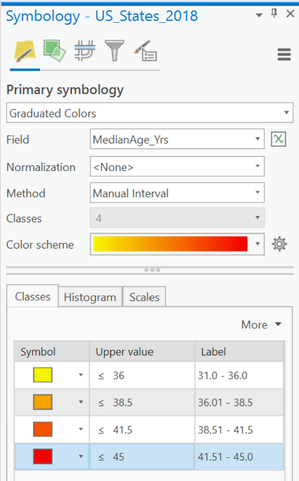
- Use the box labeled "Field" to choose the data field.
- You will usually leave the default settings for Normalization as "<none>" and for Method as "Natural Breaks (Jenks)."
- Check the default number of "Classes" and change if needed. The number of rows in the table of symbols and class values at the bottom of the dialog box will reflect that number of classes.
- In that table retype your class break values in the "Upper value" column. You will probably also need to retype the numbers in the "Label" column, especially to reduce the number of zeroes in the decimal portion. The default number of decimal places is six. The values listed here will be reproduced in the map legend (including all the decimal places). Follow the pattern on the example map below for differentiating the highest value of one class from the lowest value of the next class. It is OK to round up the highest value in the last class, but not too much.
- The default color ramp is likely not suitable. Click the list labeled "Color Scheme" and be sure to select a "light to dark" color scheme.
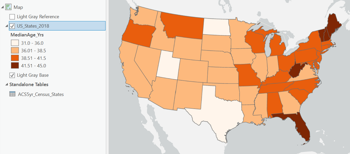
The compiled map for this example is:
Graduated Symbols Maps
Classification and Symbology for Graduated Symbols
The Symbology
Graduated symbols are usually circles, but can be many other shapes. The basic concept is that the symbols increase in size as the data increase in value. Ideally the symbols are representative of the features or the data variable being represented on the map, but that is not always easy to achieve. The circle is considered the most generic symbol and has the added benefit of being the most compact symbol. If two circles are located close to each other or overlap each other on the map, it is easier to tell them apart, based on their shapes, than if they were squares or other shapes.
Graduated circles are unique in that they can represent either point features such as cities or area features such as the states. ArcGIS Pro will make the graduated symbols dialog available for either of those types of layer. The advantage of circles for point locations is that they imitate the smaller dots that would be a common topographic symbol for them, with the center of the circles representing the actual place location. With area features it is more desirable that each circle be clearly identifiable with its area feature, even staying inside the area it represents. However, the latter is often not possible. The way ArcGIS Pro positions the graduated symbol for area features is to calculate the point, known as the centroid, at the center of the shape of the area.
One challenge of graduated symbols is that differences in size are more difficult to perceive than differences in color. Because we are asking map viewers to notice differences in size and compare the size differences between two symbols near or far from each other on the map (including the legend), we should not create as many different classes as we would for a choropleth map (see below).
Other shapes are possible and easily found in the Symbology dialog in ArcGIS; hexagons, squares and triangles are other easily resizable symbols. ArcGIS Pro has also been increasing the availability of pictorial symbols, all of which are also able to be resized. The challenge with these other shapes is that size differences in them can be more difficult to distinguish, so they have to be exaggerated a bit more than simpler symbols.
Data Requirements
Probably the most subtle, but important, aspect of deciding when to use the graduated symbols representation is making sure you have the correct data, especially when you are working with the quantitative data field in ArcGIS Pro and not with previously classified data. The data for determining symbol sizes on graduated symbols maps should be a count data variable, and not a density or ratio or similar variable.
Occasionally you will find a graduated symbols map in which the symbol sizes are directly proportional to the data values: for a map of the 50 states there can be up to 50 minutely different circle sizes, each one proportional to the number it represents. These maps are called Proportional Symbols maps and will be treated in a coming session where we deal with thematic maps for quantitative-level data.
Classification for Graduated Symbols
The discussion about classification in this context is largely the same as it was for choropleth maps, and even more similar to the discussion below about flow maps. As with the choropleth map, the data are most often divided into classes, with one symbol size representing all of the features in that class. The concept of creating classes that reflect natural clusters and gaps in the data field is just as relevant in the classification of symbol sizes.
In fact, deciding on the classes for a graduated symbols map can be more challenging, given that map readers have a harder time distinguishing size differences than they do distinguishing color differences. That is the reason why fewer classes, three to five, are recommended for classified graduated symbols maps, where four to six classes were considered optimal for a choropleth map. With fewer classes, the question of how to treat outliers becomes more critical. The objective should still be to not let the number of features in one class dominate the other classes.
Try It:
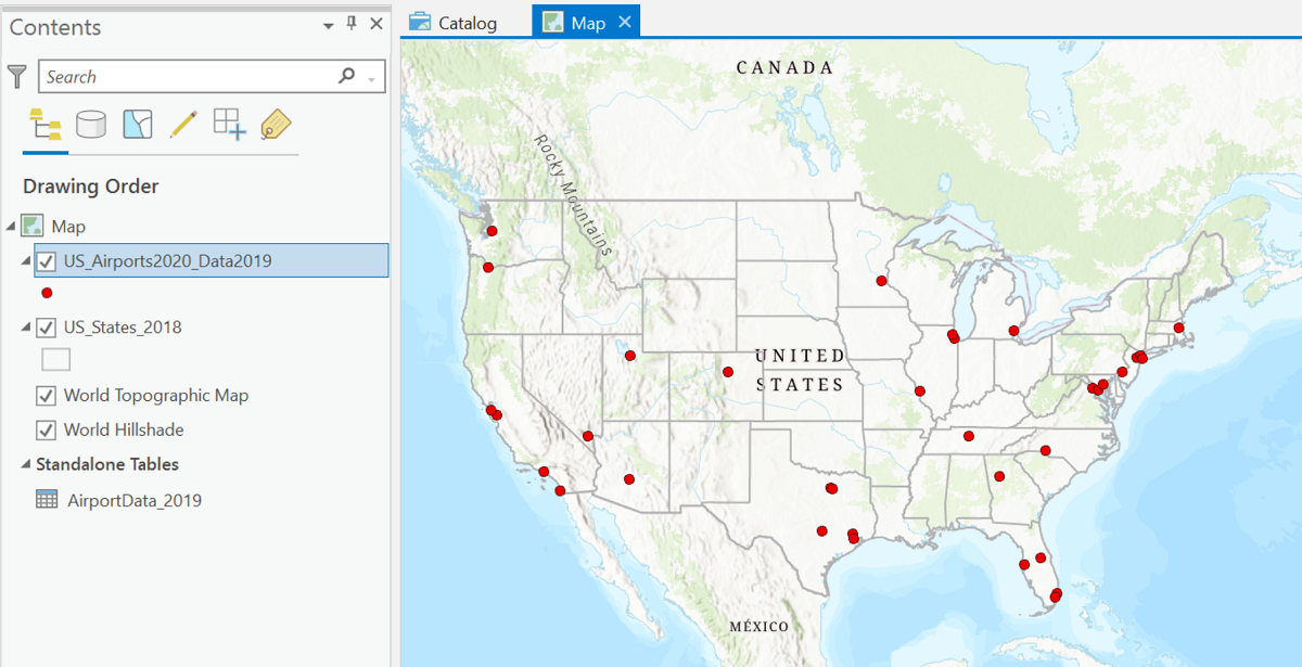
The theme for this example will be US airports. These are point locations at the scale of a US map. The plan is to represent them as graduated circles with the circle sizes representing the number of passengers boarding. The official term for boarding passengers in the airline inducstry is "emplanements."
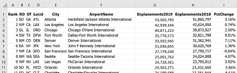
- The first step is to retrieve the data. These data came from the FAA (Federal Aviation Administration) website. One webpage (a subsite of their main page) had a layer of every airport in the country (there are thousands) and another page on their site had this spreadsheet file of the emplanement data:
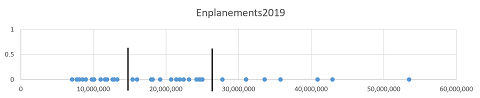
- The next step is to prepare the data. A map of all the airports in their lists would have been unusable because there would simply be too many to show on one map. Fortunately, the data table was arranged in order of size, so it was easy to choose the largest airports. That subset of three dozen airports was copied to a new Excel worksheet and taken through the classification process. Because all the airports on this shortened list were large, indicating less variation than if it was a more random sample, the classification goal was changed to three classes.
- Here is the initial map of that set of the 36 most active locations (actually 35 because Honolulu, Hawaii was removed from the map for readability). There are several ways to eliminate features from an ArcGIS Pro layer, either temporarily for one map or permanently for that dataset (always make a copy of the original in case of other uses), but those processes are beyond the scope of this course. The map below is ArcGIS Pro's map view showing the 35 airport locations.
- The other element visible in the ArcGIS Pro Contents list above is the data table. That means another step needed here is to Join the data table to the airport layer's attribute table. Once that task was done, the emplanement data became available for symbolizing the map.
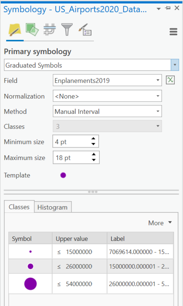
- The next step is to set up the symbology. The Symbology dialog box shown below shows that the Primary Symbology was specified to be the Graduated Symbols thematic map type. Then, the Emplanements attribute field was chosen, and the number of classes was modified to be 3. Finally, the upper and lower ends of each data range were retyped in both the Upper Value column and the Labels column of the dialog box. Commas were also added for readability. Once those changes were made, the "Method" option changed from Natural Breaks (Jenks) to "Manual Interval" and the ability to change the number of classes was canceled (notice that it is grayed in the image below). All these changes simplified the potential appearance of the map legend.
- A few more decisions will add finishing touches. The general appearance of the graduated circles was adjusted by clicking on the symbol labeled "Template," which opened a dialog allowing adjustments to the main button color (purple to stand out against the basemap) and the outline color (white was chosen to make overlapping circles easier to see) and thickness. Then the symbol sizes were set. Either use the items labeled "Minimum size" and "Maximum size" (the middle size is adjusted automatically), or control the sizes individually by clicking on each symbol in the table below the Template.
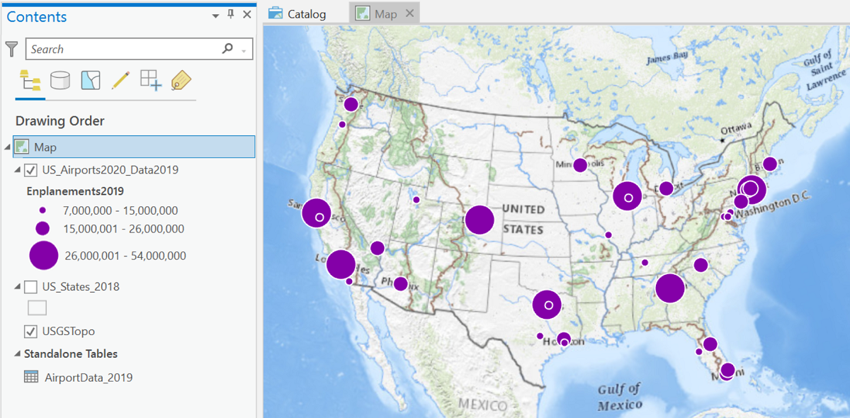
The map below shows all those decisions plus a couple of others. The default topographic basemap along with several others created issues by having too many labels partially hidden by the graduated circles. The map projection was also changed, as was the map scale and extent. Of course, it won't be hard to set up a Layout view with appropriate title, legend and other elements.
Flow Maps
Flow Maps Depict Line Features
Flow maps represent quantities of things that flow, or travel, either from an origin to a destination or along particular paths. An example of the former is a map of petroleum trade between countries, with each pair of trading partners represented by a line whose thickness corresponds to the amount of petroleum; the line just links the two trading countries, and does not follow the actual shipping route. An example of the latter type of flow map is a traffic flow map, with each stretch of road varying in thickness according to the average number of vehicles per day that travel on it. On this type of flow map the road is in its proper place on the map.
Strictly speaking, then, the data variable that a flow map is based on, like that of the graduated symbols map above, must be a "count" type of variable. Furthermore, because of the nature of the representation, the data variable should represent something that can be counted (not measured or calculated), at least conceptually. So, we can map the number of trucks per day along each stretch of highway in Pennsylvania but not the percentage of traffic that are trucks. It is a subtle distinction, but important for proper use of flow maps.
As with its cousin, the graduated symbols map, we are focused here on maps displaying ordinal-level data, meaning the data must be classified before mapping, with the map showing only a few different line thicknesses. This is in contrast to the proportional version of the flow map, in which each line's thickness is based directly on its data value.
Classification and Symbology for Flow Maps
The comments above about classification for classified graduated symbols maps are virtually identical when talking about classified flow maps. The ideal range to aim for is three to five classes. More than that and line thicknesses are just too subtle to differentiate easily, especially if there are other lines present in the map's background layers, such as boundaries, transportation routes or even the graticule.
Flow map symbology choices are much more limited than for other thematic maps. They are basically just lines of different thicknesses. There are some style variations that can be added, such as edge lines and colors. If you choose to enhance the line thicknesses by adding colors, then make sure they are in an appropriate corresponding “graduated colors” color ramp.
Try It:
Below are the steps to create an ordinal-level flow map in ArcGIS Pro. All the layers needed for this example are available on the PASDA website (see the end of Unit 4), particularly the "PA_Traffic..." layer. To find the file on PASDA, search "by Data Provider" on the PASDA homepage and select "Pennsylvania Department of Transportation" as the provider. "Pennsylvania traffic counts" is the title for the shapefile/layer. (The year given for the file in PASDA will change each time they issue a new layer, which is annually.) So, the layer consists of the right type of geographic features and has the right type of data for the flow map. The shapefile filenames were changed to make the layer name better describe its contents.
The "PA_Traffic..." layer's attribute table in the map below contains the spatial data for the state-owned roads of Pennsylvania and also the most recent traffic data for each road. The traffic data occupy a half dozen data fields, including values calculated for daily, weekly and annual traffic volumes and differentiation between total vehicles and trucks. For some context, PennDoT and county planning commissions use a variety of tools to count and categorize the vehicle traffic, but it is done at very precise locations. It is impractical to expect that every road segment gets surveyed. The field used in this example is "DLY_VMT" which stands for Daily Vehicle Miles Traveled. To determine that, examine the "Metadata" for the layer within the PASDA site. Keep in mind that every road is a combination of many road segments (from one intersection with a crossroad to the next intersection). Not every road segment will have frequent traffic counts, and some may have low counts (or high counts, for that matter) just because of the timing of the count.
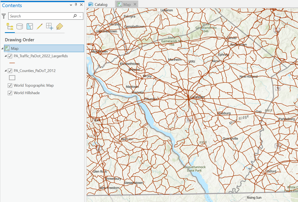
- The first image below shows the layers needed for the map with the symbology for the traffic layer defaulting to a single symbol.
- Because of the thematic map type and the amount of detail that would be easiest to see on a map with the number of features that the Pennsylvania Department of Transportation (PennDoT) is responsible for, the map is zoomed into just one county: Lancaster County, of course. The challenge with this layer is that PennDoT is responsible for many thousands of miles of roads throughout the state, ranging from major highways to smaller state routes. For this map the data were also trimmed down to show just the largest highways and more heavily-traveled roads. The procedure for making such adjustments is beyond our capabilies in this course. To make the county decision more visually clear, a Pennsylvania counties layer was also added, symbolized as a thicker medium gray border with no color fill. Because the traffic flow could be influenced by the landscape, a topographic ArcGIS basemap was chosen.
- Normally at this stage of the preparation, the proper approach is to create a data table of the selected variable in Excel, construct the number line graph, and decide on appropriate number of classes and the individual class ranges. Even with the pared-down selection of roads to be mapped, the attribute table for this layer covers so many road segments (over 38,000) that this step is impractical. This is one of the rare situations in which it is appropriate to let ArcGIS Pro's built-in algorithms make that decision.
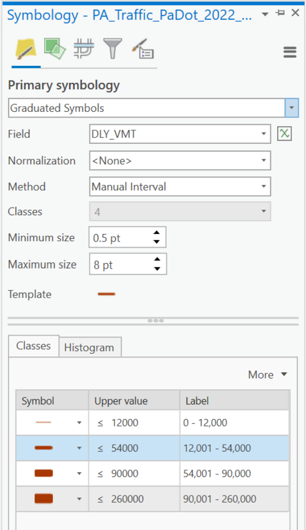
- In the Symbology dialog above, the first decision is to identify the thematic map type. ArcGIS Pro does not have a type specifically called "flow map" but in ArcGIS's categorization it is a type of Graduated Symbols map for line features. A warning statement appeared that this layer includes so many roads that ArcGIS could not easily analyze every one for preliminary categorization and would be basing the options on a sample of the total layer. Given that this is consistent with our observation and decision that there are too many features to do a proper classification, this message is no cause for concern and can be simply ignored.
- After selecting "Graduated Symbols" as the Primary Symbology, the first thing to specify is the data "Field" that the symbology will be based on:the "DLY_VMT" field described above. The second thing to specify is the number of classes. PennDoT has to manage a wide range of roads, from smaller two-lane roads in rural areas to major highways such as Interstate highways and the Pennsylvania Turnpike, so more classes could help show those differences. However, there are so many of these roads that, in a developed area such as Lancaster County, there can be considerable overlap between nearby roads, especially those that will be drawn as thicker lines due to high traffic volumes; this situation makes a smaller number of classes more appropriate. Given these limitations of this particular flow map data scenario, the decision was to choose four classes.
- The last two decisions affect the appearance of map and its legend the most. The first of these is to identify the minimum and maximum line thickness for the number of classes just chosen. Maximum readability results from making the maximum thickness as large as the map can tolerate. This can only really be done using a trial-and-error process. The final part of the Symbology process is to adjust the class limits to create a more user-friendly set of numbers. Because of the previous decision to use the class ranges calculated by ArcGIS Pro, the simplest way to proceed is to round those ranges to less-confusing numbers of significant digits.
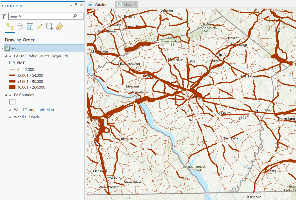
- Here is the compiled map (just the Map view) showing the four classes that are reasonably easy to distinguish: