The Quantitative Difference
We have already seen how ordinal (classified) symbols can be used to represent data values using size and color symbology options. In this unit we start by using the same symbols with almost the same appearance options to represent data but in a different way. The difference is that, whereas a classified (ordinal-level) thematic map creates a limited number of different symbols (such as five shades of red) to reflect the entire range of data values for a layer, unclassified and proportional thematic maps represent each map feature's unique data value by a correspondingly unique symbol for that feature (a virtually ulimited number of shades of red).
Keep referencing the Thematic Map Types chart from several units ago. The quantitative-level thematic maps have more specific map types than the other levels of measurement, especially for area features. Two of those map types, graduated symbols (this occurs at the ordinal level of measurement as well) and isolines, are repeated for two different types of geographical features, both points and areas. Perhaps the biggest challenge in learning about the quantitative-level thematic maps is keeping the different data requirements and symbology options straight.
Following the quantitative-level graduated symbols, flow and choropleth maps, other quantitative-level thematic maps will be explained. These are the dot map, the isoline map, the cartogram, and the heat map.
Of course, we will also be examining how these maps are created in ArcGIS Pro. In a couple of cases the best we can do here is to view completed maps and explain them conceptually; ArcGIS requires extra software or extra data or graphical manipulation to produce them. As before, we will also have to face some of ArcGIS's terminology differences with the language of cartographers. For example, we have already seen that ArcGIS Pro calls choropleth maps "graduated color" maps and treats flow maps as a version of a graduated symbols map (we will continue that interpretation here by considering flow maps here with the graduate symbols representation).
Proportional Quantitative-Level Maps
Data Requirements for Graduated Symbols Maps
We start our discussion here with the quantitative version of the graduated symbols map. As stated in the description of the ordinal graduated symbols map, the data requirement for area map features is that the variable must be a “count,” ratio, or other calculated quantity and not a density quantity. The reason for this is that the symbol size visually compared to the size of the area it represents already functions as a visual representation of density. If the graduated symbol is a circle, then the circle radius will be directly proportional to the data value it represents; in other words, there is no classification step. For any shape used as an alternative symbol, some dimension of the shape (height, width, length, area, etc.) will be used in the same way: each separate symbol will be sized in direct proportion to the data value it represents.
As you see in the Thematic Map Types chart, graduated symbols maps, both classified and proportional, can be used for point features and area features. On that chart proportional graduated symbols used with point features requires that those point features represent "discrete phenomena" in contrast to "continuous phenomena." The distinction is that the point locations should represent something that stands alone at that place, such a city surrounded by countryside or a water well surrounded by land with no wells (until at some location there happens to be another well). The symbol's size will be in proportion to the corresponding data value. With discrete point locations, the purpose is to highlight the magnitudes of the individual features. The audience will notice constrasts between areas with smaller more widely spaced features versus areas with larger features that occur closer together.
Since flow lines are considered graduated symbols in ArcGIS Pro, their data requirements are exactly like the quantities of the graduated symbols for area features. Flow maps are meant to show the quantities of some sort of material flowing along that route. It is not a measure of the speed of flow (like miles per hour), but a quantity that has a standard, consistent context. In the case of roads or railroad tracks it will be vehicles or freight or passengers (or percentages thereof). In the case of pipelines it will be some measure of the amount of fluids. For wires there are various measures of the amount of information or electricity flowing. However, the quantities still require some sort of time context. The number of vehicles traveling on a road is counted for a set length of time, such as vehicles per day.
Graduated Symbols Maps Show Quantities using Symbol Sizes
For point features, such as cities on a US map, the graduated symbol is centered on the actual city location, but with area features, like the US states, the symbol is centered within the outline of each feature. If some point locations are close together or some neighboring areas are small, the symbols become crowded together in some area(s) of the map. A little overlap between neighboring circles is fine, and is actually better than seeing a lot of white space between all circles, but too much overlap will make it harder to identify which circle goes with which map feature.
Controlling for those size issues requires you to set the symbol size in the Symbology dialog and then go back and look at the map. You can control the visual effect of that relationship by adjusting the scale of the map, though this should only be used to a limited degree. In ArcGIS Pro your control over symbol sizes for graduated symbols is limited, as you will see below, so the scale adjustment could become necessary.
One other consideration applies to maps with graduated symbols, especially with those symbols presented as circles. Start by considering square symbols. The first shape is considered 1 square unit in area: one unit wide by one unit tall. The second shape, then, is 2 square units in area and the third one is 4 square units. Even though the dimensions of the third shape are double those of the first square (2 units wide by 2 units tall), it is 4 times bigger. To make a square that is twice the area of the first square, its dimensions would have to be 1.4142 units x 1.4142 units (1.4142 is the square root of 2) in size, which are the dimensions of the last shape. Generally, the “proportional” relationship between the data value and the symbol size should relate to the symbol's area, not any one dimension.
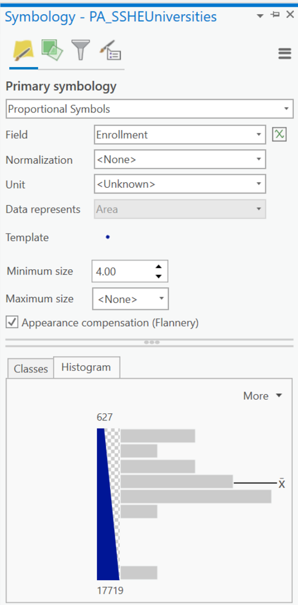
Something similar happens with circle symbols. To create a circle that is twice the area of another we cannot just double the diameter of the first circle. The formula for the area of a circle, πr², can be used to demonstrate that. Compare two circles, one with a radius of 3 and the other with a radius of 6. The area of the first circle is 28.27 and the area of the second circle is 113.10. Instead, 4.244 is the correct radius for a circle whose area is twice that of the first circle. However, psychologist James Flannery did some research in 1956 on visual perception and showed that what people perceive to be a circle twice the area of another circle is actually a little more than twice the area of the first circle. This is referred to as the "Flannery compensation." ArcGIS Pro gives you the option to apply the Flannery compensation when you create a Proportional Symbols map which you should always select as long as the symbol is a circle. For it to be available, you will need to specify that there is no maximum symbol size; larger circles will be altered more extremely than smaller circles. If you compare the same map with the Flannery compensation unselected first and then selected the second time, you will see that the effect of applying it is to make the larger circles bigger than they would be otherwise.
For the line thicknesses of a proportional flow map, think of them the same way as the proportional graduated symbols. As the data value gets bigger the line will get thicker. However, it is much more difficult to see subtle differences in line thicknesses, such as trying to decide whether one line is twice as thick as another. For that reason, it is best to use this kind of map only to show very obvious relationships.
Graduated Symbols Try It
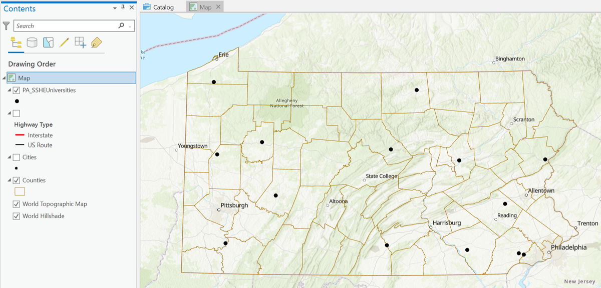
First add the appropriate layers. In this case, the main data layer is the universities of the Pennsylvania State System of Higher Education. The ArcGIS topographic basemap, the layer of major highways, and the layer of county boundaries are added to provide context. The Cities layer was contemplated for context also, but the map was looking too complicated.
Next in ArcGIS Pro we define the main data layer's symbology. In this map we will size the graduated circles using data showing the number of students enrolled at each university in 2019. In the Symbology dialog the main decisions to make are:
- The Primary Symbology is chosen first. A proportional graduated symbols map in ArcGIS Pro is called a "Proportional symbols" map.
- The name of the variable Field that the circle sizes will be based on is identified next. Remember, this should be a count, ratio, or other calculated quantity (but not a density). In this example the field name is "Enrollment."
- The "Minimum size" button gives you the main size control you need over the symbology. Remember (see discussion above) to set the "Maximum size" to "<None>" and then check the box for "Appearance compensation (Flannery)." You can only control the minimum circle size because all other circles are calculated proportionally to that smallest circle with the Flannery adjustment then added.
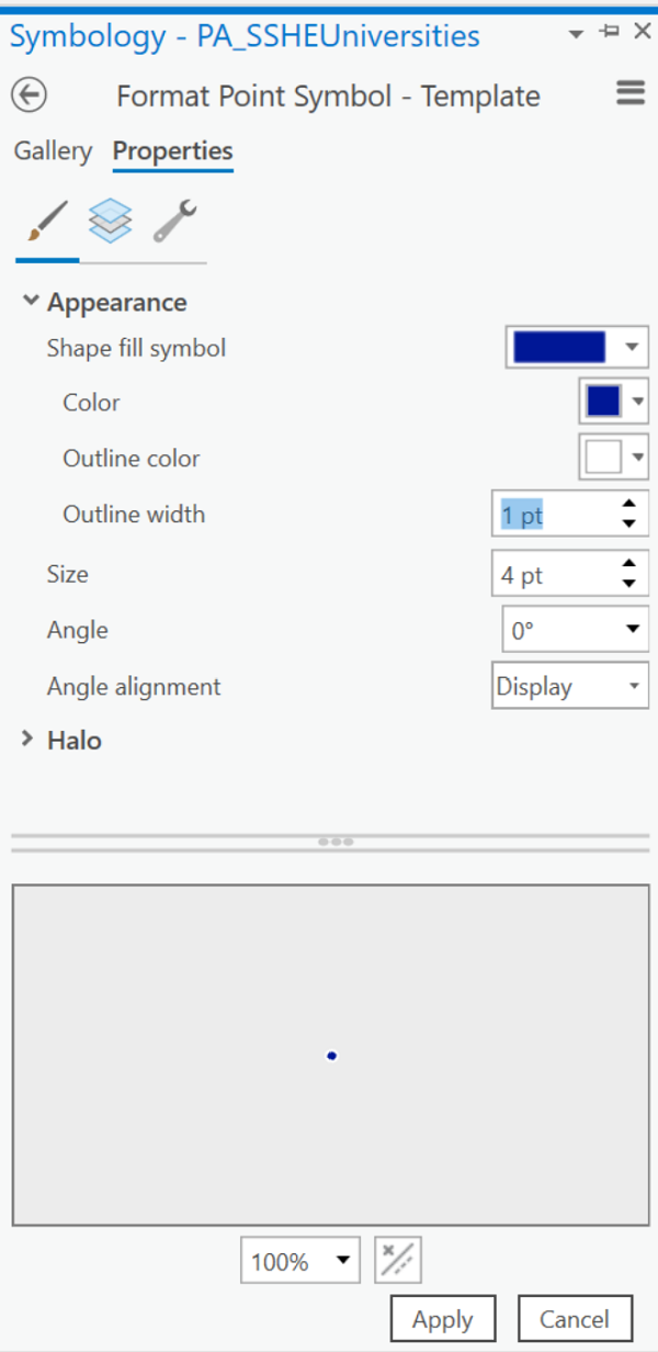
- Above the "Minimum size" setting is an item labeled "Template." Click on the dot to the right of that label to open the standard ArcGIS Pro point symbols dialog. The default symbol is usually a circle with a different-colored outline to it. In the dialog, you can change the interior color of the circle, the outline color and the outline width (or thickness). Do not change the circle Size setting in this dialog. Notice that the circles in this example have been given a dark blue color with a white outline; the purpose of the outline is to enable the small symbol for Cheyney University to be visible against the large symbol for West Chester University. Remember to click the "Apply" button before closing this dialog.
- A final caution: as with other situations where you are applying symbology, once you set the symbology sizes, if you zoom your map in or out, the symbol sizes do not change size along with the other map features (such as county sizes in this case). If you change your map scale, you could see some very significant appearance changes. Make any such adjustments before you start adding labels or other layers and their symbols in the Map view. Once all those settings are in place, DO NOT CHANGE the MAP SCALE.
The resulting map shows the effects of these decisions, plus additional symbology, basemap and labeling decisions. The proportional symbols effectively show the relative sizes of our state universities. It also demonstrates some of the potential challenges of using graduated circles (ordinal or proportional), such as the effect of covering or letting through some of the underlying basemap and what happens when ArcGIS Pro has to draw two graduated circles that overlap. In the latter case, the circles are drawn largest to smallest so the small circles will always be visible.
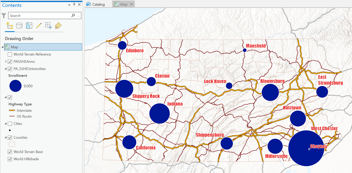
The map above shows just the compilation decisions for this map, with no map compostition elements such as a title or legend. The legend representation for the proportional symbols will be more than what is shown in the Contents list above. Where it is showing only one circle now, you will aim for at least three different circles sizes. Unlike the classified graduated circles legend, these circles will each be labeled with a single rounded number. This is the correct way to represent quantitative-level graduated symbols. Ordinal-level thematic maps show each possible symbol size labeled with the range of data values it represents. The quantitative-level map's legend for proportional symbols should show sample small, medium and large symbols so the reader can estimate the value for symbols of other sizes relative to them. This is also the best way to tell whether a map with different symbol sizes is classified or proportional, by looking at how the symbols in the legend are labeled.
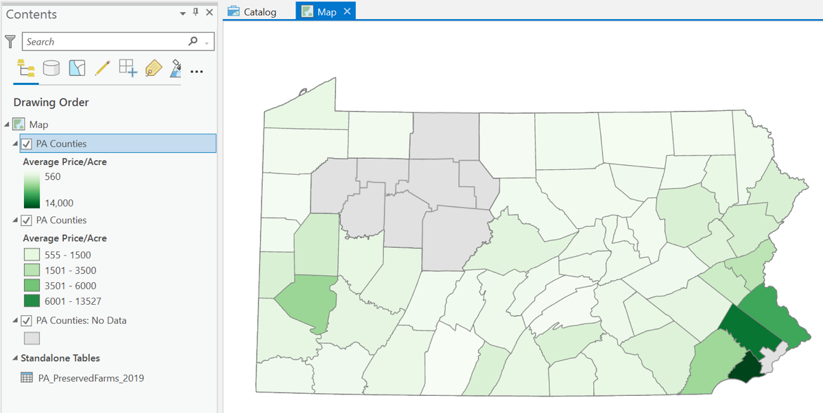
Classless Choropleth Maps
The quantitative-level version of the classified choropleth map is the classless choropleth map. Of course, since ArcGIS Pro does not use the term choropleth, they have a different name for it: "unclassed colors." Just as the proportional symbols map does away with creating classes of symbol sizes in favor of sizes that are directly calculated based on the quantitative data values, classless (or "unclassed") choropleth colors are directly proportional to the quantitative value.
The procedure for creating the map is similar to other thematic maps. First add the appropriate layers. The map below uses the same data as the classified choropleth map developed in the previous unit. In this case, the main data layer is the counties of Pennsylvania joined to the table of county data about preserved farms. The variable mapped is the average price per acre of preserved farms in each county. Both the ordinal (classified) and classless versions of the choropleth map are included in the image below (though only the classless map is visible) so you can compare the legend representations. The image does capture the subtle color variations well.
The clever nature of the color scheme on the classless map can also be identified as its biggest limitation. It may be better at showing differences for the few outliers at the upper end of the data number line graph, but in order to make any sense of the majority of the counties on the map it will require much time to study the slight variations in color. Neither the short version of that legend representation in the Contents list on the left nor the longer version that can be seen during use of the Symbology dialoggive any easy way to read and interpret the paler colors. That difficulty and the greater time needed to decipher it go against the general purpose of thematic maps: to make maps that deliver their information immediately.
Dot Maps
Dot Maps Show Densities
The main dot map principle is that the varying numbers of dots across the map reflect the overall density of the mapped feature: areas in which it is more concentrated as well as areas where it is sparse. You could achieve the same objective if you had data showing the exact location of each "thing," but very often that is not available, and you only have counts of those things for some level of area features. At the same time, we are designing maps that are meant to be viewed from a "zoomed out" perspective, not one where it would be possible to zoom in to each individual location. That design objective is very important to keep in mind: that the purpose is to show relative densities from a zoomed out perspective with only a count within each area as your data.
In the dot map below, each dot represents 10,000 acres of soybeans harvested in the US (US Dept. of Agriculture). The dots are displayed against a background of the counties of the US, which is most likely how the data were reported to the US Department of Agriculture. The dots are a little tricky to see in areas where they are relatively few, but the concentration of soybean farming in the central plains of the US is clearly shown. Notice also this map's arrangement of the inset maps for Alaska and Hawaii, which is being advocated by a number of cartographers for maps featuring US states.
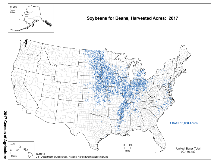
The legend of the map above is also important to examine. It is the simplest of all the thematic map legends we will encounter, but it tells you all you need to know. On this map the legend simply states the value of each dot. There is no expectation that anyone will try to count the dots or calculate any subtotals, but that legend is enough to give a relative sense of how much more productive one are of the map is than another. Another version of the legend would show a dot followed by the number and its units of measure.
Data Processing for Dot Maps
Dot maps, or dot density maps, show data by varying the number of dots filling a set of areas. Dot maps are proportional data representations because each dot represents the same number of things on the map. That number is never "1" so that, for example, on a map of beer distributors across the state of Pennsylvania, each dot cannot represent one beer distributor but can represent, say, three. The difference is that if it represented one, then people viewing the map would expect the dots to be placed at the exact location of each distributor, but not if it represents three. A map that does show each distributor at its exact location is a topographic map of the distributors (point features), not a thematic map of the counties (area features).
The key GIS layer for that example map would depict the counties of Pennsylvania, and its attribute table would include one data column showing the number of beer distributors for each county. There simply is not enough information in that attribute table field to show exact locations. Each value in that attribute table is said to represent a "count" so the variable is a count-type variable at the quantitative level of measurement. When ArcGIS Pro is given the number of dots to place in any one area, it places them randomly. You as the software user and cartographer do not control those random locations. ArcGIS does include more sophisticated procedures for “guiding” the dot locations, but that is beyond the scope of this course.
Try It
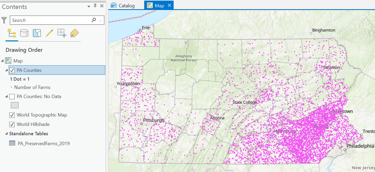
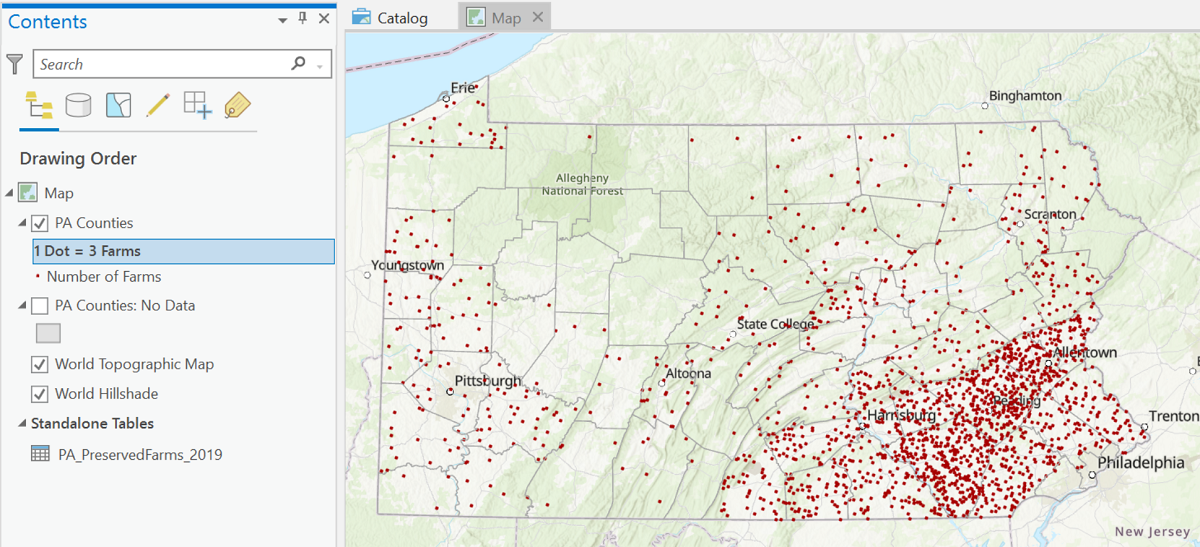
In this step-by-step example, you will be seeing the steps needed to turn a set of count data for a GIS layer of area features into a Dot Map. The example's primary data are added as a data table separately from the layer and then joined to the area layer's attribute table. The GIS layer shows Pennsylvania counties. The data table from the Pennsylvania Department of Agriculture records several types of information about preserved farms across the state, courtesy of the Department of Agriculture. The variable to be mapped is the number of preserved farms in each county. Note that several counties have no preserved farms.
- The first step is to add the layers and data, starting with the PA Counties layer joined with the PA agricultural data. The addition of the second "PA Counties" layer is intended (if needed) to enable representation of counties with no data (no preserved farms, in this case). The map also includes a basemap for improved context.
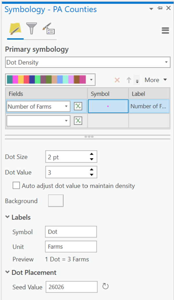
- The next step takes place in the Symbology dialog box, starting with selecting "Dot Density" as the Primary symbology and then identifying the field ("Number of Farms" in this case) containing the data. The initial map is shown below. The default dot color, pink, will not be used; nor will the default dot value of one dot representing one farm.
- The next group of decisions will take us deeper into the Dot Density dialog box in order to set up the appearance of the symbology. The field selection box is the first of three boxes in its row, laid out in table format. The second "column" in that table presents the symbol which will be used in the dot map. Clicking on it takes you to the dialog for symbolizing point features, in the same dialog used for point symbols throughout ArcGIS Pro. It should really only be used to change the color of the dot because its size will be changed below. Note that there is one other way to change the dot's color: by clicking on the drop-down list of color ramps just above the table section. As you have seen before in the choropleth color selection dialog, though, the color choices in this list are less organized. So click on the dot and choose a color that stands out against any basemap or background color.
- The third "column" in the table row is titled "Label" and is used to enter the text that will name symbol entry in the legend for this dot map layer. Since field names (the first table cell in the row) can sometimes be rather cryptic, this is an ideal place to simplify and clarify. In the example's case the field name was simple and clear so no alterations were needed. One form of the legend, which can be read in the Contents list, uses the dot symbol and the clarified field name. Notice that the dialog allows multiple boxes for selecting field names. One variation on the dot map concept is to show two (or more) different dot distributions on the same map by symbolizing each data field with a different color. Such a design is not recommended.
- The next section of the dialog allows you to choose the Dot Size and the Dot Value. These are the two decisions that have the greatest impact on the appearance of your map. The guiding principle should be that the dots should just begin to merge in the densest area (county, in this case) of the map. Reduce that tendency by either reducing the dot size or by increasing the dot value. Experiment with the map's appearance by trying to balance those two elements: as you increase the dot size, decrease the dot value, and vice versa.
- Below those controls is the label "Background" followed by a rectangle. Click on the rectangle to select the appeareance of the area features in which the dots are placed. The dialog is the same one used for area symbols throughout ArcGIS Pro. In this case the borders were set as a thin dark gray line and the background is completely transparent.
- The final two boxes in the dialog are labeled "Symbol" and "Unit." Their purpose is to define two terms seen in the Contents list and ultimately in another form of the legend for this map. The first term describes the dot symbol and the word "Dot" will be there by default. The second word is meant to describe the features represented by the data field. If this is left blank, this form of the legend will be useless. Here is the resulting map:
Isoline Maps
Isoline Maps Represent Quantities
Understanding isolines was a very important part of learning about contour lines on topographic maps earlier in the course. If you recall, contour lines are constructed by a cartographer who starts with a set of point locations with an elevation at each point. The cartographer then decided on a set of contour values based on a contour interval; each value was to be represented by one or more contour lines on the map. The paths of the contour lines were "interpolated" among those data points. The path of a contour line represents a constant elevation, and the area to one side of that line will be higher than the contour's elevation while the area to the opposite side will be lower.
The purpose of the isoline map is to add a third "dimension" to the spatial map of locations. Contours (elevation isolines) demonstrate that concept readily. Isolines can also be constructed for maps of air temperature, barometric pressure, precipitation, or some other (frequently environmental) data that represents a naturally continuous, ubiquitous phenomenon. That third dimension, like elevation on contour maps, enables us to interpret spatial change in the phenomenon measured, for example average annual precipitation. When the data represent land elevations or ocean depths, you see an approximation of the hilliness of the earth's solid surface. The contours that circle back on themselves, and that are nested inside other circling contours represent the hill tops and mountain peaks. You can apply that same metaphor to the other types of isoline data; in the sample below it becomes easy to find the small areas of highest precipitation.
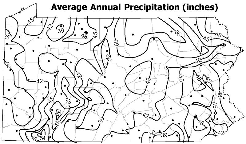
The isoline map above shows the average precipitation across Pennsylvania. In addition to the isolines, you see the locations (weather stations) at which the precipitation was measured; usually the point features used to generate the isolines are not visible on the final map. The map is titled "Average Annual Precipitation," and at each of those locations the weather station had been recording precipitation totals over several decades. Those were the starting data values from which an annual sum would be calculated; then all those annual sums were averaged to create the data used on this map. The range of average precipitation totals across Pennsylvania is between just below 36 inches (in north-central PA) and just above 51 inches (near southwestern PA). The decision about the isoline interval was to create a new isoline for every three inches of rainfall. The interval could have been set at every two inches, but that would have resulted in a very busy map; it could have been set at every five inches, but there would have been significantly fewer lines and it would have been harder to see the trends.
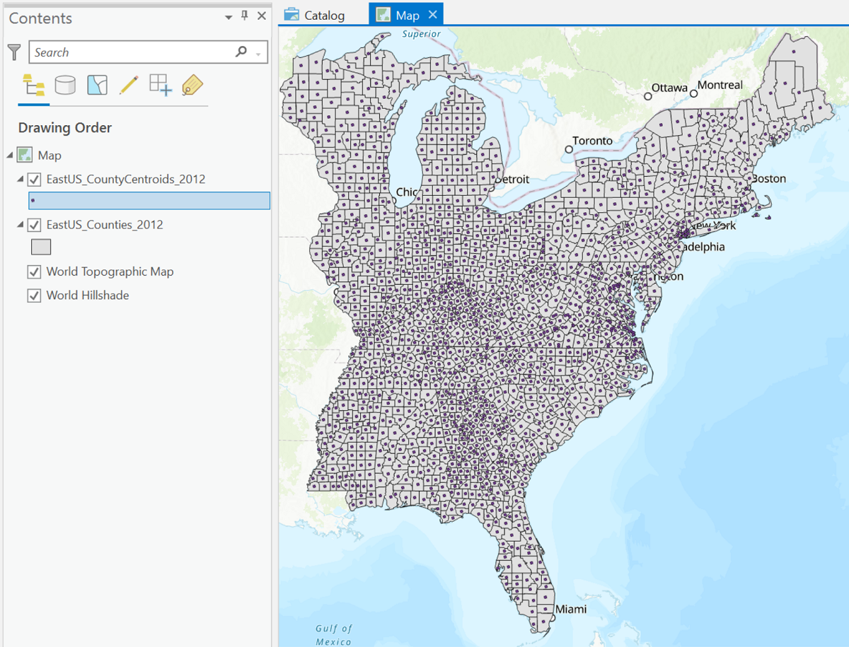
Another scenario for the use of isoline maps is to depict non-environmental data variables representing a ratio or density (never a count) for a set of area features. Given our procedure for creating contour lines, this may sound counter-intuitive, because we would not be starting from point locations. However, there is a procedure for turning a set of area features into point locations by determining the point location at the center of each area (see below). These points are known as "centroids" and ArcGIS does include a procedure for generating them automatically. Any data fields in the original areas layer are copied into the new centroid points layer. Thus, we have met the data requirements for this isoline map: a single quantitative data field.
In another sense, isolines divide the map area into zones of more similar values of the data variable, in this case inches of precipitation. These zones do not follow boundary lines, like the area features on a choropleth map, but follow lines determined by the data itself. In fact, as we do with choropleth maps, a common treatment of isoline maps is to add color to those zones, a single uniform color for each zone. The color choices for the zones follow a color ramp similar to the ones used on choropleth maps to emphasize the increasing data values. A common example of this representation is the daily high temperature map in most newspapers.
Creating Isoline Maps in ArcGIS Pro
This will be a discussion about creating isoline maps in ArcGIS Pro, but not a step-by-step demonstration of an example. The many controls and considerations in the process to create an isoline map in ArcGIS requires a deeper understanding of GIS than you are getting in this course. One of those complications is that creating isolines in this manner requires a set of geoprocessing tools that must be added to "extend" the ArcGIS software: the "Spatial Analyst extension" includes a set of interpolation tools. Recall that interpolation is the process of estimating the positions of contours between starting points in the process of constructing contour maps; in fact, ArcGIS refers to the procedure as "contouring." When you observed the contour drawing process for contour lines, we emphasized that to keep the lines looking "natural" they should be drawn with smoothly curving lines which was a very subjective process. It is the effort needed for logic-based computers to simulate creative processes like contouring that creates the challenges here.
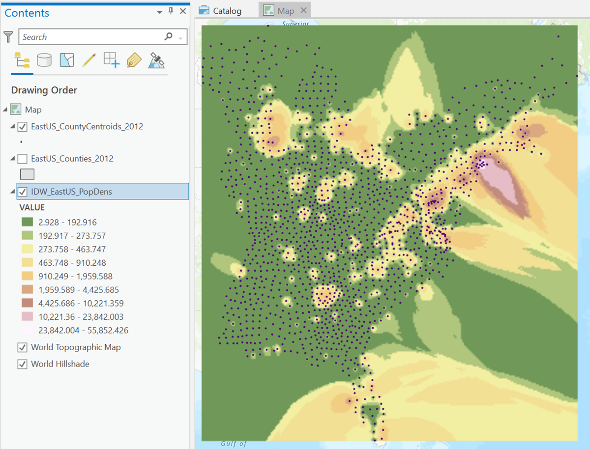
The production of the population density map above (not a finished product by any means) started with the layer of county centroids. This image also illustrates some of the pitfalls of isoline mapping in ArcGIS (and in general). The image shows the output of the easiest procedure built into ArcGIS to generate an isoline map. In this particular procedure, the map produced is a raster layer, not a layer of the isolines stored as line features. ArcGIS Pro automatically adds the choropleth coloring between the isolines, and by default it chooses a color scheme that would be better suited to showing a layer tint representation of elevation contours. It is possible to change that color scheme, though it can be hard to get an ideal mix of colors. It becomes another balancing act between competing considerations: the contour interval determines the number of different contour lines, which determines the number of different colors. Fewer colors are easier to distinguish but will show less detail.
Another point evident in the map above is that even though ArcGIS has calculated the isoline positions in order to apply the colors, it has not drawn the contours. We infer their locations by the color changes. Examining the color definitions in the Contents list reveals that the values were not calculated on an evenly spaced interval. These are some of the aspects of the map creation process that either require more detailed settings or some additional processing by different extension tools.
Another difficulty illustrated in the above image is that ArcGIS Pro creates the isolines based on the points layer, but does not "know" that areas with no points are oceans. It is designed to assume that whatever pattern it has created within the area covered by points extends outward. Again, in a higher level GIS course you will learn techniques for "clipping" the map to the edge of the counties area layer.
So, the interpolation process is essentially what you learned to execute on paper earlier in the course. ArcGIS contains tools that can approximate that procedure when given a layer of point locations that includes an appropriate data value.
Cartograms
Cartograms Show Quantities
Cartograms are the most elaborate of the thematic maps, approaching pure art. A cartogram represents count data only, again for area features such as the US states. A common data variable to use is the population of each area. Instead of varying the color of each state as is done for a choropleth map, the cartographer alters the size of each state according to its data value. Essentially, the cartographer is establishing a mathematical relationship between the data value and the state area measured in square miles or square kilometers. The artistic effect has to be added because, looking at any pair of neighboring states, state A might have a data value that is greater than state B, when in fact state A is actually smaller than its neighbor. The cartographer must introduce distortion of the shapes of each state in order to make the whole country fit together (sort of). See the example linked below. There are variations on this style of cartogram that rely less on keeping the states connected to each other, but the style depicted below tends to have maximum impact.
The website link below connects to a site that shows political election results using cartograms. What can be deceptive in this case is that the cartogram is based on states (or counties) distorted to the counts of Electoral College “electors” or election voters; the states (or counties) are then colored according to the party winning the vote count in that state (or county). The cartographer is thereby combining the cartogram with a nominal-level choropleth map.

Cartograms from GIS Software
GIS software, at least as it comes "out of the box," is unable to create the cartogram. There are algorithms created to accomplish it, but they tend to take a long time to run. If you understand that asking a program that was designed to create mapped representations of real boundaries with very precisely located coordinates to now move those coordinates and create very unrealistic representations, you get a sense of why these are challenging for the software. Add to that the fact that many viewers of cartograms have trouble seeing the purpose of them or the data being represented, then that adds to the lack of appeal.
Heat Map
Context
Heat maps are a relatively new map design concept that has uses beyond the geographical map. Consider as a "default" a landscape in which any point location is equally likely, at least at some abstract or theoretical level, to have an occurrence of the layer's theme. The data are simple point locations with no attention paid to attribute data values. The theme could be earthquakes, tornado touchdowns, property sales, or crimes. The purpose of the heat map is to represent the relative density of the features, to identify "hot spots" or areas where that density is higher than those default conditions. Because of the calculations necessary to work that out, the heat map is categorized at the quantitative level of measurement.
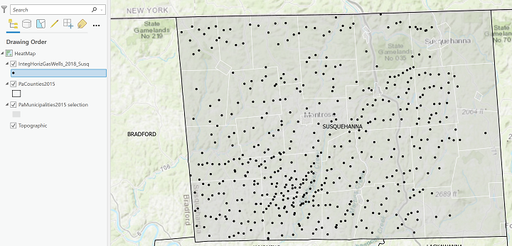
Here is an example of the starting data for such a map: this map shows oil and natural gas wells in one county (Susquehanna County) in northern Pennsylvania for which the controversial procedure known as "fracking" (hydraulic fracturing) has been used. This map shows the well locations as simple black dots. It is a little deceptive because many of the apparent black dots are actually two or more separate dots spaced very closely together but impossible to differentiate at this scale.
The Heat Map
Here is the Heat Map corresponding to the above map of fracked wells. Compare the well locations from the map above with the shades of color on this map. The paragraph below the map explains the logic of the calculations involved. Take note of the legend representation in the Contents list.
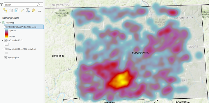
The heat map representation of those dots uses a color scheme that expresses a range of value from a minimum, say blue, to a maximum, like a bright red. For every location (including locations that have no dots), spaced a certain distance apart, the algorithm counts the number of data theme occurrences (or dots) within a fixed distance of that location. The occurrences (dots) are "counted" multiple times, but the shifting of the count locations means that some areas of the map will have much higher count values than others. Following the counting stage, the minimum and maximum numbers of occurrences are established as the lowest (coolest) and highest (hottest) values, respectively. That range of counts is made equivalent to the corresponding range of colors, which are then applied to the map at the count locations. Like the choropleth map, the heat map is using the "color ramp" idea to convey increasing density; unlike the choropleth map, there are no fixed boundaries for the colors, just the gradually shifting locations of the counts.
The steps to create the map are simple enough. If you have a layer with abundant and variably spaced point locations, it will just be a matter of choosing the Heat Map option from the Primary Symbology list in the Symbology dialog. The point spacing requirements (for an effective heat map) being difficult to define and the scarcity of data that would create an effective heat map are the main reasons for not illustrating those steps in more detail here. Like the isoline mapping procedure, there are also many settings to adapt the default appearances to simpler, clearer versions.