General Principles
Main Points about Thematic Maps
Recognizing the difference between topographic mapping and thematic mapping is critical. Topographic maps (like the USGS quadrangles we have used in this course) can be complex and detailed, but thematic maps should be simple and clear. The complexity of a topographic map invites the map user to spend time studying it and looking for details. Since many different kinds of information are crammed in together, the cartographer has to pay attention to things like whether some features are covered by other features, and whether labels can be read easily. Thematic maps, on the other hand, are like magazine ads: if they don't communicate their "message" (the spatial pattern of the data) within a few seconds, the reader will probably not buy into it. Simpler is better. And if anything is visually wrong or distracting, that error will be noticed more than the data pattern.
Because thematic maps have to communicate their message quickly, having too many details creates problems. That is why the principle of mapping only one or at most a few variables is usually followed. Text is also used sparingly so that the symbols do most of the communicating.
Detailed location information is not necessary, but easy clues to the identity of the map area are. The cartographer has to consider whether the map's intended audience will recognize the map area. Latitude and longitude, map scales and north arrows are not usually desirable because they add complexity to thematic maps and detract from the immediate message. If the area will not be easily recognized by its intended audience, other solutions are available and will be descibed below.
Choice of Thematic Map Type
Over the last few units we have reviewed all the types of thematic maps. When choosing among them, it is important to always return to the chart showing the types of geographic features and the data levels of measurement. Those are the two aspects of your thematic mapping project that you should always specify first.
| Geographic Feature Types | |||
|---|---|---|---|
| Levels of Measurement |
Points | Lines | Areas |
| Nominal, or Qualitative |
Descriptive Point Symbols | Descriptive Line Symbols | Descriptive Area Patterns |
| Ordinal, or Ranked |
Classified Graduated Symbols Map | Classified Flow Map | Classified Choropleth Map Classified Graduated Symbols Map |
| Interval/Ratio, or Quantitative |
Discrete Phenomena Proportional Graduated Symbols Map Heat Map Continuous Phenomena Isolines Map |
Proportional Flow Map | Absolute Counts Dot Map Cartogram Proportional Graduated Symbols Ratios or Densities Classless Choropleth Map Isolines Map |
The need for a thematic map may stem from having a data set to display, or it may stem from a research goal best expressed in map form. If the map is data driven, you identify the map features (including their feature type) by looking at the data table rows, and you identify the data level of measurement by looking at the column heading and the types of data values showing up as you look down the column. Create the type of thematic map suitable to those two criteria. If the map is research driven, it takes a bit more analysis and creativity. What is the best level of geographic detail to represent the scope of your research? That will define your map features, which will in turn define what GIS layer is needed. Once that is determined you will need to identify an appropriate data variable that can be added as a field in the attribute table. Determine the geographic feature type and the data level of measurement from those decisions.
So, choosing the most appropriate type of thematic map is the most important decision in the mapping process, and that choice requires maximum familiarity with your project goals and your data.
Map Page Elements
The word map can be used to identify either one specific part of a document (video screen or paper) page or the larger page that map is part of. The elements of a map page are the parts that make up the whole. They must work together to communicate the "message" you are trying to convey with the map. They complement each other and should all help to focus the reader's attention on the most important content within the map. It is important to note here that it is not necessary to include all the elements below; include them only if they contribute to that main message. Here is a list of the most common map page elements; most of them are described further below.
- The map
- The map title and subtitle (if needed)
- The legend
- A north arrow
- A map scale
- Any additional explanatory text
- Source information
- The cartographer's, or the cartographer's organization's, identity or logo
The general principle underlying all positioning and sizing decisions for your thematic map page is that the size and position of the map element should reflect its general importance relative to your map's purpose. The map itself should be the most important thing on the page, so make it as large as possible (allowing for the other map elements that will be needed). For example, the title communicates the purpose in words, so that should also be relatively large and high up on the page, usually above the map but that depends on the shape of your map area. Other elements can fit lower on the page wherever there is room to keep them appropriately sized.
Working with the Map Elements in ArcGIS Pro
Remember the distinction made earlier in the semester between map compilation and map composition. The previous chapters presenting the types of thematic maps were focused on the map compilation stage of the process. All your work in ArcGIS Pro there was in the Map view. That will be reflected in the map element alone which means that many of the compilation decisions are independent of the map page composition.
Map composition starts with inserting a Layout view into your project. The Layout view represents the map page. Remember that the availability of some commands on the various ArcGIS Pro menus changes in a Layout view. There will be some exceptions, but the most important map composition decisions will require the use of the Layout view's Insert menu, in particular for the Legend and text elements; you are much less likely to need a north arrow or map scale on a thematic map.
Some compilation decisions, however, will have an effect on your map composition. One example is the importance of clear geographical context. Here are some options that are worth experimenting with:
- For example, if a map of Lancaster County is needed for a publication with a Pennsylvania-wide audience, then an inset or marginal map with Lancaster County highlighted within Pennsylvania will help. Inset maps are possible to create in ArcGIS Pro, but require more advanced knowledge of the software than we are covering in this course. If you want to look it up and figure it out yourself, it involves creating a second "map frame" or Map view and then adding both map frames to your Layout view.
- Far easier in ArcGIS Pro, as we have demonstrated previously, is to add a basemap. These were described in the early part of the course in the context of topographic mapping. The important distinction here is that the basemap must be a real "background" for the map, allowing the map to stand out. There are two primary considerations for this option:
- The topographic basemaps built into ArcGIS Pro will generally not work for this purpose. They are mostly very complex with many colors, symbols and labels which could clash with the thematic symbology. There are two non-topographic alternatives; one is the "Light Gray Canvas" basemap and the other is the "Dark Gray Canvas." Other basemap options can provide similar simple background colors. The vast majority of the time you should find the Light Gray Canvas version to be preferable. The dark gray version adds a great deal of drama to the map; however, the risk is that the darker colors could easily distract from your map's main theme.
- A map page whose map element includes a basemap will require a rectangular space for that map element, while the shape of a map element without a basemap could create some interesting smaller areas within the page where smaller elements (legend, source details, supplemental text, etc.) could fit. A map element with a very pale or simple basemap could create similar smaller spaces.
- A third option, much less preferable than the previoius two, is to add a graticule to the map. Lines of latitude and longitude can work well for indicating location and direction on a topographic map, where such context is usually vital. For a thematic map, the increased number of lines and labels would be too much of a distraction from the map's purpose. However, if your map area is small in an area of the world unfamiliar to your audience and if done with a non-intrusive design, it can be a simple way to add that spatial context.
Map Composition Elements
Symbology Considerations
As we have seen in the last few units, the determination of the appropriate type of thematic map is the most important compilation decision when you have statistical data to present, and determines generally what types of symbols will be used. Each thematic map type does have some flexibility in its design. It may be the color choices in a choropleth map, the smallest and largest circle sizes in a graduated symbols map, the dot size and value in a dot density map, or the isoline interval for an isolines map. The motivation for each decision should be to keep the intended information as clear and obvious as possible.
For another example, refer back to the discussion above about basemaps. Both the light gray and dark gray canvas alternatives add two layers to your map. The main layer, drawn as you would expect behind all your thematic layers, depicts the continents and oceans in shades of gray with very lightly represented boundaries. The second layer, which you might find distracting, is added at the top of your Contents list and includes the name "Reference" in its title. This layer adds many labels which, depending on your map purpose and audience, could be beneficial or could be distracting. You have the option of either turning it off (unchecking its box) or removing it altogether.
Any composition elements added should be sympathetic to the thematic map symbols' color and shapes. If you add color to text elements, perhaps the text's color can visually connect with symbol colors. Composition elements comprised primarily of text can be made more visually intrusive or less so simply by changing the font's color, or weight (boldness), or size.
The Legend
Thematic maps generally require a legend to convey the meanings of the symbols. Some legends take up significantly more space than others; the smallest legends are for a dot map or an isoline map. Legends are generally a combination of symbols and labels, both of which should be considered carefully. Design simplicity and clarity are important.
One of the sure signs of an amateur cartographer is when the heading of the legend is "Legend." Map readers will know what it is and what it is for. The heading can be used to convey some finer details about the primary thematic layer, such as its units of measure. The most important characteristic after the data values themselves, is the units of measure. Since the map title or caption should identify the variable displayed on the map, it is not necessary to repeat that in the legend, but any clarification or explanation would be well suited to being either in or adjacent to the legend.
It is not necessary to include every layer added to the map when creating the legend. The primary thematic layer must be shown, of course. But layers added for spatial context such as foreign boundaries on a map of the US, or state boundaries on a map of Pennsylvania are more likely to be well known by American audiences. Other topographic layers whose features are labeled, such as cities or rivers on a map whose main layer depicts the US states, are also self explanatory.
Legend Position and Shape
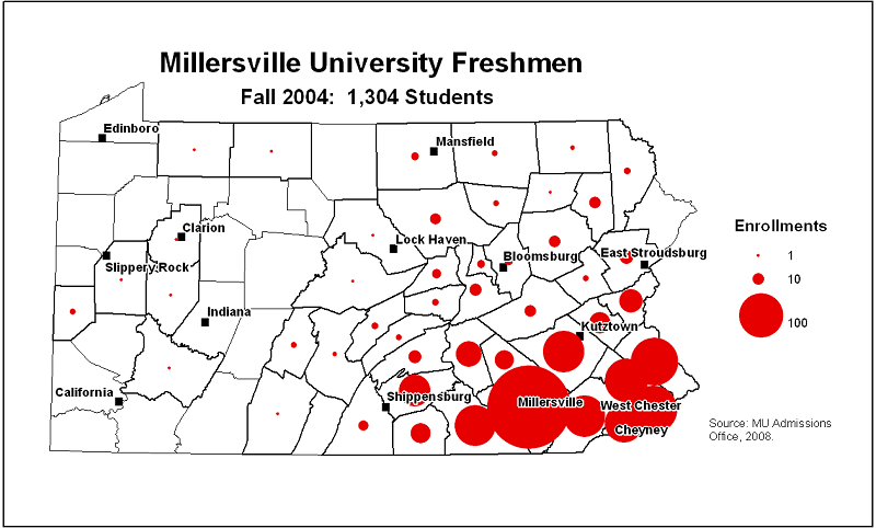
The legend is less important than the title but more important than elements like the source information or cartographer's identification. Therefore, its position should be higher on the page than those latter map elements and as close to the map as possible. The reason for such a position is that, if the map reader has to judge colors or circle sizes (as in the map above), the comparison will be easier if its counterpart in the legend is as close as possible. That was a significant enough concern on the map above that the map portion of the page was made narrower to accommodate the legend to the right of the map. There it is closer to the majority of the sizable graduated circles.
Computer programs are limited to as much flexibility as the programmers can allow and ArcGIS is no exception. In ArcGIS Pro the shape of your legend will always be a rectangle. You do have the option (see below) of adding a rectangle around the legend or leaving it with none, as in the map above. In that proportional graduated symbols map not having a legend allowed the East Stroudsburg label to intrude into that space a little even though the legend still appears cohesive and complete.The other program limitation imposed by the software in the above example was that it would not produce a circle size in the legend appropriate for evaluating Lancaster County's circle on the map.
The legend is the most complicated map element to design in ArcGIS Pro, so it will be treated separately below.
Text
The title, and subtitle if you add one, of a thematic map are important. If they are brief and clear they enhance the informational message. Thematic maps used in textbooks, magazines and journal articles do not require a title if there is a caption. The caption states the map title and usually includes a brief interpretation of the map, so it encompasses the subtitle, too. The caption in that scenario allows the cartographer to keep text within the map to a minimum.
The goal of the title on the map is like titles in advertising: send a message that will make the map reader want to look closer at the map. This can be a place for clever creativity, but the goal is to convey the map's message efficiently. If the map area depicted is clear and obvious for the intended audience there is no need to restate the name of the area in the title. What will be less clear is the specific variable shown on the map and possibly its units of measure. The variable name is perfect for the title content and the units of measure work well for the subtitle. Another important detail is usually going to be the date representing when the data were collected. Its relative importance determines whether it needs to go in the title or subtitle, or even somewhere lower on the map page. Just remember the comment made near the top of this page: less text is better than more text; let the symbols speak for themselves.
Creating a title for your Layout can be done in one of several ways, all from the Layout view's Insert menu. Look in the group of icons labeled "Graphics and Text." All the options with an upper case A on them will prompt you for text to add. The differences have to do with whether there will be a shape drawn around the text; the one represented as an upper case A by itself has no shape added. As soon as you click the icon the mouse cursor changes and wherever you click on the map a default shape will be drawn and default text (the word "Text") will be added.
Unfortunately, it is not always easy to see the text you are adding. Not only is the word short, but the default font is very small and the default color is black against a transparent background. If it happens to be created in a dark area of your map, it can be hard to find. The best thing to do is to type your title right away. Then, click elsewhere on the map and a rectangle surrounding the text will appear which is easier to see.
Clicking on that text box either while first adding the text or to edit the text after it was inserted adds (but does not switch to) a Text Format menu on the menu ribbon. That menu shows the standard Windows options for text, including the font choice, the font size, and Regular vs. Bold. To change any of those characteristics of the text, the text must be selected first. The menu also shows other options specific to ArcGIS Pro, for the various situations in which you might like to add text either to the map itself or elsewhere on the page.
The shape that is part of most of those text options is transparent by default, but can be turned into a background shape covering whatever is there on the page. The location of this feature is tricky to find. On that Text Format menu in the ribbon, the first item at the left end of the menu says "Text" by default. Click on that and select "Background" instead. The menu changes to highlight controls that work on shapes, such as "Fill" for selecting the background color and "Stroke" for selecting the color of the outline of the shape (remember to select a line thickness greater than 0 just to the right).
Other text might be needed on the map or on the page, but its size and position should reflect its importance to the map's purpose. The title should be the largest text positioned highest on the page, and the subtitle should be a little smaller and a little lower. Other information, filling in relevant context information or technical details, should be smaller and lower in position compared to those elements.
Because the thematic map is showing some form of calculated or researched data, like any research publication it is important to document the source or sources of the data right on the map. This is generally done in small print near the lower margins of the map or in the caption if one is attached to the map. You will notice in the Layout view in ArcGIS Pro that Esri automatically adds source information for the basemap near the lower right corner of the page. The one exception the fact that the map represents its data as of a certain date (generally just the year) which might be part of the title or subtitle or perhaps in the legend (see below). If there is a caption, the date could be repeated there.
Finally, it is conventional for the cartographer to add their own initials and the date (again, year only) of publication for the map. This is generally placed, also in very small text, in the lower right corner of the map page.
Scale and North Arrow
To access the map scale and north arrow elements, you must, again, be in your Layout view. On the Insert menu is one icon to click on to insert a North Arrow on the map and another icon to insert a Scale Bar. Considerations for designing these elements were described in an earlier unit on map composition for topographic maps.
Both these elements were considered to be very important on topographic maps, but that value is not so vital on most thematic maps. The question again is how central to the map's purpose and audience these map elements might be. If the map is intended for elementary school students who are still learning North, East, South and West, and you are trying to show a pattern that favors one of those directions, then a north arrow, or even a full compass rose, can be considered necessary. If you are displaying city locations with graduated symbols and it is relevant to consider how far apart the cities are from each other, then a map scale, along with a note instructing users to measure from the center of one circle to the center of the other, and not edge to edge, could be necessary to clear understanding. In most other cases these map elements are not integral to the map's purpose. In fact they might be considered as clutter, interfering with the map's interpretation.
If either one of these elements is considered to be necessary, then the best design decision is to keep its appearance simple and appropriately-sized. Do not draw attention to the north arrow or map scale at the expense of the legend or even the map itself. ArcGIS Pro does include many north arrow and scale bar designs and many of those are very much over the top with ornateness. Again, the best design philosophy is "keep it simple."
Legend Design in ArcGIS Pro
The Legend Design Process
One challenge with using any kind of graphics software is learning its terminology and its tools. ArcGIS Pro is no exception to that challenge. Its interface for helping the cartographer design a map legend includes many options and settings with very subtle purposes. In what follows here, I will point out the parts of that interface that are most useful and that I expect you to use; whether you spend time experimenting with others is up to you.
Start this legend design adventure by navigating to the Layout view's Insert menu and clicking on the icon to insert a Legend. That will cause the menu ribbon to add new tabs, depending on what part of the menu you are actively working on. At other points dialog panels will open from the right side of the ArcGIS Pro window. The other significant change you will see will occur in the Contents list to the left of the map page.
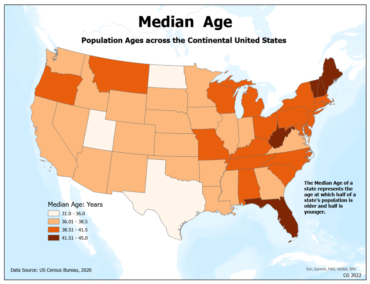
The example we will follow creates a choropleth map legend for the map of median ages of the continental US states. To begin, the Map view (compilation) for which the legend is being designed is shown below. Notice that the Map view's version of the legend appears in the Contents list on the left. Remember that we altered elements of the Map view's Contents legend in order to prepare it for creating this Layout view legend.
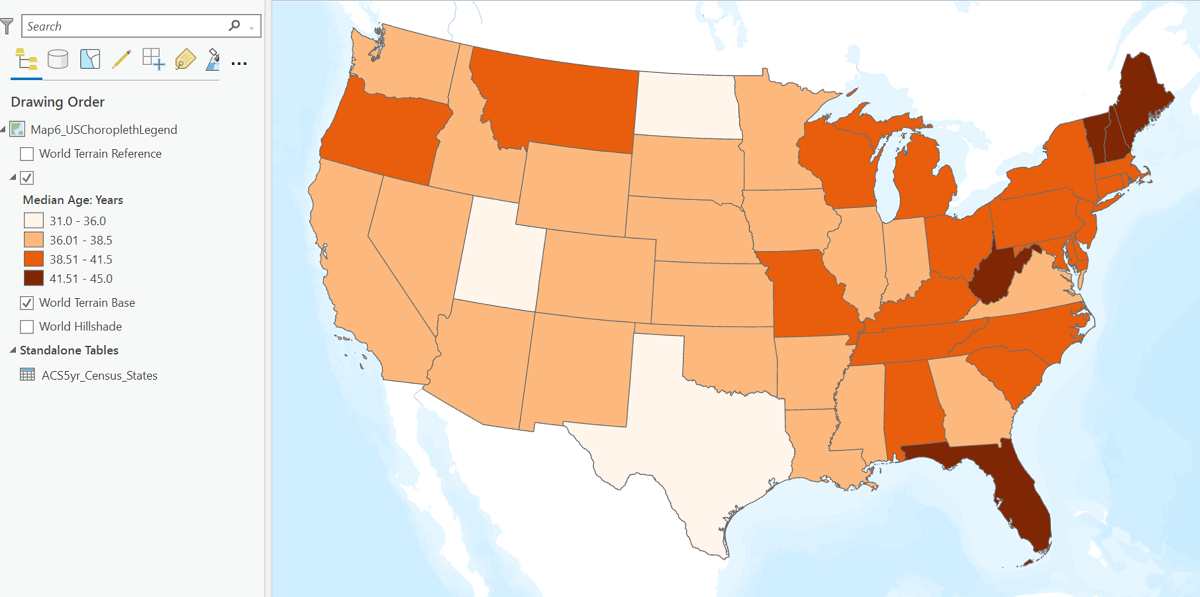
As noted above, start by clicking on the Legend icon on the Layout view's Insert menu. Then click in the upper left corner of the space on your layout page where you plan to fit the legend and drag the cursor to the opposite (lower right corner) of that space. It starts by adding a default legend based on the layers and symbols found in the Map view's Contents list. A "Legend" item is added to the Layout view's Contents list which can be expanded to show the individual layers symbolized in that Map view. You can uncheck the boxes of any layers you don't want to see in the map legend. At the same time, a new Legend Format menu ribbon has been added above the map.
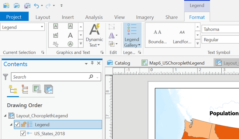
The menu ribbon above the map changes depending on whether the Legend is selected (clicked on) in the Contents list, as shown below, or one of the layers to be symbolized is selected. Depending on which part of the legend you are working on (selected in the Contents list) some of the menu ribbon items might be unavailable (grayed out).
You can also right-click on the selected item in the Layout view's Contents list and choose Properties at the bottom of that list to view a "Format Legend" dialog window opening from the right side of the ArcGIS Pro window. Like the menu ribbon, its contents change depending on which item in the Contents list Legend section you clicked on. See below for a view of this dialog for the Legend item itself. The two arrows point to two menu-style items and four items represented as icons. Each of those, when clicked on, changes the contents to a different aspect of formatting the legend, way too many options to be examined here.
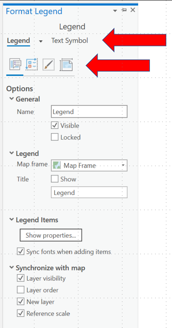
Recall the earlier discussion in which we decided "Legend" is the worst possible heading for a legend. The dialog shown above has two places in which the word "Legend" appears. The first has a main heading "General," below which is a box labeled "Name." This is not the legend heading, but is the name that appears in the Contents list for the legend (theoretically you could have multiple partial legends in different locations on your map page). The next item in the Format Legend dialog (above) has a main heading "Legend," below which are a selection box labeled "Map frame" (identifying which map frame, or Map view this legend is associated with) and a checkbox labeled "Title" and "Show." Below that is the word "Legend" typed in a box. This is the legend heading; you have the option of retyping a more meaningful legend heading or, as shown above, since there is no rule that every legend needs a heading (they are generally self-explanatory), you can uncheck the box labeled "Show."
That takes care of the main legend heading, but there still might be other headings showing. The key to controlling these is to remember that connection (via the "map frame") between the Map view and the Layout view. There are complex ways to remove or retype such headings within the Legend dialogs in Layout view, but as explained previously the easiest way to do it is to go back to your Map view's Contents list and delete or retype the labels there.
Another common preference in a legend is for a box surrounding it. You can add a border and a background fill color as standard options in ArcGIS Pro. In the current example, whose finished map is shown below, the legend is presented with no border. It is usually preferable to avoid legend borders because the additional lines add clutter on a thematic map, but if a basemap, for example, has strong colors in it the legend border can make the legend easier to see.
The procedure for adding the legend border starts with selecting the Legend item (not any of its sub-items) in the Layout view's Contents list and selecting the Legend Format menu ribbon above the map. The easiest next step is to click on the "Legend Gallery" icon which opens a selection of several generic standard appearances for legends. Find one that best fits your preferences for borders (or lack thereof) and background color (or lack thereof). If you choose a legend format from the gallery that has a border or background color, you will notice its outline does not match the outline of the actual legend consisting of its graphic symbols and labels; that is the trickiest aspect of the legend to set if starting from scratch so prioritize that appearance when making your choice. It is easier to adjust those characteristics than it is to create them.
At the left end of the Legend Format menu ribbon is a text box with the word "Legend" in it. To make adjustments to the background color, click in that box and select "Background" from the list that opens. The rest of the menu will change to show appropriate controls, including "Fill" for changing the background color. If you want a box coinciding with the background color block, select a line thickness greater than 0 (zero) for the "Stroke" item just below the "Fill" item. These don't appear on the finished choropleth map below, but do show up on other maps further below.
Similar Results for the Other Ordinal-level Maps
This classified graduated symbols map has a strongly colored basemap, chosen to illustrate landscape influences on major airport location and size. The strong coloring in the basemap led to the decision to include colored backgrounds for the title and legend and to separate the colored backgrounds from the basemap using a solid black border. A second issue on this map is the large block of text added in the lower right area of the map page. This is added by Esri (the producers of ArcGIS software) and is huge here because apparently many different organizations contributed to creating the basemap. That is not normal for them. The decision was made just to leave it and work around it, placing the cartographer's initials and publication date below in the corner. If that space was needed for a legend or some other map page element, it would probably be easier to switch to a different basemap. It would be in poor taste to cover that text.

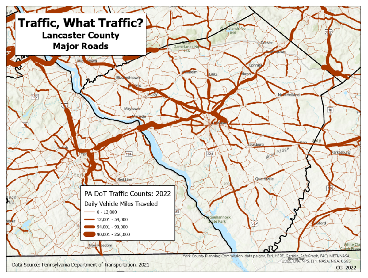
The classified flow map below also required a background for the title and legend. In this case it was not so much the basemap, even though it was topographic, but more because of the fact that the primary layer covered the entire state. The title of this map uses a little humor to convey the data theme, and included the county name (in spite of the fact that the layer shows statewide data) to draw attention to the focal area of the map. In the legend, both the legend heading and the layer name were used to explain what the data is measuring.
Finished Quantitative-level Maps
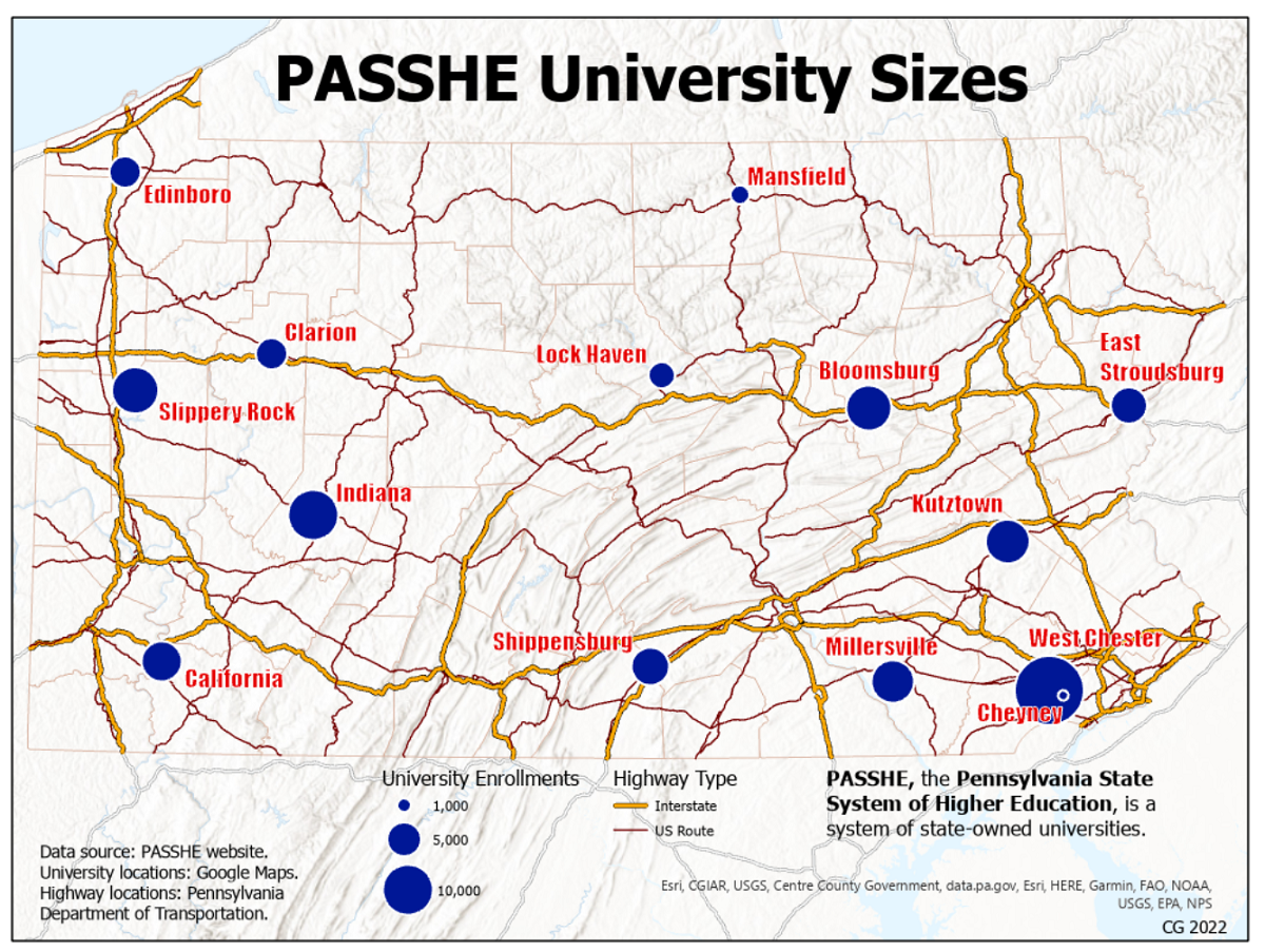
The first quantitative-level map to show is the proportional graduated symbols map. This map does not have a strongly colored basemap but does have an additional layer showing the major highways of the state that features bold colors. For this map the size of Pennsylvania was maximized, leaving less room around the margins of the map page with two layers to include in the legend. Given Pennsylvania's proportions, though, it was possible to position the map higher within the map frame to create more space along the bottom of the map page. The paleness of the basemap allowed a legend with no background. Both the graduated circles and the nominal highway symbols lend themselves to vertical legend arrangements, which ArcGIS Pro placed side-by-side by default. Centering it beneath the state created the space needed in the corners to place source details and the cartographer's identification. An explanation of the abbreviation used in the map title potentially broadens the map's audience.
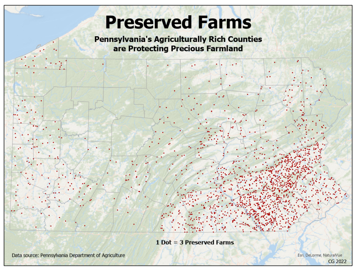
The dot density map below required a change of basemap in order to allow the small dark red dots to stay visible but also to give some sense of the state's topography. A brief title enhanced by a more descriptive subtitle sets the theme. The legend-type information appearing in the Contents list of the Map view is clear, especially since we used the Symbology dialog to set some of the legend label text. If anything, they give more than is needed by stating the information twice: once with words alone and then with the dot symbol followed by the dot label. Unfortunately, attempting to use the procedure we have been using to insert a legend, never seemed to get it right. It turns out to be simpler to insert the all-words version by typing the same text in a text box.